
Discover proven tactics in website design for saas to boost conversions, engage users, and accelerate growth.
Jan 11, 2026

Good SaaS website design is much more than just picking a cool color palette and a modern font. It's about building a digital experience that turns curious visitors into paying customers. This means you have to get inside your audience's head, sharpen your message until it’s crystal clear, and lay a strategic foundation that informs every single design decision you make.
Laying the Strategic Groundwork
Before you even think about wireframes or mockups, you have to do the strategic heavy lifting. A high-converting SaaS website is born from a solid strategy, not just pretty visuals. Jumping straight into design without this groundwork is like building a house without a blueprint—it might look okay at first, but it won't be long before the cracks start to show.
The whole point of this initial phase is to answer a few critical questions. Who are you actually selling to? What’s the one big, painful problem your software solves for them? And why on earth should they choose you over the competition? Getting these answers right is what separates a website that just sits there from one that becomes your most powerful growth engine.
Pinpoint Your Ideal Customer Profile
You can't build a website that resonates if you don't know who you're talking to. That’s where an Ideal Customer Profile (ICP) comes in. It's a hyper-specific description of the exact type of company that gets the most value out of your product. Forget broad demographics; we need the nitty-gritty details that actually drive buying decisions.
Get specific about things like:
Industry and Company Size: Are you targeting scrappy marketing agencies or massive enterprise tech companies? A site built for a 10-person startup needs a completely different tone and focus than one aiming for a Fortune 500 client.
Their Biggest Headaches: What keeps your ideal customer up at night? Zero in on the operational snags, frustrating inefficiencies, or missed growth opportunities that your software makes disappear.
What They're Trying to Achieve: What does a "win" look like for them? Your website's messaging should speak directly to their goals, whether that's boosting revenue, clawing back time, or sleeping better knowing their operational risk is lower.
Nailing your ICP ensures your copy, visuals, and calls-to-action all hit the right note. Your ideal customer lands on your site and immediately thinks, "Okay, these people get me."
Map Out the Customer Journey
Once you know who you're after, you need to figure out how they buy. A customer journey map is your guide, showing you the path a person takes from first hearing about you to becoming a die-hard fan. Spoiler alert: it's rarely a straight line.
A classic mistake is designing the entire website for someone who's ready to pull out their credit card right now. The reality is, most of your visitors are just kicking the tires, trying to understand their problem, or comparing you to three other tools. Your site has to work for all of them.
Think about the key phases people go through:
Awareness: Someone has a problem but might not even have a name for it yet. They stumble upon one of your blog posts or see a social ad. At this stage, your job is to be helpful and educational, not pushy.
Consideration: Now they're in research mode. They're digging into your product pages, comparing features, and checking out your pricing. Here, you need to be clear, convincing, and answer all their questions.
Decision: They're down to the final few contenders and are ready to commit. This is where compelling case studies, glowing testimonials, and a ridiculously easy way to sign up for a trial or demo seals the deal.
This simple diagram breaks down how these strategic pieces fit together, flowing from the customer to their journey and, finally, to the value you offer.
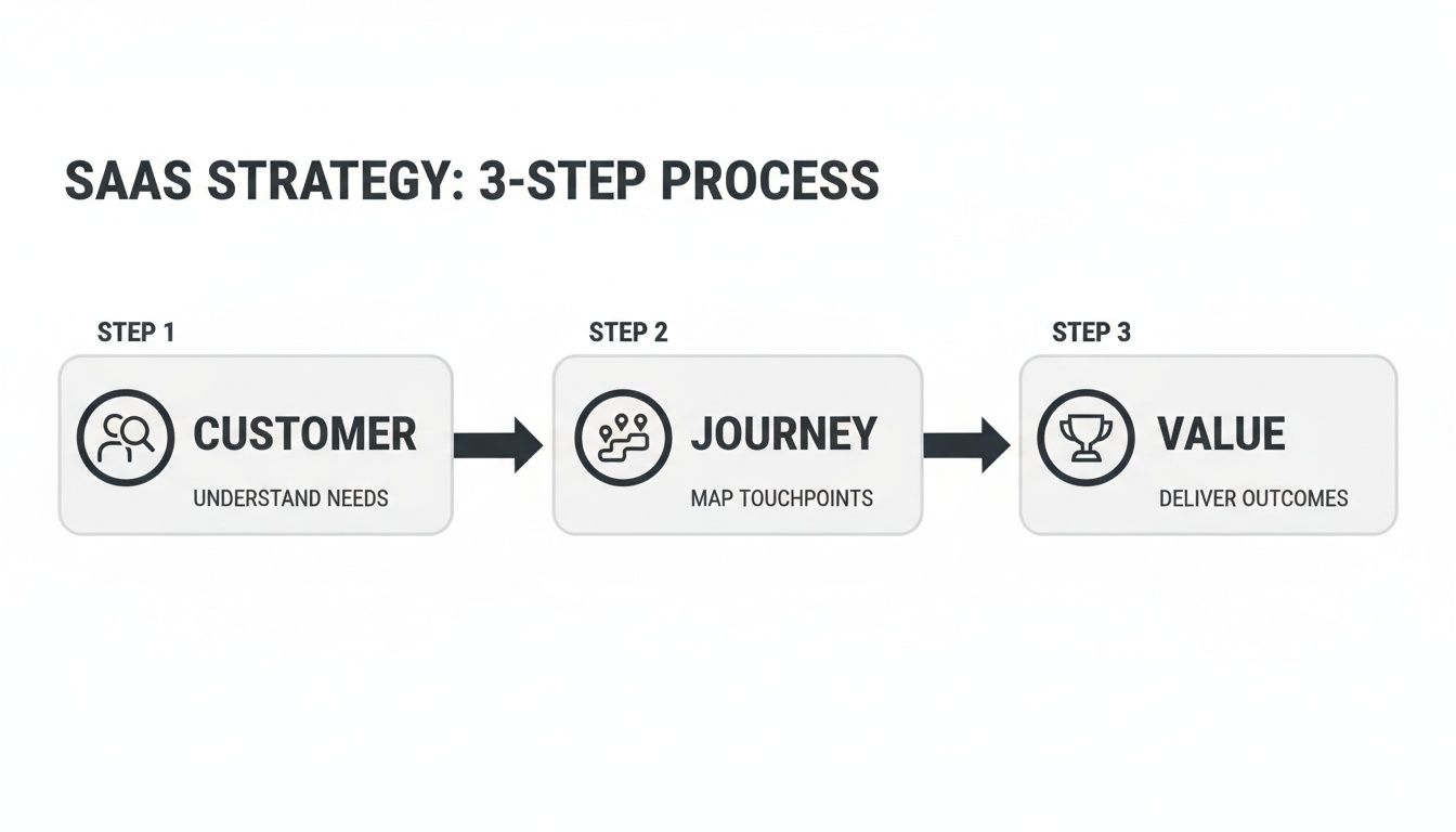
This really drives home the point: a winning website strategy always starts with the customer. By understanding their path, you can create a site that meets them exactly where they are and gently guides them toward becoming a happy customer.
Designing Core Pages That Drive Action
Okay, you've nailed down your strategy. But a great strategy doesn't automatically mean a great website. The real magic happens when you design core pages that guide people from just browsing to actually signing up. Every page—from your homepage to your pricing—has a specific job to do. When they all work together, you create a seamless path that turns visitors into customers.
This is where all that hard work understanding your customer journey really comes into play. You're about to build the actual experience that meets them right where they are.
Crafting a Homepage That Converts
Think of your homepage as your digital storefront. You've got maybe five seconds to convince someone they’re in the right place. That's it. Your only goal is to instantly answer three questions: What is this? Who is it for? And what do I do next?
The hero section—that first screen they see—is everything. It needs a headline that speaks directly to your ideal customer’s biggest headache or their ultimate goal. Don't get clever; get clear. Pair it with a simple sub-headline explaining how you solve that problem, and cap it off with a single, impossible-to-miss call-to-action (CTA) button. Think "Start Free Trial" or "Request a Demo."
Once you’ve hooked them, the rest of the page needs to build your case, fast.
Social Proof: The first thing under the hero? Logos. Show visitors the recognizable companies already using your product. This builds immediate credibility before they've even read about a single feature.
Problem/Solution: Briefly state the pain point your software crushes. Then, show them how it works with clean visuals or a short, looping GIF of your product in action.
Key Benefits: Don't list features, list outcomes. Instead of "Task Automation," write "Save 10 Hours a Week on Repetitive Work." Stick to just three or four of your most powerful benefits.
A great homepage acts like a confident, helpful guide. It tells visitors, "You're in the right place," and then points them exactly where they need to go next.
To really nail this, you should be thinking in terms of landing page optimization best practices. It’s a mindset that forces every element on the page to earn its keep.
Designing a Pricing Page That Sells
Your pricing page is where the decision gets real. It’s often the final hurdle before a conversion, and if it's confusing, you've lost the sale. Your goals here are clarity and confidence. You want prospects to easily pick the right plan and feel great about it.
Name your tiers logically, often based on who they're for ("Starter," "Pro," "Enterprise"). Under each tier, use bullet points to show the key features—but only the ones that actually differentiate the plans. Don't overwhelm them.
A simple design trick? Visually highlight your most popular plan with a colored border or a "Most Popular" tag. It’s a simple nudge that helps reduce decision fatigue.
If your pricing is complex, don't be afraid to add a pricing calculator or a clear CTA to "Talk to Sales." This gives your team a chance to explain the value to high-ticket customers. And be transparent! A simple FAQ section that answers questions about billing, cancellations, and support can handle objections before they even become deal-breakers.
Showcasing Value on Product and Feature Pages
The homepage makes the promise; your product pages provide the proof. This is your chance to go deeper into how your software actually works, but you have to stay focused on the user's benefit. The classic mistake here is just listing features. Nobody cares about features; they care about what those features do for them.
Structure the content for each major feature to answer three simple questions:
The Goal: What is the user trying to do?
The Feature: How does your tool make that possible?
The Outcome: What's the real-world result? (e.g., more leads, less manual data entry, clearer insights).
Bring these features to life with high-quality screenshots, annotated GIFs, or short demo videos. A visitor should be able to see themselves using your tool and feeling the win. If you want to dive deeper, our guide on a better website design for conversion has some great, practical tips.
Finally, don't treat your About and Contact pages as an afterthought. A good About page builds a human connection and trust. A clean Contact page makes it dead simple for hot leads to reach sales while guiding existing customers to the right support channels.
To help you keep it all straight, here's a quick checklist of the essential elements for these core pages.
Essential Elements for Core SaaS Pages
This table breaks down the must-have components for your key website pages, ensuring each one is built to maximize clarity and drive conversions.
Page Type | Key Elements | Primary Goal |
|---|---|---|
Homepage | Clear Value Proposition, Social Proof, Single CTA | Guide visitor to the next logical step |
Pricing | Clear Tiers, Highlighted Plan, FAQs | Help users self-select the right plan |
Product/Feature | Benefit-focused Copy, Visuals (GIFs/Video), Use Cases | Prove the product solves a specific problem |
About Page | Company Story, Mission, Team | Build trust and human connection |
Contact Page | Simple Forms, Clear paths for Sales vs. Support | Make it easy for leads to get in touch |
Using this as a guide ensures you're not just filling pages with content, but strategically designing each one to do its job effectively.
Mastering UX and UI for a Seamless Experience
You can have the sharpest strategy and the most persuasive copy, but if your website feels clunky or confusing, you've already lost. This is where great UX (User Experience) and UI (User Interface) design make all the difference. For SaaS, great design isn't about chasing trends; it’s about creating an intuitive, frictionless path that makes your visitors feel smart and in control.
Before we get into the nitty-gritty, it's worth understanding the distinction between UX and UI. Think of UX as the overall journey and feeling a person has while using your site. UI, on the other hand, is the collection of visual elements they interact with along the way—the buttons, menus, and layouts that bring that experience to life.
Embrace Simplicity and Clarity
Look at the most successful SaaS websites. They’re almost always the simplest. Your job is to reduce cognitive load—that’s the fancy term for how much brainpower someone has to use to navigate your site. If a visitor has to squint to read your text or hunt for the sign-up button, they're gone.
This is why designers are obsessed with white space. It's not just "empty" space; it's an active tool that gives your content room to breathe. It guides the eye, improves readability, and makes your calls-to-action pop.
Here’s how to put that into practice:
Clean Typography: Stick to one or two readable font families. Use size and boldness to create a clear visual hierarchy. A visitor should instantly know the difference between a headline and body text.
Focused Color Scheme: A limited, intentional color palette looks professional and helps you direct attention. Use your primary brand color for buttons, links, and other key actions to build consistency.
Consistent Navigation: Your main menu should be predictable and available on every single page. A user should never feel lost or have to think about how to get back to the pricing page.
Build Trust with Social Proof
For a new visitor, signing up for a SaaS product is a leap of faith. Social proof is your best tool for calming that anxiety and building instant credibility. It’s the digital version of walking past a busy restaurant—if all these people are inside, it must be good.
Don't just hide your testimonials on a dedicated page. Weave them into your site where they’ll have the most impact.
A customer quote placed right next to a feature description is far more powerful than a long list of testimonials on a standalone page. It provides context and validation exactly when the user needs it most.
Plaster well-known customer logos right on your homepage, typically just below the main hero section. This immediately signals that other respected companies trust you. The same goes for product pages; showcasing case studies or five-star reviews right there reinforces the value you’re promising.
Let Users Experience the Product
One of the biggest challenges in SaaS is getting a prospect to "get it." You can describe a feature all day, but nothing beats letting them feel its value. This is where interactive elements can be a game-changer.
Instead of just showing static screenshots, consider offering an interactive demo. Let people click around in a simulated version of your product without having to sign up. They get a tangible sense of the interface and can have that "aha!" moment on their own, making them much more likely to start a real trial. For more advanced techniques, you can dig into our in-depth guide to improving the UX design for SaaS.
This focus on user-centric design is driving huge market growth. The global web design market hit USD 58.5 billion in 2022 and is on track to blow past USD 100 billion by 2031. That explosion is tied directly to the growth of SaaS, where exceptional design isn’t a luxury—it’s a critical business investment.
Choosing the Right Technical Foundations
A beautiful design means nothing if your website is slow, buggy, or a complete headache for your marketing team to update. The tech choices you make are the invisible backbone of your SaaS website, and they directly impact everything from lead generation to the trust you build with potential customers. This isn't just an "IT thing"—it's a critical part of designing a SaaS website that actually works.
Your site’s performance is often the very first impression you make. We live in an on-demand world, and even a one-second delay in page load time can tank your conversions by 7%. A slow site feels unprofessional and, worse, it subtly suggests your actual product might be just as clunky.
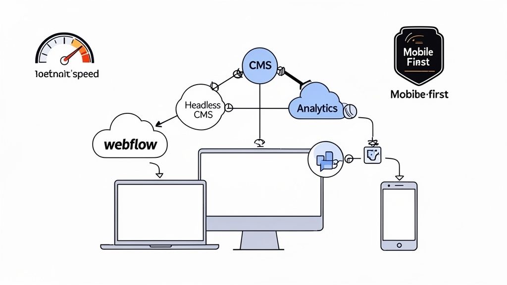
Select a Modern and Flexible Tech Stack
One of the biggest decisions you'll make is the platform you build your site on. You're looking for that sweet spot: a system that lets your marketing team move fast without constantly needing to pull engineers away from the core product.
This is exactly why modern visual development platforms and headless content management systems (CMS) have become so popular. They offer a fantastic middle ground between rigid, cookie-cutter templates and fully custom, code-heavy projects.
Webflow & Framer: There’s a reason these platforms are favorites among SaaS companies. They give designers and marketers the keys to build, launch, and manage incredibly custom, high-performance websites without needing to write code. Need to spin up a new landing page or run an A/B test? You can do it yourself, today.
Headless CMS (e.g., Contentful, Sanity): If your team has more complex integration needs or is set on using a specific front-end framework like React or Vue, a headless CMS is a phenomenal choice. It separates your content (the "body") from the presentation layer (the "head"), giving developers total freedom while still offering a simple, clean interface for the content team.
Your website's tech stack should be an enabler, not a bottleneck. The right choice gives marketing the agility to experiment and iterate while freeing up valuable engineering resources to focus on the core product.
Prioritize On-Page SEO and Analytics
A brilliant website that no one can find is just an expensive digital brochure. Right from the very beginning, your technical setup has to be built with search engines in mind. This isn't about gaming the system with old-school tricks; it’s about creating a clean, logical structure that search engines can easily crawl and understand.
Make sure your site has these fundamentals locked down:
Logical Heading Structure: Think of it like an outline. A single
<h1>for the main page title,<h2>tags for major sections, and<h3>tags for sub-points. This hierarchy makes the content digestible for both people and search crawlers.Descriptive Metadata: Every single page needs a unique title tag and meta description. These should accurately summarize the page's content and include the keywords people are actually searching for.
Clean URLs: Keep your URLs short and readable. For example,
/features/project-managementis infinitely better than/p-id=123.
Once people find you, you need to understand what they're doing. Setting up analytics isn't optional. Tools like Google Analytics 4, Mixpanel, or Posthog are your eyes and ears, showing you which pages are resonating, where users are getting stuck, and which marketing channels are actually bringing in valuable leads.
The SaaS market is moving at a breakneck pace. For instance, AI-native SaaS spending jumped 108% year-over-year, and low-code platforms now power 75% of new applications. This kind of acceleration means your website’s technical foundation needs to be more than just solid—it has to be agile enough to keep up. You can dig into more of these trends on Zylo's blog.
Adopting a Mindset of Continuous Improvement
Launching your website isn’t the finish line; it’s the starting pistol.
The most successful SaaS companies I've seen treat their website like a living product—something that is never truly “done.” This shift in mindset, from a one-time project to a continuous improvement cycle, is what separates websites that stagnate from those that become powerful growth engines.
Every visitor interaction, every click, and every scroll is a data point. Your job is to gather this feedback, understand the story it tells, and use those insights to make your site progressively better. This isn't about massive, risky redesigns every few years. It’s about making small, smart, data-informed bets every single week.
Running A/B Tests That Actually Teach You Something
A/B testing is your best tool for making decisions with data instead of just gut feelings. The idea is simple: you show two different versions of a page to different groups of visitors and see which one performs better for a specific goal, like getting more demo requests or trial sign-ups.
The key to doing this well is to be scientific about it. Don't just throw random ideas at the wall. You need to start with a clear hypothesis. For instance, you might theorize that changing your CTA from "Get Started" to "Start Your Free 14-Day Trial" will boost clicks because it’s more specific and highlights the "free" aspect.
To get the biggest bang for your buck, focus your first tests on high-impact areas:
Headlines and Value Props: Try out different ways of explaining what your product does. Does a benefit-driven headline beat one that's all about features?
Call-to-Action (CTA) Buttons: Experiment with the button text, its color, and where you place it on the page.
Pricing Page Layout: See what happens when you highlight a different plan or change the order of your features.
A/B testing isn't just about finding a "winner." Every test, even one that fails, teaches you something valuable about what your audience responds to. Document everything to build a library of insights over time.
Going Beyond the Numbers with Qualitative Feedback
Quantitative data from A/B tests tells you what is happening, but qualitative feedback tells you why. You absolutely need both to get the full picture. Sometimes the biggest opportunities for improvement are hidden in the frustrations and hesitations of your actual users.
Session recording tools like Hotjar or FullStory are fantastic for this. They let you watch anonymized recordings of real user sessions, showing you exactly where people get stuck, hesitate, or rage-click in confusion. You might discover that a button is hard to find or that your pricing tiers are causing analysis paralysis.
You can also try a few other simple methods:
On-site surveys: A simple pop-up asking, "Was there anything preventing you from signing up today?" can yield incredibly honest and direct feedback.
Customer interviews: Just talk to recent sign-ups. Ask them about their experience on your site. What convinced them? What almost stopped them?
This feedback loop is also crucial for improving what happens after the initial sign-up. To learn more about creating a frictionless experience from the start, check out our guide on SaaS onboarding best practices.
Personalizing the Experience with AI
The next frontier in website optimization is personalization. Instead of showing the exact same website to every single visitor, you can adapt the experience based on who they are. This is no longer science fiction; AI-powered tools are making it surprisingly accessible.
Imagine, for example, changing the hero headline and customer logos based on a visitor's industry, which you might know from their IP address or a third-party data service. A visitor from a finance company would see testimonials from banks, while someone from a healthcare organization would see case studies from hospitals.
Let's be real: SaaS buyers today have zero patience for confusing websites. If your homepage doesn't clearly explain what you do in the first 3-5 seconds, visitors bounce and never return.
We're already seeing that AI-powered personalization is delivering 20-40% conversion lifts by dynamically adapting hero messages and content based on visitor industry, role, or use case. This level of relevance makes visitors feel understood, building instant rapport and dramatically increasing the chances they’ll stick around to learn more.
Answering Your Top SaaS Website Design Questions
Even with a solid plan, a bunch of practical questions always pop up when it's time to build a SaaS website. Let's dig into the common ones I hear from founders and marketing leaders all the time. Getting these sorted out early saves a lot of headaches down the road.
These are the things that keep people up at night once the strategy is set and the real work begins.
What's the Real Cost of a SaaS Website?
This is always the first question, and the truthful answer is: it's all over the map. You could get a simple site up for a few thousand dollars using a template, or you could invest well into six figures for a completely custom, enterprise-level build.
So what drives the price? It really boils down to three things:
Scope and Complexity: Are we talking about a handful of pages, or do you need complex animations, deep integrations with tools like Salesforce, and a full-blown blog powered by a custom CMS?
Design Customization: Is a tweaked template good enough for now, or do you need a unique design system crafted from the ground up to make your brand stand out?
Agency vs. Freelancer: Who you hire makes a big difference. An agency will generally have a higher price tag but brings a full team and dedicated project management to the table.
Your website is an investment in growth, not just another line item on a budget. The right site isn't an expense; it's an asset that should be actively generating qualified leads and paying for itself.
Should We Go with a Template or a Custom Design?
This is the classic battle between speed and flexibility. I've seen templates work brilliantly for early-stage startups that just need to get an MVP site live, test their idea, and start conversations. They’re fast, affordable, and can look surprisingly sharp.
But templates always come with limitations. You'll inevitably hit a wall where you can't get a page to look or behave exactly how you need it to. A custom website design for saas is about taking back control. It lets you design an experience that perfectly matches your ideal customer's journey and gives you a powerful way to look different from the dozens of competitors in your space.
How Do I Know If My Website Is Actually Working?
Your website’s performance shouldn't be a gut feeling. To know if it’s successful, you have to track the numbers that actually move the needle for your business—not just vanity metrics like page views.
Here are the key performance indicators (KPIs) I tell my clients to obsess over:
Conversion Rate: What percentage of people who visit your site actually sign up for a trial or book a demo? This is your north star metric.
Lead Quality: Are the sign-ups coming from your ideal customer profile? A flood of sign-ups from the wrong kind of user is just a distraction.
Cost Per Acquisition (CPA): How much marketing spend does it take to get one new customer through the website?
When Should I Redesign My Website?
A redesign shouldn't happen just because you're bored with the old look. It needs to be a strategic move tied to a clear business goal.
You should seriously consider a redesign if:
Your conversion rates have gone flat. If qualified traffic isn't turning into sign-ups, something on the site is broken.
You've pivoted or rebranded. Your website is your company's front door. If your message or audience has changed, the website has to change with it.
The site is a pain to update. Is your marketing team stuck waiting for developers to launch a simple landing page? That’s a major growth bottleneck.
It looks ancient next to the competition. Design isn't just about looking pretty; an outdated site erodes trust and makes your product feel obsolete.
At Shalev Agency, we partner with SaaS teams to design and build high-performing websites that act as powerful growth engines. If you're ready to turn your site into a conversion-focused asset that saves you time and drives measurable outcomes, we can help. Learn more about how we work.