
Turn visitors into customers. This guide covers website design for conversion with actionable strategies on UX, UI, copywriting, and performance optimization.
Jan 11, 2026

When we talk about “website design for conversion,” we’re really talking about the art and science of turning casual visitors into active customers. It’s a thoughtful process that blends psychology, user experience (UX), and hard data to gently guide people toward a specific goal, whether that’s hitting "buy now" or filling out a contact form. The entire point is to eliminate friction and make taking that next step feel like the most natural thing in the world.
Why Your Website Is Not Converting Visitors
Let's be real for a moment. Most websites are little more than digital brochures. They look nice, share some information, but they don't do anything. Just having a site up and running isn't enough anymore, not when the competition is just a click away. If you're getting traffic but not seeing business results, the problem probably isn't your product—it's your website's design and the experience it creates.
The usual suspects are often hiding in plain sight. I see it all the time: confusing navigation that leaves people feeling lost, a muddled value proposition that doesn't answer "what's in it for me?" within seconds, or painfully slow load times that send visitors packing before the page even loads. These small frustrations add up, creating a digital dead-end that actively pushes potential customers away.
Moving Beyond Generic Advice
This guide isn't about the tired old advice like "make your button bigger." We're going to dig deeper into the fundamental mindset shift you need to build a website that truly converts. It's about transforming your site from a passive library of information into an active, hardworking sales and lead generation tool.
This transformation is built on three simple but powerful principles:
Clarity: Can someone understand who you are, what you offer, and why they should care within five seconds of landing on your page? If not, you've already lost them.
Simplicity: A clean, uncluttered design is easier on the brain. When you give people fewer choices, they can make decisions faster.
A Single, Compelling Call-to-Action (CTA): Every page needs one clear purpose. Guide the user toward one obvious next step, and only one.
The numbers don't lie. Across most industries, the average conversion rate hovers around a grim 2.35%. But here's the good news: simply focusing your design on a single, clear CTA can boost conversions by an incredible 371%. Pages crowded with multiple CTAs just create confusion and decision fatigue. A single, prominent CTA, on the other hand, tells users exactly what to do next.
Understanding the Conversion Funnel
To figure out where your site is failing, it helps to think of the user's journey as a funnel.
This isn't just a one-and-done task. As the diagram shows, improving your conversion rate is a continuous cycle of analyzing, hypothesizing, and testing. It's about constant learning and refinement, not finding a single magic bullet.
A great website isn't just about pretty visuals; it's a carefully engineered system. It’s designed to solve a user's problem while hitting a business goal. Every single element, from the headline down to the footer, has to work together to build trust and guide the user forward.
For companies with global ambitions, a common conversion killer is a one-size-fits-all approach. If you're targeting international markets, understanding what localization and global growth truly entails is non-negotiable. A website that resonates in one culture can fall completely flat in another, so tailoring the experience is key to avoiding costly missteps. By building a solid foundation on clarity and user intent, you can finally start turning your website traffic into real, meaningful results.
Core Pillars Of Conversion-Focused Design
To build a website that consistently converts, you need to move beyond aesthetics and focus on the underlying principles that drive user action. The table below breaks down the essential pillars that separate a high-performing site from one that just looks good. Think of it as your cheat sheet for building a true conversion engine.
Pillar | Description | Impact On Conversion |
|---|---|---|
User-Centricity | Designing the entire experience from the user's perspective, addressing their needs, pains, and goals. | Builds trust and makes users feel understood, directly increasing their likelihood of taking the desired action. |
Crystal-Clear Value | Immediately communicating what you offer and why it’s better than the alternatives. | Answers the user's "What's in it for me?" question within seconds, reducing bounce rates and capturing attention. |
Frictionless Path | Removing unnecessary steps, fields, and distractions to make the user’s journey as smooth as possible. | A simpler, faster path to the goal means fewer opportunities for users to get frustrated and abandon the process. |
Trust & Credibility | Using social proof, testimonials, security badges, and professional design to build user confidence. | Alleviates user anxiety and skepticism, which is often the biggest barrier to completing a purchase or form submission. |
Data-Driven Iteration | Continuously analyzing user behavior, A/B testing elements, and refining the experience based on data. | Ensures the site evolves with user preferences and market changes, leading to sustained and improving conversion rates. |
Mastering these pillars is the difference between hoping for conversions and engineering them. Each one reinforces the others, creating a cohesive experience that naturally guides visitors toward your business goals.
Building Your Foundation With UX Research
Before you ever think about wireframes or code, the best-performing websites start with a simple question: What does our user actually need?
Great conversion-focused design isn't about chasing the latest trends or making something that just looks cool. It's about empathy. It's about getting to the heart of what your audience wants, and that's where user experience (UX) research comes in. It's your most important tool.
Too many teams skip this part. They jump straight into Figma, armed with a bunch of assumptions and internal opinions. They build a site they think is perfect, then scratch their heads when it fails to connect with real customers. UX research completely flips that script. It gets you out of your own head and into the user's world to uncover their real motivations, frustrations, and goals.
Beyond Generic Personas
Forget those flimsy, one-page personas with stock photos and made-up hobbies. To create a design that actually works, you have to dig much deeper. The goal here is to build an evidence-based hypothesis about what will make your users tick. This isn't guesswork; it's a strategic investigation.
To do it right, you need to get your hands dirty with a few key activities:
Customer Interviews: Go talk to your actual customers. Ask open-ended questions about the problems they were trying to solve, how they found you, and what almost stopped them from buying. Pay close attention to the specific words they use—that’s pure gold for your website copy.
Competitor Analysis: Don't just glance at what your competitors' sites look like. Go through their entire user flow. Sign up for their product, add something to the cart, and try to check out. Pinpoint where they make things easy and where they create friction. You can learn just as much from their mistakes as their successes.
User Journey Mapping: Trace the entire path a person takes, from the moment they realize they have a problem to the second they become your customer. Identify every single touchpoint and ask, "What are they thinking, feeling, and doing right now?" This map will shine a light on the make-or-break moments where your website has to deliver.
A huge mistake I see is treating research like a one-and-done checklist item. The best teams build a continuous feedback loop. They're always talking to users, not just at the beginning of a project, so they stay plugged into their customers' evolving needs.
When you combine these methods, you stop making assumptions and start gaining real insights. You go from saying, "I think users want this," to, "Our research shows users are struggling with X, and here's how we're going to solve it." If you’re at the very beginning, understanding the principles of UX design for startups can give you a massive head start.
Uncovering The "Why" Behind The Clicks
Analytics tools are great at telling you what users are doing. For instance, you might see that 70% of users abandon their cart on the shipping page. But analytics can't tell you why.
Is the shipping cost a surprise? Is the form too complicated? Are there hidden fees popping up? This is the gap that qualitative UX research is designed to fill.
This is where session recording tools like Hotjar or FullStory are absolute game-changers. Watching anonymized recordings of real people using your site lets you see it through their eyes. You’ll witness firsthand where they get stuck, where they hesitate, and where they rage-click in pure frustration.
This process turns cold, abstract data into real human stories, giving you the empathy you need to design an experience that feels effortless. As you can see below, the journey from a confusing mess to a clear call-to-action is what drives growth.
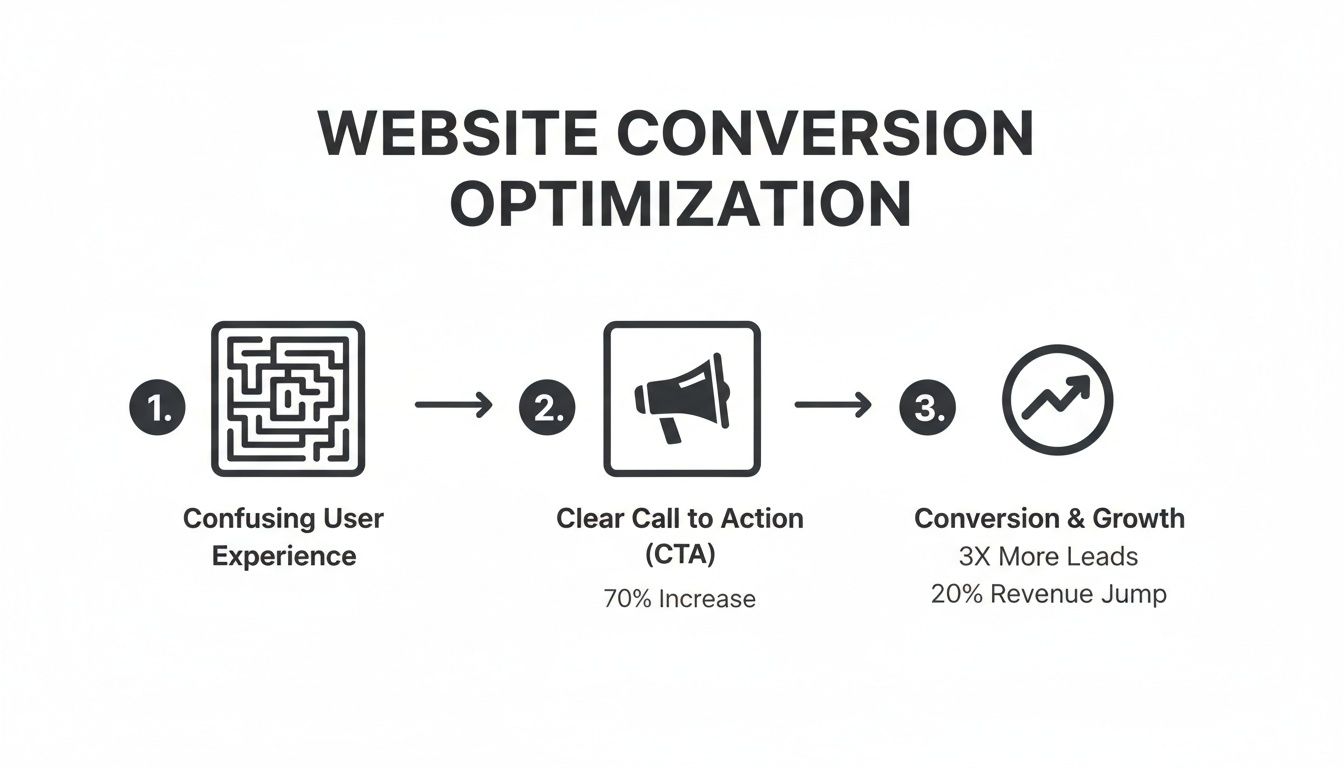
The biggest takeaway here is that simplifying the user's path and giving them a single, obvious next step is the most direct way to boost your conversion rates.
From Research To A Strong Hypothesis
Ultimately, all this foundational research work is leading to one thing: a clear, testable hypothesis. It's a simple statement that connects a change you want to make with an outcome you expect, all based on the evidence you've gathered.
A strong hypothesis isn't just a shot in the dark. It looks like this:
"Based on our user interviews, we believe that by adding customer testimonials directly below the 'Add to Cart' button, we will increase checkout conversions by 15% because it will address the trust issues users mentioned."
See the difference? This is a strategic, educated guess rooted in what your users have already told you. This single sentence becomes the foundation for your design and testing plan, making sure every decision is aimed at solving a real problem and driving a measurable result. This is the work that separates a website that just exists from one that actually performs.
Designing An Irresistible User Interface
Okay, you've done the research and you understand your user. Now for the fun part: turning those insights into an on-screen experience that actually gets people to click, sign up, or buy. This is where your strategy gets a face—the user interface (UI) that your visitors will interact with.
A high-converting UI isn't just about pretty colors and modern fonts. It’s a deliberately crafted system designed to lead users to your goal so smoothly they barely notice it happening.
The best designs just feel right. They use visual hierarchy—the smart use of size, color, and spacing—to direct attention where you want it to go. Your main call-to-action (CTA) should never be a wallflower; it needs to be the most obvious, can’t-miss element on the page.
Guiding The User's Eye With Visual Hierarchy
Visual hierarchy is the secret weapon of persuasive design. It’s how you tell a user’s brain what to look at first, second, and third, all without saying a word. You can build a powerful visual flow by playing with a few key ingredients.
Size and Scale: Bigger things feel more important. It’s that simple. Your headline should dwarf your body text, and your primary "Buy Now" button should look more substantial than a secondary "Learn More" link.
Color and Contrast: A vibrant, high-contrast button on an otherwise muted background is impossible to ignore. Use your brand's boldest color for your main CTA to make it the undeniable star of the show.
Whitespace: Don't be afraid to let your design breathe. Plenty of empty space around a form or a button makes it feel less cluttered and more important, which helps reduce a user's mental workload.
Think about a SaaS pricing page. They almost always highlight the "most popular" plan by making its container slightly larger or giving it a bolder color. That’s visual hierarchy in action, gently nudging users toward the choice you want them to make.
Building Instant Trust With Social Proof
Let's be honest, people are pack animals. We instinctively look to others to figure out what to do, especially when we’re about to spend money or hand over an email address. This is precisely why social proof is one of the most potent tools in your UI toolkit.
Social proof isn't a vanity metric. It directly answers the user's biggest unspoken question: "Can I actually trust this?" When you show them that real people already trust you—and were happy they did—you knock down one of the biggest walls standing between them and conversion.
Here are a few classic ways to weave social proof into your design:
Customer Testimonials: Pop a few glowing quotes from happy clients right next to your CTAs. Adding their photo makes it feel even more genuine.
Company Logos: If you work with well-known brands, show off their logos. For B2B companies, this is an instant credibility booster.
Reviews and Ratings: Those little star ratings are a universal symbol for quality. If you run an eCommerce site, they're not optional.
Here’s a stat for you: an analysis of 1,200 websites found that pages with User-Generated Content (UGC) saw a 3.2% conversion rate. That rate can jump by another 102% if visitors actually interact with it. Authentic voices are clearly a massive asset.
Crafting Copy That Compels Action
Your UI design sets the stage, but it's your copy that delivers the knockout punch. Every single word—from the main headline down to the microcopy on a button—is a chance to move a user closer to your goal. Great conversion copy is always clear, concise, and focused on the user.
Start with your value proposition. Can you explain what you do and what's in it for the customer in a single, powerful sentence? Ditch the corporate jargon and focus on the benefit they’ll get.
Then, obsess over your CTAs. Your button text needs to be specific and action-oriented. Instead of a lazy "Submit," try something like "Get My Free Demo" or "Start My 14-Day Trial." This tiny shift reframes the action around the value the user is about to receive. Getting this right is a huge part of learning how to create a landing page that converts fast.
Ultimately, a truly irresistible interface is born when stunning visuals and persuasive words work together seamlessly. When every element on the page is there to guide the user, build trust, and clarify value, converting becomes the most natural next step. To go even deeper, check out our guide to landing page design best practices.
Boosting Conversions With Technical Performance
You can have the most beautiful, persuasive website in the world, but if it's slow, buggy, or a nightmare to use on a phone, none of that matters. All the clever UI and compelling copy can't save a sale if the site itself gets in the way. Technical performance isn't just an IT checklist; it's the bedrock of a high-converting website.
Every second a user spends waiting for a page to load, every broken link they hit—it all chips away at the trust you're trying to build. In a world of instant everything, a slow website is a conversion killer. It tells potential customers you don't care about their experience and sends them straight to your faster competitors.
Why Page Speed Is A Conversion Metric
Page load time isn't a vanity metric; it directly impacts your bottom line. We're all impatient online, and the financial hit from a sluggish site is staggering. Even a one-second delay feels like an eternity and is often enough to make someone give up before they even see what you have to offer.
The data tells a stark story. A page that loads in just 1 second can see an average conversion rate of nearly 40%. But that number nosedives with every tick of the clock. At 2 seconds, it's down to 34%, and at 3 seconds, a meager 29%. It's no wonder that a whopping 88.5% of people will bail on a slow-loading website, a trend you can dig into with these website statistics.
Your website’s speed is the first promise you make to a visitor. A fast-loading site says, "We respect your time." A slow one says, "We weren't prepared for you." This first impression sets the tone for the entire user experience.
Practical Steps To A Faster Website
Thankfully, boosting your site speed doesn't require some kind of dark magic. It usually boils down to a few high-impact fixes that can make a world of difference. Think of it as clearing the path for your users to convert.
Here are a few places to start:
Optimize Your Images: This is the low-hanging fruit of site speed. Massive, uncompressed images are the number one cause of slow websites. Use modern formats like WebP and run your images through a tool like TinyPNG to slash file sizes without wrecking the quality.
Choose Quality Hosting: That cheap, shared hosting plan might seem like a good deal, but you get what you pay for. A slow server will sabotage your site speed no matter what else you do. Investing in reliable hosting isn't an expense; it's an investment in your conversion rate.
Leverage Browser Caching: Caching lets a visitor's browser "remember" parts of your site (like your logo and other assets). The next time they visit, they don't have to re-download everything, making the site feel lightning-fast for returning users.
Embrace A Mobile-First Design Approach
With more than half of all web traffic now coming from phones, a "mobile-friendly" site just doesn't cut it anymore. You need to think mobile-first. This means you design the experience for the smallest screen first and then adapt it for larger screens like desktops—not the other way around.
This approach forces you to be ruthless with your priorities. It makes you cut the fluff and focus on the core elements that drive a user toward your conversion goal. A clean, simple layout isn't just a "nice to have" on mobile; it's essential for getting people to take action.
Why is mobile-first so critical for conversions?
A Better User Experience: It guarantees that navigation is simple, text is readable without pinching and zooming, and buttons are easy to tap with a thumb.
Faster Load Times: By starting with only the essentials, mobile pages are naturally lighter and load much faster, especially over spotty cellular networks.
Better SEO: Google now primarily uses the mobile version of your site for its indexing and rankings. A better mobile experience directly translates to better visibility in search results.
At the end of the day, technical excellence is the invisible foundation holding up your entire conversion strategy. By making speed and mobile usability a top priority, you remove friction, build confidence, and create a smooth path for visitors to become customers.
How To Measure And Improve Your Results
Launching your new website isn’t the finish line; it’s the starting block. The real work—and where the real growth happens—starts now. A website truly built for conversion is a living, breathing thing that you have to measure, analyze, and constantly refine. Guesswork and gut feelings are only going to get you so far. You need data.
It all begins with setting up the right tools to actually listen to what your users are doing. This is where you shift from thinking, "I bet this will work," to knowing, "The data shows this works better." That simple change in mindset is what separates a stagnant website from one that sees consistent, long-term growth.
Setting Up Your Measurement Toolkit
Before you can improve a single thing, you need to see what’s happening. Your first move is to get a clear picture of user behavior. This isn't about getting lost in a sea of dashboards; it's about zeroing in on the numbers that actually matter for conversions.
Start by setting up conversion goals in a tool like Google Analytics. A "goal" isn't just the final sale. It’s any action that nudges a visitor closer to becoming a customer.
Some of the most common conversion goals we track are:
Form Submissions: A lead filling out your contact or demo request form.
Newsletter Sign-ups: Someone joining your audience by giving you their email.
"Add to Cart" Clicks: The first clear signal of purchase intent on an e-commerce site.
Key Page Views: A visitor checking out important pages like pricing or case studies.
When you define these goals, you can see precisely where users are succeeding and—more importantly—where they're getting stuck and dropping off. This data becomes the bedrock of every optimization decision you make.
Seeing Your Site Through Your Users' Eyes
Analytics tells you what users are doing, but it almost never tells you why. You might see that 70% of visitors abandon your sign-up form, but you have no idea if it’s because the form is too long, a button is broken on mobile, or your pricing is confusing.
This is where qualitative tools come in. Think of heatmaps and session recordings as your secret weapons for building empathy.
Heatmaps give you a bird's-eye view of where people click, move their cursors, and scroll. They instantly reveal which parts of your page grab all the attention and which are totally ignored.
Session Recordings are like watching over a user's shoulder. Watching just a few of these anonymous recordings is often a humbling—and incredibly insightful—experience. You’ll see people wrestling with elements you were sure were crystal clear.
These tools bridge the gap between abstract numbers and real human behavior. They help you form much stronger hypotheses for what to test because you're not just guessing anymore—you're seeing the friction points firsthand.
Running Effective A/B Tests
Once you have a few solid insights from your analytics and user recordings, it's time to start testing. A/B testing is the heart and soul of conversion rate optimization. It’s a simple concept: you show two versions of a page (an "A" and a "B") to different groups of visitors to see which one performs better.
The process itself is straightforward, but it demands discipline.
Form a Strong Hypothesis: Never just test for the sake of it. Start with an educated guess rooted in your research. For example: "Based on session recordings, we believe changing the CTA button text from 'Submit' to 'Get My Free Guide' will increase form submissions because it clarifies the value."
Prioritize Your Tests: You can't test everything at once, so don't even try. Focus on changes that you believe will have a high impact and are relatively easy to implement.
Run the Test and Be Patient: This is key. You have to let the test run long enough to collect a statistically significant amount of data. Don't call it early just because one version jumps out to an early lead.
Analyze and Learn: Whether your hypothesis was right or wrong, you’ve learned something valuable about your audience. Implement the winning variation (if there is one) and move on to the next test.
If you're looking for a practical way to jump in, our guide on simple A/B testing for Framer is a great place to start.
A/B Testing Idea Prioritization Framework
Deciding what to test first can feel overwhelming. To cut through the noise, we use a simple scoring system to prioritize ideas objectively. This framework helps you focus your energy on the tests most likely to actually move the needle.
Test Idea (e.g., Headline, CTA Color, Page Layout) | Potential Impact (1-5) | Confidence (1-5) | Ease (1-5) | Priority Score (Impact * Confidence * Ease) |
|---|---|---|---|---|
Revise Homepage Headline | 5 | 4 | 5 | 100 |
Add Testimonials to Pricing Page | 4 | 5 | 4 | 80 |
Change "Buy Now" Button Color | 3 | 3 | 5 | 45 |
Redesign Entire Checkout Flow | 5 | 5 | 1 | 25 |
A simple calculation like this can bring a lot of clarity, helping your team rally around the highest-value opportunities first.
By creating this iterative loop of measuring, analyzing, and testing, you build a powerful system for continuous improvement. This is how you transform your website from a static digital brochure into a dynamic asset that actively drives your business forward.
Common Questions We Get About Conversion-Focused Design
When you start digging into conversion design, a lot of questions come up. It’s where strategy, psychology, and code all collide, so it's only natural to have a few. We've put together answers to the questions we hear most often from founders and marketing teams.
How Long Until We See Results?
This is always the first question, and the honest answer is: it depends.
You can often see a lift from quick, high-impact fixes—like a major page speed improvement—in your analytics within a few days. But for a more comprehensive redesign focused on conversion, you’ll typically need one to three months to see the full effect.
Why so long? You need enough data to know your changes are actually working. A week’s worth of data can be a fluke; a full quarter shows you a real trend. Remember, optimization isn't a "one and done" project. It’s a constant cycle of learning and tweaking based on how real people behave.
What Are the Most Important Metrics to Track?
Your main conversion rate (like sales or leads) is obviously the star of the show, but it doesn't tell you the whole story. To get a real sense of your site’s health and find new opportunities, you need to watch a few supporting metrics.
Keep your eyes on these key indicators:
Bounce Rate: What percentage of people land on a page and leave without doing anything? A high bounce rate is often a big red flag that you’ve got a mismatch between your ad or search result and your landing page.
Average Session Duration: How long are people actually sticking around? Longer sessions are a good sign—it usually means they're engaged and interested in what you have to say.
Click-Through Rate (CTR) on CTAs: Are people clicking your main call-to-action buttons? Tracking this is crucial for figuring out if your copy and design are hitting the mark.
Cost Per Acquisition (CPA): If you're running ads for leads or sales, this is non-negotiable. CPA tells you exactly what you're spending to land a new customer, which is the only way to measure your true ROI.
The real magic happens when you look at how these metrics connect. For instance, a page with a high bounce rate but a high CTR on one specific link tells a very different story than a page where everyone just leaves.
Can I Boost Conversions Without a Full Redesign?
Absolutely. In fact, you should. A massive, top-to-bottom site overhaul is risky, expensive, and frankly, often overkill. The best, most sustainable growth comes from making smart, incremental improvements over time.
Start with the "low-hanging fruit" you found during your research. Small, focused changes can have a surprisingly big impact.
For example, you could try:
Rewriting a confusing homepage headline to focus on a clear benefit.
Changing a generic "Submit" button to something specific like "Get My Free Quote."
Removing one or two unnecessary fields from your signup form.
Adding a few powerful customer testimonials right next to your "Buy Now" button.
A/B testing these small tweaks gives you clean data on what works for your audience. This iterative process lets you rack up significant wins without the huge time and money sink of a full redesign.
How Do SEO and Conversion Design Work Together?
Think of them as two sides of the same coin. They’re deeply connected and are most powerful when they’re working in sync. SEO gets the right people to your door; conversion design convinces them to come inside.
A site that loads fast, is built for mobile, and has a clear, logical structure is a massive win for both. Google rewards these things with better rankings, and users reward them with their trust and their wallets. When you write content that directly answers a user’s search query (a core tenet of good SEO), you're also building the authority and trust you need to guide them toward a conversion.
At Shalev Agency, we specialize in turning these insights into high-performing websites. If you're ready to build a site that not only looks great but also drives measurable results, we can help. Learn more about our approach at https://shalev.agency.