Discover 10 actionable landing page design best practices to boost conversions, reduce bounce rates, and generate qualified leads. Learn with real examples.
Jan 11, 2026

A great landing page is more than just a pretty design; it's a finely tuned conversion machine. Yet, countless businesses watch promising ad clicks turn into disappointing bounce rates, all because of small but critical design flaws. The difference between a page that converts and one that doesn't often comes down to a handful of strategic principles. This is not about abstract theory; it's about making specific, impactful changes that guide users toward a single, desired action.
This guide breaks down the essential landing page design best practices that successful marketing teams and startups rely on to turn visitor interest into measurable results. We will move beyond generic advice and dive straight into actionable strategies. You will learn precisely how to craft compelling headlines, design irresistible calls-to-action (CTAs), leverage powerful social proof, and optimize the user experience for every device. These aren't just tips; they are the foundational elements of a high-performing digital asset. For a more comprehensive look at the fundamental principles of crafting high-performing pages, consider this no-BS guide to landing page design that actually converts for deeper insights.
By the end of this article, you will have a clear blueprint to build landing pages that not only look professional but also consistently deliver tangible outcomes, such as higher conversion rates and a steady stream of qualified leads. We'll cover everything from the initial value proposition your visitor sees to the final click on your form's submit button. Let's get started.
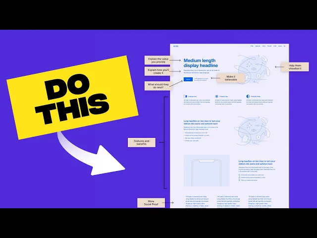
1. Clear Value Proposition Above the Fold
The first thing a visitor sees on your landing page is the "above the fold" section, the area visible without scrolling. This digital real estate is your most valuable asset. Placing a clear, concise, and compelling value proposition here is one of the most critical landing page design best practices because it immediately answers your visitor’s two most important questions: "What is this?" and "What's in it for me?".
Your value proposition isn't a slogan or a list of features; it's a direct promise of the value a customer will receive. It should be the first thing they read, supported by a sub-headline that offers a bit more context. Research consistently shows that you have mere seconds to capture attention before a user decides to leave. A powerful value proposition makes those seconds count, stopping them in their tracks and encouraging them to learn more.
How to Implement It
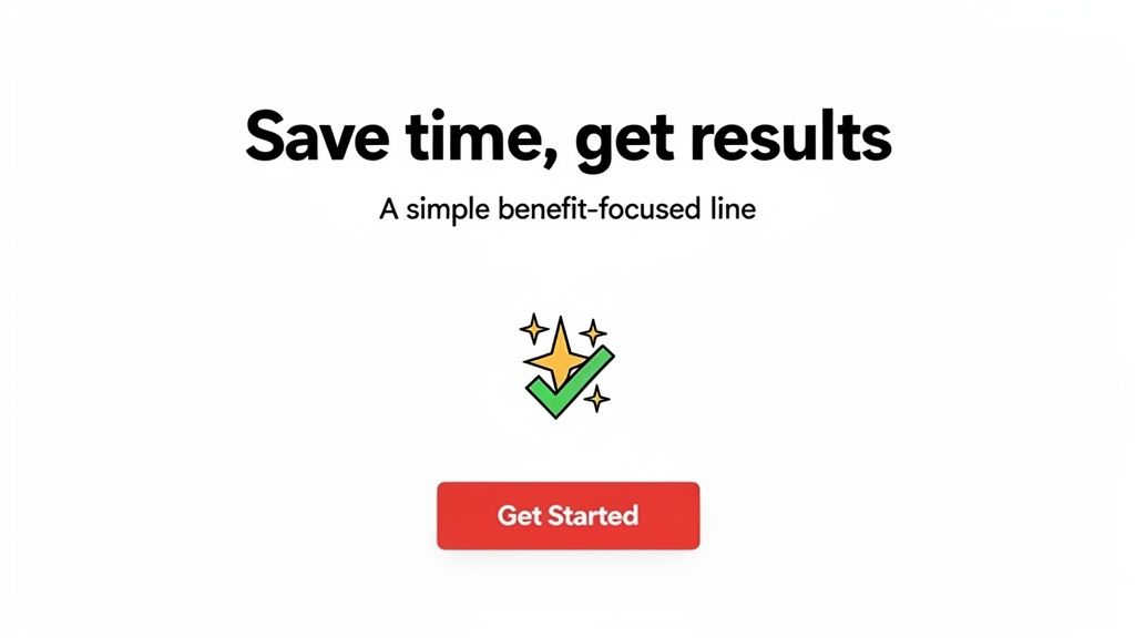
To craft a winning value proposition, focus on outcomes, not mechanics. Instead of saying "Our software uses AI-driven algorithms," say "Automate your reports in 60 seconds." The benefit is clear and immediate.
Headline (The "What"): State the primary benefit in a short, punchy sentence. Figma’s "Where teams design together" is a perfect example.
Sub-headline (The "How"): Briefly explain how you deliver that value or for whom it's intended. Slack supports its famous "Where work happens" with "Slack transforms the way organizations communicate."
Visual Reinforcement: Use a hero image or short video that visually communicates the promised outcome, creating an instant connection.
This upfront clarity is especially vital for new or innovative products where the concept isn't immediately obvious. It sets the stage for the rest of your page and is a foundational element in effective website design for startups. For more insights, explore how a strong value proposition fits into a broader startup website design strategy. By nailing your above-the-fold message, you ensure visitors understand your offer's value right away, drastically increasing the likelihood they will scroll down and convert.
2. Single, Focused Call-to-Action (CTA)
Once you’ve captured a visitor's attention with a strong value proposition, the next step is to guide them toward a single, specific action. Limiting your landing page to one primary Call-to-Action (CTA) is one of the most effective landing page design best practices for boosting conversions. Offering multiple competing options, like "Sign Up," "Learn More," and "Contact Us" all at once, creates decision paralysis and dilutes the visitor's focus, causing them to take no action at all.
A landing page should have one job, and your CTA is the instruction for how to complete it. By removing distractions and presenting a single, clear path forward, you reduce cognitive load and make the desired action obvious and easy. This singular focus aligns the entire page, from the headline to the final button, on achieving one specific goal, whether it's signing up for a trial, downloading a guide, or scheduling a demo. This clarity is a cornerstone of a high-converting design.
How to Implement It
To create a powerful, focused CTA, you must make it visually dominant and verbally compelling. The design should draw the eye, and the copy should create a sense of urgency and benefit. Dropbox, for example, centers its entire homepage around a single "Sign up for free" CTA, leaving no doubt about the next step.
Make it Stand Out: Use a contrasting color for your primary CTA button that makes it pop from the background. It should be impossible to miss.
Use Action-Oriented Copy: Start your CTA text with a verb. Instead of "Submit," use "Get Your Free Ebook" or "Start My Trial." Be specific about what the user will get.
Strategic Placement: Place your CTA at natural stopping points where a visitor might be ready to act, such as after your value proposition and again after a key benefits section.
Mobile-First Design: Ensure your CTA button is large enough for easy tapping on mobile devices. A minimum size of 44x44 pixels is a widely accepted standard.
While a single primary CTA is key, a less prominent secondary CTA (like a "Watch Demo" link) can be acceptable if it serves a different user intent without competing visually. By channeling user attention to one clear endpoint, you streamline the conversion process and maximize the impact of your page, a critical lesson from experts like the team at Unbounce.
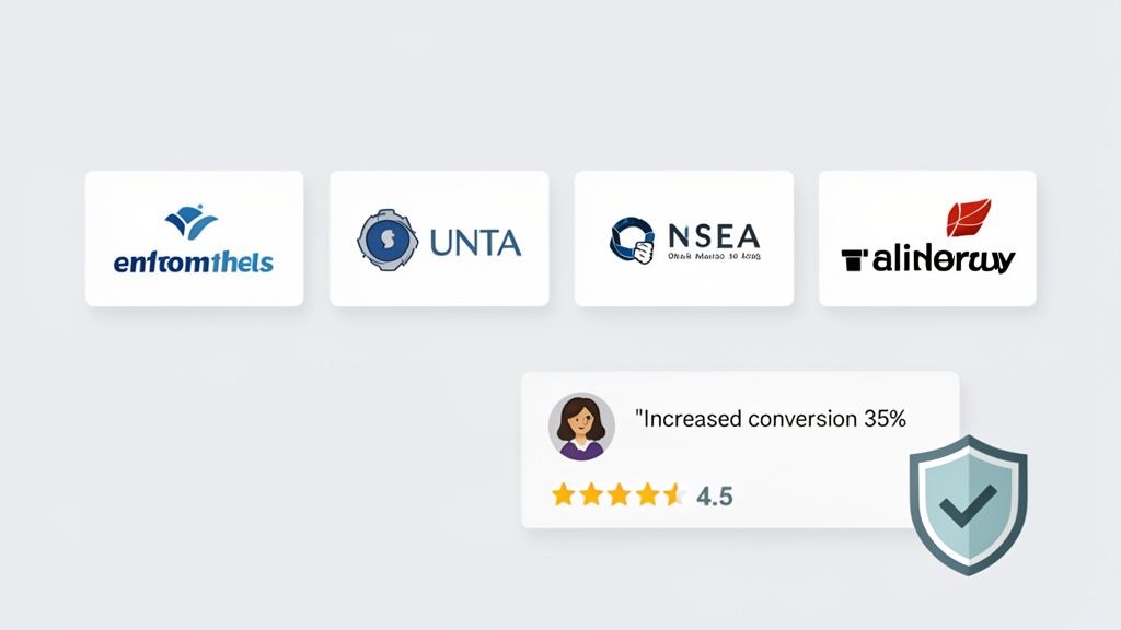
3. Social Proof and Trust Indicators
Before a visitor trusts your product, they need to trust your business. Displaying social proof and other trust indicators is one of the most powerful landing page design best practices because it addresses a fundamental question in your visitor's mind: "Can I trust this?" By showcasing positive experiences from real users and recognized brands, you leverage the psychological principle of social influence, effectively borrowing credibility to build your own.
This strategy is especially crucial for startups and new products trying to gain a foothold in the market. When potential customers see that others have already used and benefited from your offer, it significantly reduces their perceived risk and hesitation. Elements like testimonials, client logos, case studies, and security badges act as powerful endorsements that validate your claims and make the decision to convert feel safer and more reliable.
How to Implement It
To effectively build trust, your social proof must be specific, authentic, and strategically placed. Vague praise is easily dismissed, but concrete results are hard to ignore. For example, Airtable showcases testimonials from well-known brands, while Stripe prominently features security and compliance badges to reassure users about transaction safety.
Use Specific Metrics: Instead of a generic "We love it!", use a testimonial that says "Their tool helped us increase conversions by 35%." Quantifiable results provide concrete evidence of your value.
Showcase Recognizable Logos: Displaying logos of well-known clients, like Slack does with its "Used by 750,000+ teams" section, creates an immediate association with established, trusted entities.
Leverage Video Testimonials: A short video of a happy customer can feel more genuine and engaging than text. This format often leads to higher engagement and builds a stronger emotional connection.
Place Indicators Strategically: Position your strongest social proof, like a key customer logo or a powerful testimonial, near your primary call-to-action button to reduce last-minute friction before a user converts.
By integrating authentic social proof, you transform your landing page from a simple sales pitch into a trusted recommendation. This approach provides the validation many visitors need to move forward, making it an essential component of any high-converting landing page.
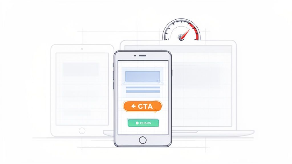
4. Mobile-First, Responsive Design
With the majority of web traffic now coming from mobile devices, treating your desktop design as the default is no longer an option. A mobile-first, responsive approach is a non-negotiable part of modern landing page design best practices. This strategy involves designing for the smallest screen first (your mobile phone) and then scaling up to larger screens like tablets and desktops. This ensures your core message, user flow, and call-to-action remain clear and effective for every visitor, regardless of their device.
This approach forces you to prioritize what truly matters. On a small screen, there's no room for clutter or non-essential elements. By starting with these constraints, you ensure the mobile experience is streamlined and conversion-focused. Popularized by Google’s mobile-first indexing initiative, this method not only improves user experience but also directly impacts your SEO performance, making it a critical consideration for any campaign.
How to Implement It
To adopt a mobile-first mindset, start your design process in a mobile viewport. Focus on vertical rhythm, touch-friendly targets, and content legibility. Companies like Calendly excel at this, offering a mobile scheduling interface that is just as intuitive as its desktop counterpart.
Prioritize Ruthlessly: Identify the single most important action you want a user to take. Place your value proposition and CTA prominently, ensuring they are immediately visible on a mobile screen without any pinching or zooming.
Optimize for Touch: Ensure all buttons, links, and form fields are large enough to be easily tapped with a thumb. Avoid placing interactive elements too close together to prevent accidental clicks.
Compress and Lazy Load: Mobile users are often on slower connections. Aggressively compress images and implement lazy loading for visuals that appear below the fold. This dramatically improves load times and reduces bounce rates.
Test on Real Devices: Browser emulation is helpful, but nothing beats testing on actual iPhones and Android devices. This helps you catch issues with performance, rendering, and interactivity that simulators might miss.
By designing for mobile first, you create a more focused, faster, and user-friendly experience for the largest segment of your audience. This foundation of accessibility and performance ensures your landing page is built to convert across the entire digital landscape.
5. Compelling Visuals and Video
Humans are visual creatures, and a wall of text is one of the fastest ways to lose a visitor's attention. High-quality visuals, graphics, and video content are essential landing page design best practices because they communicate value much faster than words alone. Research shows landing pages with video can see up to 80% higher conversion rates, as they increase engagement and keep visitors on the page longer.
The key is to use visuals that support your value proposition, not just decorate the page. An authentic product demo, a short explainer animation, or a compelling hero image can convey trust and clarity in seconds. Generic stock photos often have the opposite effect, feeling impersonal and cheapening your brand. Visuals should be an integral part of your narrative, guiding the user's eye and reinforcing the benefits you promise.
How to Implement It
Your visuals must serve a purpose: to explain, persuade, or build trust. Instead of a static image of a laptop, show a short, looping video of your software in action, like Loom and Calendly do. This instantly demystifies your product and shows visitors exactly what they're getting.
Choose the Right Format: Use high-quality product screenshots, short animated GIFs explaining a workflow, or a professionally produced explainer video as your hero element.
Keep it Short and Sweet: Hero videos should be 10-30 seconds and auto-play on mute. Longer demo videos should be kept under 2-3 minutes to maintain engagement.
Optimize for Performance: Compress video files to load quickly without sacrificing quality. A slow-loading page will negate any benefits the video might offer.
Prioritize Accessibility: Always include captions for videos. Many users browse with sound off, and it ensures your message is accessible to everyone.
Using compelling visuals is crucial for making complex ideas simple and for building an immediate emotional connection with your audience. By showing your product's value instead of just telling, you create a more engaging and persuasive experience that drives visitors toward conversion.
6. Minimal, Distraction-Free Layout
Every element on your landing page either helps or hurts conversion. A cluttered page with excessive navigation links, competing calls-to-action, and distracting visuals creates decision paralysis, pulling visitors in multiple directions instead of guiding them toward a single goal. Adopting a minimal, distraction-free layout is one of the most effective landing page design best practices because it focuses user attention squarely on your offer and the desired action.
The core principle is simple: remove anything that doesn’t directly contribute to the conversion goal. This intentional simplicity creates a clear, direct path for the user, reducing cognitive load and making it easy for them to understand what you want them to do next. Companies like Basecamp and ConvertKit have built their success on this philosophy, proving that less is often much, much more when it comes to conversion rates.
How to Implement It
To create a focused experience, perform a "distraction audit" on your page. For every element, ask: "Does this help the user convert?" If the answer is no, remove it. This approach prioritizes clarity and function over unnecessary flair.
Remove Main Navigation: Your landing page has one job. A global navigation header with links to "About," "Blog," or "Careers" offers an easy escape route. Hide it completely to keep users on the conversion path.
Embrace Whitespace: Don't crowd your content. Intentional whitespace (the empty space around elements) improves readability and draws the eye to important components like your CTA. Aim for 30-40% of your page to be empty space.
Simplify Your Footer: Just like the header, a busy footer with dozens of links can be a major distraction. Limit it to only the absolute essentials, like links to your privacy policy or terms of service.
This minimalist approach is particularly crucial for campaigns with a very specific call-to-action, such as a webinar signup or an ebook download. By stripping away all non-essential elements, you create an environment where the visitor's next logical step is to convert. This is a core tenet of modern website design for startups, where every visitor is precious. For more on creating focused user journeys, learn how to conduct a UX audit to identify and eliminate these friction points.
7. Fast Page Load Speed and Performance
In the digital world, speed is not just a feature; it's a fundamental requirement. A slow-loading page is one of the fastest ways to lose a potential customer. Fast page load speed is a critical component of landing page design best practices because it directly impacts user experience, bounce rates, conversion rates, and even your SEO rankings. Research has shown that even a one-second delay in page response can result in a 7% reduction in conversions.
Your landing page can have a brilliant design and a compelling offer, but if it takes too long to load, many visitors will never see it. Google’s Core Web Vitals (LCP, FID, CLS) are now direct ranking factors, meaning performance is intrinsically linked to visibility. Prioritizing a lightweight, fast-loading page ensures you don't lose visitors to impatience and sends positive signals to search engines, ultimately improving your reach.
How to Implement It
Achieving optimal performance involves a multi-faceted approach, from optimizing assets to refining your code. Instead of seeing it as a one-time task, treat performance as an ongoing process of monitoring and improvement.
Optimize Your Images: Large, uncompressed images are the most common cause of slow pages. Compress all images using modern formats like WebP and ensure they are no larger than 100KB whenever possible.
Minify and Defer Code: Minify your CSS and JavaScript files to remove unnecessary characters and reduce file size. Defer the loading of non-critical scripts, such as analytics or chatbot widgets, so they don’t block the initial page render.
Leverage Caching and CDNs: Use browser caching to store assets locally for repeat visitors, making subsequent loads much faster. A Content Delivery Network (CDN) like Cloudflare or AWS CloudFront distributes your assets across global servers, reducing latency for users worldwide.
Consistently monitoring your page with tools like Google PageSpeed Insights is essential. A robust technical foundation is key to maintaining speed, and understanding the core principles of a structured build can be very beneficial. For those interested, exploring a streamlined website development process can provide valuable insights into building for performance from the ground up. By making speed a priority, you create a seamless user experience that respects your visitor's time and encourages them to convert.
8. Messaging, Segmentation, and Personalization
Beyond layout and visuals, the words on your page are what ultimately convince a visitor to act. But a one-size-fits-all message rarely connects with everyone. This is where a strategic approach to messaging, segmentation, and personalization becomes one of the most powerful landing page design best practices, allowing you to speak directly to the unique needs of different visitor groups.
Effective messaging isn't just about what you say; it's about the order in which you say it. A strong hierarchy guides the user's thought process, moving from a high-level benefit to specific pain points and solutions. When you combine this with personalization, tailoring content based on the visitor's referral source, role, or previous behavior, your landing page transforms from a static brochure into a dynamic and relevant conversation that drives higher conversions.
How to Implement It
Start by identifying your 2-3 primary audience segments. A marketer visiting from a LinkedIn ad has different pain points than a founder who clicked a link in a VC newsletter. Tailoring your message to each segment makes your solution feel like it was built just for them.
Focus on Benefits, Not Features: Your headline should scream value. Instead of saying "Our software is a messaging platform," Slack says "Where work happens," focusing on the outcome. This benefit-first approach hooks the visitor immediately.
Segment Your Audience: Create distinct landing page variations or use dynamic content for different roles. Airtable, for example, could show a headline like "The Ultimate Project Hub for Founders" to one segment and "Streamline Your Marketing Workflow" to another.
Personalize the User Journey: Use UTM parameters from your ad campaigns to dynamically change headlines, images, and CTAs. If a user clicks an ad targeting "small businesses," your landing page should reflect that language, creating a seamless and highly relevant experience.
This targeted approach ensures your message resonates deeply with each visitor. It proves you understand their specific problems and have the exact solution they need, a crucial step in building trust and compelling them to convert. To see how this fits into a larger strategy, read about HubSpot's buyer persona approach.
9. Form Optimization and Progressive Profiling
The sign-up form is often the biggest point of friction on a landing page. Every additional field you ask a visitor to fill out is another reason for them to abandon the process. This is why form optimization and progressive profiling are essential landing page design best practices. The goal is to make the initial conversion as effortless as possible, reducing the barrier to entry and capturing the lead first.
Research consistently shows that shorter forms convert better. Forms with just 1-3 fields can outperform those with five or more by a significant margin. Progressive profiling builds on this by collecting more detailed information over time, after the initial, low-friction signup. By asking for just an email upfront, you secure the lead, and you can then request more data (like name, company, or role) later in the user journey when they are more invested.
How to Implement It
Your mantra should be: ask only for what is absolutely essential for the next step. If all you need is an email to start a trial or send a newsletter, then only ask for an email. Companies like Slack and Notion master this by presenting a single email field to get users into their ecosystem quickly.
Start with the Minimum: Begin with the fewest fields possible, ideally just one to three. Test your conversion rates, and only add more fields if they are critical and you've measured the impact.
Use Smart Defaults and Validation: Make the process smoother with real-time field validation (e.g., checking for a valid email format as the user types) and auto-populating fields like country based on IP address.
Implement Progressive Profiling: After a user signs up with their email, use subsequent interactions to gather more data. For example, the first time they log in, you can ask for their name and role. HubSpot often uses this technique in its marketing funnels.
Optimize for Mobile: Ensure your form fields are stacked vertically on mobile devices and that input fields and buttons are large enough to be easily tapped.
By treating the form as a delicate, high-impact conversion point, you can dramatically increase your lead capture rates. This approach respects the user's time and builds trust by asking for information incrementally, which is a cornerstone of modern, user-centric website design.
10. Continuous Testing and Data-Driven Optimization
Even a perfectly designed landing page is just a well-informed hypothesis. The only way to know what truly works is to test it. This is why continuous testing is one of the most powerful landing page design best practices; it transforms your page from a static asset into a dynamic, conversion-generating machine. Instead of relying on intuition or trends, this approach uses real user data to make incremental improvements that compound over time.
Successful landing pages are never truly 'finished'. They evolve through iterative cycles of testing and optimization. Companies like Slack and Figma constantly A/B test headlines, calls-to-action, and layouts to refine their messaging and boost sign-ups. This commitment to data-driven decision-making separates high-performing pages from those that stagnate, ensuring your design choices are based on evidence, not guesswork.
How to Implement It
Getting started with optimization means establishing a baseline. Before you change anything, document your current conversion rate, bounce rate, and average time on page. This baseline will be the benchmark against which you measure all future tests. To further enhance your optimization efforts by delving into these 9 conversion rate optimization best practices, you can build a more robust framework.
Test One Variable at a Time: To get clear results, isolate your tests. Test your headline first, then your hero image, then your CTA button color. Changing multiple elements at once makes it impossible to know what caused the change in performance.
Use the Right Tools: Tools like Google Optimize (now part of Google Analytics 4), Optimizely, or VWO make setting up A/B and multivariate tests straightforward. For qualitative insights, use heatmaps from tools like Hotjar to see where users click and how far they scroll.
Be Patient and Document Everything: A test needs sufficient data to be statistically significant. Aim for at least two weeks or a few hundred conversions before declaring a winner. Keep a detailed log of every test you run, including your hypothesis, the results, and what you learned.
This disciplined process of hypothesizing, testing, and learning is the engine of conversion rate optimization. For those looking to implement this on their own sites, you can learn more by exploring a guide to simple A/B testing for Framer. By embracing a culture of continuous improvement, you ensure your landing page consistently performs at its peak.
Top 10 Landing Page Best Practices Comparison
Item | Implementation Complexity | Resource Requirements | Expected Outcomes | Ideal Use Cases | Key Advantages |
|---|---|---|---|---|---|
Clear Value Proposition Above the Fold | Low–Medium — copy + layout changes, iterative testing | Copywriter, designer, A/B testing tools | Lower bounce, clearer CTA intent, more qualified leads | Conversion-focused landing pages, startups, SaaS homepages | Immediate clarity; faster visitor understanding |
Single, Focused Call-to-Action (CTA) | Low — design and copy adjustments | Design, UX, analytics for tracking | Higher conversion rates, simpler funnel | Signup, trial, demo campaigns, focused offers | Reduces cognitive load; easier to optimize |
Social Proof and Trust Indicators | Medium — content collection and placement | Customer outreach, legal permissions, design | Increased credibility and conversions | B2B, SaaS, purchase decisions, trust-building pages | Builds trust quickly; reduces buyer skepticism |
Mobile-First, Responsive Design | Medium–High — design + dev + QA across devices | Frontend engineering, device testing, performance work | Better mobile engagement, improved SEO, lower mobile bounce | Mobile-heavy audiences, broad consumer reach, SEO-focused sites | Consistent UX across devices; prioritized content |
Compelling Visuals and Video | Medium–High — production and integration effort | Video production, design, compression/hosting | Higher engagement and time-on-page; boosts conversions if optimized | Product demos, complex features, brand storytelling | Communicates quickly; increases engagement and authenticity |
Minimal, Distraction-Free Layout | Low–Medium — design discipline and content prioritization | Designer, copywriter, simple UX testing | Higher focus on CTA, faster page loads, improved conversions | Single-goal landing pages, webinars, signups | Reduces cognitive load; clearer user path |
Fast Page Load Speed and Performance | High — technical optimization and monitoring | Engineers, CDN, performance tools, testing infrastructure | Improved conversions, SEO rankings, lower bounce | High-traffic sites, global audiences, mobile-first campaigns | Directly boosts conversions and search performance |
Messaging, Segmentation, and Personalization | High — content strategy plus data/tech setup | Content team, analytics, personalization tooling | Significant conversion lift through relevance | Multi-persona campaigns, paid channels, ABM | Increases relevance and ROI per segment |
Form Optimization and Progressive Profiling | Medium — UX tweaks plus backend support | Form UX, backend for progressive profiling, validation logic | Higher form completion rates, improved lead data quality | Lead gen, SaaS trials, demo signups | Higher conversions with better-quality leads over time |
Continuous Testing and Data-Driven Optimization | High — ongoing experiments and analysis | A/B testing tools, analysts, heatmaps, user testing | Iterative conversion improvements, validated insights | Growth teams, CRO programs, mature marketing stacks | Eliminates guesswork; delivers compounding gains |
Your Next Step: Building a Landing Page That Works
You've made it through the essential toolkit of landing page design best practices, from nailing your value proposition to the ongoing discipline of A/B testing. The journey from a simple idea to a high-converting landing page isn't about finding a single magic bullet. Instead, it’s about the systematic application of proven principles: prioritizing user needs, removing friction, and making a compelling, trustworthy case for your offer.
A powerful landing page is more than just a collection of well-designed elements. It’s a finely tuned engine for conversion, where every component works in harmony. Your headline grabs attention, your visuals build desire, your copy builds trust, and your call-to-action provides the clear, final step. When these pieces align, the result is a seamless user experience that guides visitors toward a single, valuable goal.
From Knowledge to Action: Your Implementation Blueprint
Knowing these principles is one thing; putting them into practice is another. The difference between an average landing page and a great one lies in execution. Don't let this comprehensive list overwhelm you. Instead, view it as a strategic checklist to guide your efforts.
Start by auditing your existing pages against these core tenets:
Clarity First: Does a first-time visitor understand what you offer, who it's for, and what to do next within five seconds? If not, start with your headline and value proposition. This is the foundation everything else is built on.
The Power of One: Identify the single most important action you want a user to take. Is your entire page, from copy to design, laser-focused on driving that one action? Eliminate every link, button, and sentence that distracts from that goal.
Trust as a Currency: Scan your page for trust signals. Are your testimonials specific and credible? Is your privacy policy easy to find? Do you have logos of well-known clients or partners? Building confidence is non-negotiable for securing conversions.
Performance is Paramount: Test your page speed. A slow-loading page is one of the biggest and most preventable conversion killers. Optimizing images and leveraging modern web technologies isn't just a technical task; it's a critical part of the user experience.
Embracing the Mindset of Continuous Improvement
The most crucial takeaway from this guide is that a landing page is never truly "finished." The digital landscape, customer expectations, and your own business goals are constantly evolving. The highest-performing teams treat their landing pages not as static documents, but as dynamic tools that are continuously refined through data.
Embrace a culture of testing. Start with small, manageable A/B tests. Change a headline. Test a new button color. Swap out a hero image. Each test, whether it "wins" or "loses," provides an invaluable insight into your audience's behavior. This iterative process is the engine of sustainable growth and the core of mastering landing page design best practices. By consistently listening to what your data is telling you, you move from guesswork to a predictable system for turning visitor traffic into tangible business results. Your next successful campaign starts with the deliberate, strategic choices you make today.
If your team needs to implement these best practices to ship high-quality websites that convert without the overhead, Shalev Agency can help. We combine research-backed UX and pragmatic engineering to help startups and marketing teams build landing pages that achieve measurable results, faster. Learn more about how we can accelerate your growth at Shalev Agency.