Discover a practical guide on website design for startups that converts visitors into customers and accelerates growth.
Jan 11, 2026

Forget the old idea of a website being a "digital storefront." For a startup, your website has to be a lean, powerful machine built for one thing: turning visitors into believers. This is exactly where most founders go wrong. They build a digital brochure when what they really need is a growth engine.
Why Most Startup Websites Never Take Off
Too many founders treat their website as just another line item on a launch checklist—a necessary expense to get out of the way. That mindset is the single biggest reason they fail.
Instead of a strategic asset, the site becomes a static collection of pages that talks at potential customers instead of with them. The result? A beautiful but useless website that burns cash without bringing in a single lead, signup, or sale.
This mistake almost always leads to a costly redesign down the road, not to mention all the missed opportunities that can seriously hurt an early-stage company. A strategically built website, on the other hand, is your best tool for validating your idea, getting your first users, and showing investors the traction they need to see.
From Cost Center to Growth Engine
When you start thinking of your website as a growth engine, everything changes. It forces you to prioritize what works over what looks cool, and what users need over what the internal team thinks they want. This isn't just about pretty pictures; it’s about building a credible, trustworthy online presence from the moment you launch.
Let's look at the numbers. A professional website can cost anywhere from $6,500 to $15,000, with another $1,200 or so for annual upkeep. That feels like a lot, I know. But consider this: a staggering 75% of users judge a company's credibility based on its website design.
That initial investment stops you from losing the trust of three out of every four people who land on your site. You can dig into the data yourself in this insightful report on web design statistics.
A startup website isn't a digital business card. It's your first salesperson, your primary market research tool, and your most persistent investor pitch. It works 24/7 to prove your concept and win over your earliest adopters.
The Conversion Killers I See All the Time
So, what are the common traps that absolutely tank a website's conversion rate? I've seen these trip up founders again and again:
A fuzzy value proposition. If a visitor can't figure out what you do and why it matters in five seconds, they're gone.
Ignoring the user's path. The site is built around the company's org chart, not the customer's actual journey to solving their problem.
No clear call-to-action (CTA). Visitors are left hanging. They have no idea what to do next, whether that's signing up, buying, or just learning more.
A terrible mobile experience. The site is basically broken on a smartphone, instantly alienating a massive chunk of your audience.
By putting conversions first from day one, you’re not just building a pretty placeholder online. You're building the foundation for real, sustainable growth.
Laying the Groundwork: Strategy Before Pixels
It’s so tempting to jump right into Figma and start designing. But I’ve seen it time and time again: jumping the gun is the fastest way to build a beautiful website that completely misses the mark. The best startup websites aren't built on aesthetics alone; they’re built on a rock-solid strategic foundation.
This initial phase is all about asking the hard questions upfront to save yourself from costly re-dos down the road. Who is this really for? What’s the one critical problem we solve for them? And how do we prove we’re the only logical choice in a sea of competitors?
Think of it this way: you’re shifting from a static brochure to a dynamic growth engine.
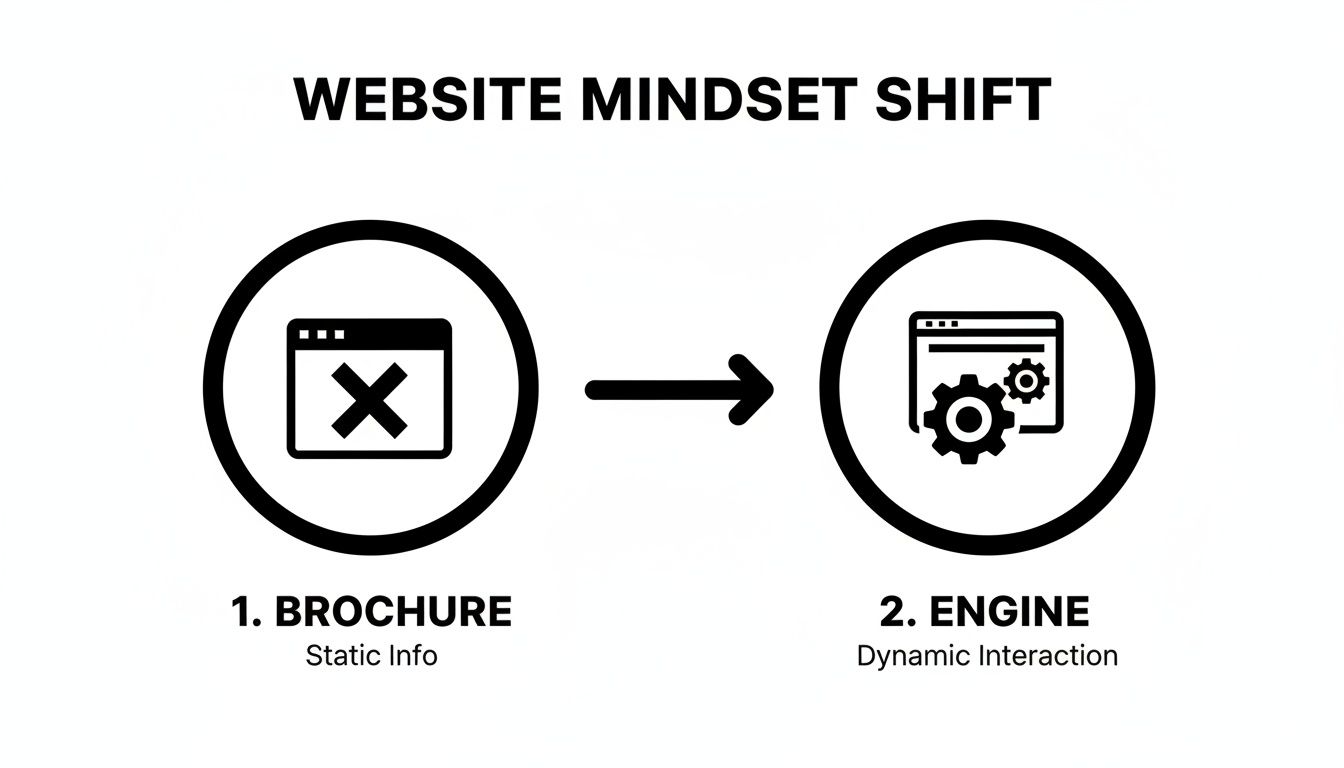
This isn’t just a new coat of paint; it’s a fundamental change in how your website works for your business. It moves from being a passive information hub to an active, results-driven machine.
Nail Your Ideal Customer Profile
Forget vague personas like "Marketing Mary." If you want a website that actually converts, you need a laser-focused Ideal Customer Profile (ICP). This goes way beyond basic demographics. We're talking about psychographics—the deep-seated pains, motivations, and goals that drive your absolute best customer.
Instead of guessing, get granular. Ask yourself:
What's their real problem? What's the nagging issue that keeps them up at night, which your product directly solves?
What's their "job to be done"? What specific outcome are they trying to achieve by hiring a solution like yours?
Where do they live online? Are they on LinkedIn, Reddit, specific Slack communities? Where do they go for trusted advice?
What does their buying process look like? Who else needs to sign off on the purchase, and what proof do they need to see?
A sharp ICP becomes your north star. Every piece of copy, every image, and every feature you decide to highlight should be aimed directly at this person.
Map the User's Journey
Once you know who you're talking to, you have to understand the path they take to find you. A user journey map is simply a visual story of their experience, from the moment they realize they have a problem to the point where they become a happy, paying customer.
Your website’s job is to meet people exactly where they are in their journey and make the next step completely obvious. Don't make them think. Just guide them.
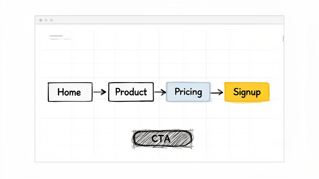
As a startup, you don't need a sprawling, 50-step map. Just focus on the key moments. For example, a potential customer might search Google, land on your blog, click through to the homepage, check out your pricing, and then finally book a demo. Each of those touchpoints requires different information and a different call-to-action to keep them moving forward.
Scope Out the Competition to Find Your Angle
Your competitors have already done a lot of the heavy lifting for you. Their websites are a goldmine of intel on what works—and what definitely doesn’t—in your space. Don't just glance at their color scheme; dig into their entire strategy.
Positioning & Messaging: How are they framing their value? Are there weaknesses or gaps in their story that you can pounce on?
User Flow: Trace the path from their homepage to conversion. Where does it feel clunky or confusing? You can do better there.
Content Strategy: What topics are they owning? What questions are they answering that you could answer more thoroughly or with a fresh perspective?
The goal isn't to copy anyone. It's about understanding the existing conversation so you can enter it with a point of view that’s impossible to ignore. Seeing how others have tackled this can spark incredible ideas. For a little inspiration, feel free to check out some of our past website design and development projects to see how strategy translates into a final product.
By locking in your ICP, mapping the user journey, and finding your competitive edge, you’ll have a powerful strategic brief. This document is the blueprint for a website that doesn't just look good—it's engineered from day one to attract and convert the right customers for your startup.
3. Map Out Your Website's Blueprint for Conversion
Now that you've nailed down your strategy, it’s time to turn those ideas into an actual plan for your website. This is where we stop thinking about the 'why' and start sketching out the 'how'. We’re mapping out how a real person will click through your site, from the moment they land on your homepage to the second they sign up.
This all comes down to information architecture (IA). It sounds technical, but it’s really just about organizing your website in a way that makes perfect sense to a visitor.
Think of it like this: you wouldn't stock milk in the hardware aisle of a grocery store. Your website is no different. Every page and link should guide users intuitively from their first impression ("What does this do?") to the final action ("I need this now.").
Getting this structure right before you even think about colors or fonts is critical. It ensures your site is built on a solid foundation of clarity and purpose, making it feel effortless to use.
Start with a Simple Sitemap
First things first, sketch out a sitemap. No, not the complicated XML file for Google—this is a simple, visual outline of your site's pages and how they link together. It’s your navigation cheat sheet.
For an early-stage startup, less is more. You don't need a sprawling, 50-page website.
Just focus on the essentials:
Homepage: Your digital storefront. It has to grab attention and explain your value in seconds.
Product/Service Pages: The deep dive. This is where you show how your solution solves their problem.
Pricing: The bottom line. Be clear and upfront to build trust.
About Us: The human element. Tell your story and show the people behind the product.
Contact/Demo: The next step. Make it ridiculously easy for them to get in touch.
This basic structure will serve 90% of your ideal customers perfectly. By keeping it lean, you eliminate confusion and guide people straight to what they're looking for.
From Sitemap to Wireframes
With your pages defined, the next move is to create low-fidelity wireframes. These are the super-simple, black-and-white sketches of your main pages. Think of them as the architectural blueprints—no design, no branding, just boxes and lines showing where everything goes.
The entire point of wireframing is to focus on function without getting distracted by looks. It forces you to answer the tough questions upfront:
Hierarchy: What's the single most important thing on this page? Make it the biggest and boldest.
Layout: How do we arrange the content to pull the user's eye down toward the call-to-action?
Functionality: Where should the buttons, forms, and menus go so they're impossible to miss?
A wireframe is a silent conversation with your user. Every element should anticipate their questions and guide them to the next logical step. You're solving their needs before they even have to think about them.
Think About How People Actually Read a Page
The way you arrange elements on a page can make or break a conversion. A cluttered or confusing layout creates friction and sends people running for the 'back' button. Smart website design for startups uses a bit of psychology to create a smooth, intuitive experience.
Ever heard of the F-Pattern? Research shows that people tend to scan websites in a shape that looks like the letter 'F'. They read across the top, scan down the left side, and then dart across again on subheadings that catch their interest.
Knowing this, you can place your most important content—your killer headline, key benefits, and call-to-action—directly in that path.
Whitespace is also your best friend. Giving your text and images room to breathe makes your content feel less overwhelming and easier to digest. It helps focus the visitor's attention, guiding them from your headline, to your customer testimonials, and right to that big "Get Started" button. This isn't just design; it's a carefully crafted journey.
Choosing A Tech Stack That Fuels Speed And Scale
Picking the right technology for your startup website is a huge decision. It’s not about finding the coolest new tool on the block. It’s about laying a foundation that lets you get to market fast, change things on the fly without a headache, and grow without hitting a technical wall.
For founders who aren't developers, the options can feel endless and frankly, confusing. You'll hear jargon like CMS, static site, and headless, but it all boils down to one simple question: What will get the job done now without trapping us later?
The real goal is to hit that sweet spot between speed, cost, and flexibility. A platform that takes six months to build might work for a massive corporation, but it’s a death sentence for a startup that needs to prove its concept today.
Your Core Options, Demystified
Let's cut through the noise and look at the main ways you can build your site. Each one has its place, depending on your team's skills, budget, and where you see the company going.
No-Code Website Builders: Tools like Webflow, Framer, and Squarespace are lifesavers for startups. They give you a visual canvas to build a beautiful, custom site without touching code. They’re perfect for marketing sites and landing pages where design and quick updates are everything.
Traditional CMS: WordPress runs a massive chunk of the internet, and for good reason. It’s a workhorse. With countless plugins and themes, you can make it do almost anything. The trade-off? It can be more complex to manage and requires ongoing maintenance to keep it secure and running fast.
Headless CMS: This is a more modern approach using platforms like Sanity or Contentful. It separates your content (the "back-end") from the design (the "front-end"). This gives developers total freedom to build a blazing-fast, custom experience while letting your marketing team easily update content. It’s powerful and scalable but definitely requires a developer to set up.
To dig deeper into which no-code tool might be right for you, check out this excellent Framer vs Webflow comparison guide.
Startup Website Tech Stack Comparison
To make this even clearer, here's a quick breakdown of how these platforms stack up against each other based on what typically matters most to a new venture.
Platform Type | Best For | Initial Cost | Scalability | Technical Skill Needed |
|---|---|---|---|---|
No-Code Builder | Marketing sites, landing pages, MVPs | Low-Medium | Medium | Low (Visual) |
Traditional CMS | Content-heavy sites, blogs | Low-Medium | High | Medium |
Headless CMS | Custom web apps, scaling tech startups | Medium-High | Very High | High (Developer Required) |
Static Site Generator | Performance-critical sites, portfolios | Low | High | High (Developer Required) |
Ultimately, there's no single "best" choice—only the best choice for your specific stage and goals.
Making The Right Call For Your Stage
The best tech stack is a moving target; it changes as your startup evolves. A pre-seed company has entirely different needs than one raising a Series A.
The right technology is the one that allows you to test your core assumptions with the least amount of time and money. Don't build for a ten-year vision on day one; build for the next six months of learning.
Think about which of these scenarios sounds most like you:
You're pre-product and just validating an idea. Speed is everything. A no-code builder like Webflow or Squarespace is your best friend. You can get a slick landing page live in a weekend to start collecting emails and testing your message.
You have early traction and a small team. A powerful no-code tool like Webflow or a well-managed WordPress site is a great fit here. They empower your marketing folks to own the website—publishing content and running A/B tests without needing a developer for every little change.
You're scaling fast and need custom features. This is where a Headless CMS or a completely custom solution starts to make sense. If your website needs to pull in user data from your product or handle complex integrations, the flexibility of a headless architecture is a massive win.
The good news is that the web design industry is booming, which helps startups get things done faster. As of 2025, there are nearly 890,000 web designers employed in the US, and that's expected to grow to over 229,000 specialized roles by 2032.
Plus, with 93% of web designers now using AI in their workflows, you can partner with agencies and freelancers who can deliver high-quality work on an accelerated timeline. You can read more about these website design trends.
At the end of the day, the best website design for startups is built on technology that serves the business, not the other way around. Pick the simplest tool that gets you to your next milestone, and don't be afraid to switch later. That's how you stay focused on what really matters: building a business customers love.
Designing an Experience That Builds Instant Trust
With your site's blueprint and tech stack sorted, it’s time to get into the fun part: the visual design. This is where you turn a functional website into an experience that builds immediate credibility. We’re not talking about winning design awards here; effective website design for startups is all about making a visitor feel confident they’ve landed in the right place.
We'll zero in on the small but mighty details that signal professionalism and gently guide users toward taking that next, all-important step. These core User Experience (UX) and User Interface (UI) principles are what separate a site that feels cobbled together from one that inspires trust from the first click.
Establish a Simple and Consistent Brand Identity
Think of your brand identity as your startup's visual language. Consistency isn't just a nice-to-have; it's the bedrock of recognition and trust. You don't need a hundred-page brand book to start—just nail down a few core elements and use them everywhere.
Color Palette: Keep it simple. Stick to two or three primary colors. Use one for your main calls-to-action (like "Sign Up" buttons), another for headlines, and a neutral for body text. This approach instantly creates a clean, intuitive visual hierarchy.
Typography: Pick two fonts, maximum. One for headings and one for paragraphs is a classic, effective combo. Google Fonts has a massive library of free, web-safe options that are easy to work with. Above all, prioritize readability.
Voice and Tone: Is your brand professional and serious? Playful and witty? Technical and direct? Settle on a voice and make sure it echoes in every word on your site, from the homepage headline to the 404 error page.
This consistency reassures users they’re dealing with a professional company, not just a side project.
Write Microcopy That Reduces Friction
Microcopy refers to those tiny bits of text on your site that guide users along—the words on buttons, in forms, and under input fields. Don't underestimate them. While small, this text has a massive impact on the user experience and, ultimately, your conversion rates.
Bad microcopy creates confusion and friction. Great microcopy makes tasks feel simple and obvious.
For instance, instead of a generic "Submit" button on a contact form, why not try "Get Your Free Demo"? It clarifies the outcome and aligns with what the user actually wants. Or, try adding a little note like "We'll never share your email" right below an email field. That small reassurance can dissolve anxiety and boost signups.
Think of microcopy as the friendly guide holding your user's hand through your website. Its job is to anticipate questions, clarify actions, and make the entire process feel smooth and intuitive.
Design Calls to Action That Are Impossible to Ignore
Your Call-to-Action (CTA) buttons are arguably the most important elements on your entire site. They are the gateways to conversion, so you absolutely cannot afford for them to blend in. A great CTA is a perfect mix of compelling copy, smart placement, and visual pop.
Here’s a quick checklist for creating powerful CTAs:
Use a Contrasting Color: Your main CTA button should be the most vibrant, eye-catching color on the page. It needs to stand out.
Write Action-Oriented Text: Always start with a verb. "Start Your Free Trial" is so much stronger and more compelling than just "Free Trial."
Create Ample Whitespace: Give your buttons room to breathe. Crowding them with other elements just diminishes their importance.
Looking at how established companies design their CTAs is a great way to find inspiration. You can see powerful examples of this by reviewing a portfolio of successful IT and SaaS website projects at https://shalev.agency/work/it-saas, where clarity is always king.
Finally, remember that trust-building extends beyond your website. How your site appears when shared on social media is crucial. Using solid Open Graph template tips ensures your social previews look professional and enticing, driving more of the right people to your site. By focusing on these core design principles, you’ll create an experience that doesn’t just look good—it actively builds the trust needed to turn a curious visitor into a loyal customer.
Launch, Learn, and Iterate for Growth
Getting your startup website live is a massive milestone, but it's really just the starting line. The best startup websites are never actually "finished." Think of your site as a living, breathing asset that gets smarter over time, evolving based on real user behavior to drive growth.
This requires a big mental shift: from a launch-and-forget mentality to a continuous cycle of launching, learning, and iterating. This is how you turn your website from a static digital brochure into a powerful, compounding engine for your business.
Before you pop the champagne, let's run through a few final checks.
Your Pre-Launch Final Checks
Don't let a simple, avoidable mistake trip you up right at the finish line. Before you tell the world your site is live, quickly tick these boxes.
Google Analytics 4 Setup: Is your Google Analytics 4 tag installed and firing correctly? Make sure you’re tracking crucial events from day one—things like button clicks, form submissions, and key page views. This data is the raw material for every improvement you'll make later.
On-Page SEO Basics: Give every page a quick once-over. Does each one have a unique, descriptive title tag and a compelling meta description? Are your main headlines wrapped in H1 tags? These little details are huge signals to search engines.
Performance and Speed: Run your site through Google's PageSpeed Insights. A site that loads in under 3 seconds can dramatically reduce bounce rates. Look for easy wins like compressing images or deferring non-critical scripts.
The goal of a launch isn't perfection. It's about getting a functional, measurable MVP into the hands of real users as fast as you can. The real work begins the moment you start collecting data.
Building Your Iterative Roadmap
Once your site is live and analytics are trickling in, you can finally start figuring out what’s working and what isn't. Your first batch of data will show you which pages get the most traffic, where people are dropping off in the user journey, and which of your calls-to-action are being completely ignored.
This is where you put on your detective hat. Use the data to form educated guesses, or hypotheses. For example: "I believe changing the headline on the homepage will increase demo requests because the current one doesn't clearly state the benefit."
This is the perfect time to start testing your ideas. You can learn more about how to set up simple A/B testing for Framer and apply the same core principles no matter your platform.
From there, build a simple, prioritized backlog of improvements. It doesn’t have to be fancy—a Trello board or a Notion doc works perfectly. Start with small, high-impact changes, like tweaking the text on a CTA button or rewriting a confusing paragraph. This simple loop—analyze, hypothesize, test, and repeat—is the secret sauce for building a website that actually moves the needle for your business.
Common Questions Founders Ask About Building a Website
Let's cut through the noise. When you're building a startup, you have a million questions, and website design is a big one. Here are some straight answers to the questions I hear most often from founders.
What's a Realistic Website Budget for a Startup?
This is the classic "it depends" question, but I can give you some real-world numbers.
If you're just starting out and cobbling things together, you could use a DIY site builder for under $50 a month. It gets you online, but that's about it. A more realistic starting point is hiring a good freelancer, which will likely run you anywhere from $3,000 to $10,000 for a solid, foundational website.
When you're ready to get serious about conversions and user experience, you'll want to partner with a specialized agency. These projects typically start in the $10,000 range and can go up to $50,000+ depending on how complex your needs are—think custom features, deep content strategy, and advanced integrations. The trick is to stop thinking of it as a cost and start seeing it as an investment in your single most important sales tool.
What Are the Absolute Must-Have Pages?
It's tempting to build a massive site right out of the gate, but that’s a rookie mistake. For your first version—your MVP website—keep it lean and focused. You really only need these five pages:
Homepage: Can a visitor understand what you do in five seconds? This is your one job here.
About Page: People buy from people. Tell your story, show your face, and build some trust.
Product/Service Page(s): Get specific. What is it, who is it for, and what problem does it solve?
Pricing Page: Be clear and upfront. Confusion here will cost you customers.
Contact/Demo Page: Make it incredibly easy for interested people to take the next step.
Start with these. You can—and should—add more pages later, but only after you have real user feedback telling you what's missing.
I see founders overbuild all the time. A sharp, five-page site that actually converts is worth a hundred times more than a bloated 50-page site that just confuses everyone. Nail the basics first, then expand.
Should We Use a Template or Go for a Custom Design?
There’s a time and a place for both.
If you're in the very early stages—maybe you’re pre-seed and still validating your core idea—a well-chosen template is a perfectly smart move. It's fast, it's cheap, and it gets you in the game.
But the moment you start getting traction and have a clear sense of your product-market fit, it’s time to invest in a custom design. A custom site isn’t just about looking unique; it’s about strategically guiding your specific users toward a specific goal. It’s built around your business, not a generic mold, and that almost always leads to better conversion rates and a brand that people take seriously.
At Shalev Agency, we live and breathe this stuff. We partner with startups to build polished, high-converting websites that actually move the needle on growth. If you want a team that can help you ship a better website, faster, let's talk. You can see how we work at https://shalev.agency.