Learn practical steps in ux design for startups to validate ideas, prototype fast, and scale confidently.
Jan 11, 2026

For startups, UX design isn't a luxury—it's a survival strategy. It’s the engine that makes your product intuitive, efficient, and genuinely enjoyable to use. Get it right, and you’ll attract and keep those crucial early customers. Get it wrong, and even the most brilliant idea will fall flat.
Ultimately, great UX is what turns a curious visitor into a loyal fan and is one of the clearest signs you're on your way to product-market fit.
Why Smart UX Is a Startup’s Secret Weapon
Let’s be honest: most startups don't make it. A killer idea or elegant code simply isn't enough in today's crowded market. Often, the real difference between a product that fizzles out and one that takes off is the user experience.
Think of UX design as your competitive edge. It’s the secret weapon that shapes everything from a user's first impression to their long-term loyalty.
When every dollar and every hour counts, UX isn't about making things look pretty; it's a core business function. It acts as the bridge connecting your product's features to the real-world problems your customers are trying to solve. A clunky, confusing interface will send potential users straight to your competitors, no matter how innovative your tech is.
The Tangible Business Impact of Great UX
Putting money and effort into UX from day one delivers real, measurable returns that both founders and investors love to see. This isn't some fuzzy concept—it directly moves the needle on your most important metrics.
The numbers are pretty staggering. Design-driven companies have been shown to outperform the S&P Index by 228% over 10 years. Even better, some studies show that every dollar invested in UX can bring back up to $100 in return.
Here's a quick look at some of the critical metrics that are directly influenced by a commitment to UX.
Key Startup Metrics Directly Influenced by UX Design
Metric | Impact of Strong UX | Why It Matters for Startups |
|---|---|---|
Conversion Rate | A seamless onboarding and clear calls-to-action drive more sign-ups, trials, and sales. | This is your first validation. It proves people are willing to take the next step. |
Customer Retention & Churn | An intuitive, enjoyable product makes users want to stick around, drastically reducing churn. | Acquiring a new customer is far more expensive than keeping an existing one. High retention is the key to sustainable growth. |
Customer Lifetime Value (LTV) | Happy users stay longer, upgrade more often, and become more valuable over time. | A high LTV gives you more capital to reinvest in growth and proves your business model is sound. |
Customer Acquisition Cost (CAC) | Word-of-mouth from delighted users creates a powerful, low-cost acquisition channel. | Lowering your CAC means your marketing dollars go further, accelerating your path to profitability. |
Support Costs | A well-designed product anticipates user needs and minimizes confusion, leading to fewer support tickets. | This saves money and frees up your small team to focus on building the product, not just troubleshooting it. |
As you can see, investing in UX isn't just a design decision; it's a strategic business move that pays dividends across the board.
For a startup, good UX is the most efficient form of marketing. A product that users love sells itself through word-of-mouth, creating organic growth that paid ads can't replicate.
This user-first mindset is critical throughout the entire product journey. You can see how these principles are applied from concept to launch in this complete guide to mobile app development for startups.
At the end of the day, UX is about de-risking your entire venture. It helps ensure you're building something people actually want, will enjoy using, and will happily pay for. For more on this, you can also explore our guide on website design for startups.
Running Lean Research Without Wasting Time
Let’s be honest—user insights are the lifeblood of a startup, but traditional research can feel painfully slow. The good news? You don’t need a massive budget or months of formal studies to figure out what your users actually want. Lean research is all about being scrappy, fast, and focused on getting just enough information to make the next right decision.
This isn’t about generating exhaustive reports that no one reads. It’s about creating a quick, continuous learning loop that feeds directly back into your product strategy. For a startup, this is a survival tactic. It’s how you avoid the catastrophic mistake of building something nobody needs, and it keeps you from burning through your runway on a bad bet.
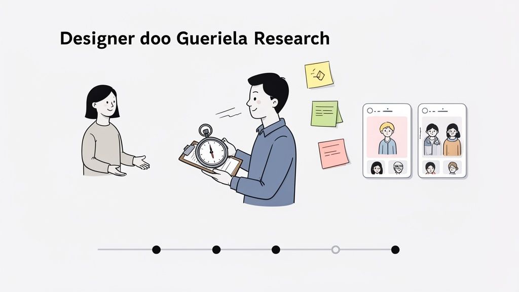
Uncovering Insights with Guerrilla Tactics
Forget sterile lab settings and tedious recruitment processes. Guerrilla research means getting out of the building (or just off Slack) and talking to real people where they are. It's fast, cheap, and shockingly effective.
Say you’re building a new project management tool for freelancers. Instead of drafting a formal survey, just head over to a local co-working space. Offer to buy someone a coffee in exchange for 5 minutes of their time to get their gut reaction to a wireframe on your laptop. That raw, first-impression feedback is pure gold.
A few of my favorite low-cost methods include:
Coffee Shop Testing: Seriously, just show your prototype to a handful of people at a cafe. You’ll get immediate, unfiltered thoughts you’d never find otherwise.
Social Media Polls: Use Instagram Stories or LinkedIn polls to quickly test a feature name, a design preference, or a value proposition. It’s a great way to tap into your target audience for free.
Support Ticket Mining: Your existing customer support inbox is a goldmine of pain points. Look for patterns in complaints and frustrations—that's your roadmap for what to fix next.
These small, consistent efforts add up fast, helping you build a rich understanding of your users without the overhead of a formal research department.
Crafting Proto-Personas from What You Know
Deeply researched user personas are great, but most startups simply don't have the data for them yet. That’s okay. Start with proto-personas instead. These are lightweight, assumption-based sketches of your target users, built from whatever information you do have.
Get your founding team in a room with a whiteboard. Based on your early conversations, competitor analysis, and gut feelings, map out your ideal customer. What are their goals? What drives them crazy? What are their biggest frustrations?
A proto-persona isn't a sacred document; it's a hypothesis about who your user is. Its real job is to get everyone on the same page and give you a target to either prove or disprove with your research.
Every user interview and feedback session from there on out helps you refine that initial sketch. You might discover that the "tech-savvy project manager" you envisioned is actually a less-technical small business owner. That single insight could completely change your design priorities.
Mapping the Journey to Find the Pain
A customer journey map sounds complex, but it's really just a visual story of how a user experiences your product (or a competitor's). For a startup, a simple version of this map is the fastest way to pinpoint the exact moments where users get stuck, frustrated, or just give up.
Don't overcomplicate it. Start with a basic timeline of the key stages a user moves through, from discovering your solution to getting value from it.
For instance, for a meal-planning app, the journey might be:
Awareness: User thinks, "I'm so tired of deciding what to cook every night."
Consideration: They search online for "easy meal prep apps."
Onboarding: They download your app and set up an account.
Activation: They create their first weekly meal plan.
Ongoing Use: They generate a shopping list and actually cook a recipe.
Under each stage, jot down the user's actions, thoughts, and feelings. That "feelings" row is where you'll find the most valuable clues. If a user’s feeling shifts from "curious" to "confused" during onboarding, you've just found a critical UX fire you need to put out. This simple exercise turns vague problems into specific, actionable design challenges.
Building Prototypes That Actually Answer Questions
You’ve done the research and have a handful of user insights. Now comes the hard part: turning those abstract ideas into something you can actually see and touch. This is where prototyping comes in. It’s the critical bridge between what you've learned and what you'll eventually build.
For a startup, the goal isn't to create a pixel-perfect mockup. Forget that. The real goal is to build just enough of a prototype to answer your most pressing questions. It’s a tool for learning, not a final blueprint. Getting this mindset right from the start will save you from sinking weeks into design details that just don't matter yet.
This approach focuses your limited resources on solving the one core problem you found during research. It keeps the whole team aligned and moving forward with purpose.
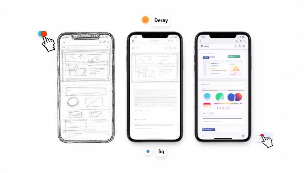
From Low-Fidelity Sketches to Interactive Concepts
Always, always start with low-fidelity (lo-fi) methods. I'm talking pen and paper, a whiteboard, or a simple digital equivalent. Just start sketching out the basic user flow. Don't even think about colors, fonts, or drawing straight lines.
The magic of lo-fi wireframing is its speed and how disposable it feels. You can crank out a dozen layout ideas in an hour without getting emotionally attached to any of them.
Common Lo-Fi Prototyping Techniques:
Paper Sketches: The classic. Draw your main screens on paper, then walk through the user journey by physically swapping out the pages. It's an incredibly effective way to spot glaring flaws in your logic.
Digital Whiteboarding: Tools like Miro or FigJam are perfect for this, especially for remote teams who need to brainstorm flows together in real-time.
Clickable Wireframes: Once you have a basic flow sketched out, you can jump into a design tool to create simple, grayscale wireframes and link them together. This gives you a bare-bones feel for the navigation.
This initial phase is all about structure and flow. Are the right buttons in the right places? Can someone easily get from A to B? Answering these questions now will save you countless hours of headaches later on.
Choosing the Right Tools for Speed
As your ideas get clearer, you'll need a tool that lets you add more detail and collaborate easily. The UX field is always shifting, and the pressure is on to deliver high-impact designs fast. This is especially true in B2B, where buyers are checking out multiple sites before making a call. Research shows that 90% of them are swayed by good UX, and 80% actually prioritize the experience over the price.
For startups, this means your tool choice is crucial. Right now, Figma is the undisputed king, holding a dominant 72% market share for wireframing. To get a sense of where things are headed, check out this great research on the state of UX.
While there are plenty of options, Figma’s real-time collaboration and generous free tier make it a no-brainer for startups on a budget. Designers, developers, and founders can all be in the same file at the same time, which cuts down on endless back-and-forth and version control nightmares.
The Value of a Mini Design System
Okay, before you dive headfirst into high-fidelity design, do yourself a favor: take a few hours to create a tiny design system. I’m not talking about building something massive like Google's Material Design. This is about being pragmatic.
A mini design system for a startup is just a single page in your Figma file that defines your core styles. It's a pragmatic tool, not a bureaucratic process.
Your starter system should be simple. Just include:
Colors: Define 3-5 primary, secondary, and accent colors.
Typography: Pick a heading font and a body font. Define a few key sizes (H1, H2, Body, Caption).
Buttons: Create primary and secondary button components.
Input Fields: Design a standard text input with its different states (default, hover, focus).
This one simple step ensures that you aren't reinventing the wheel every time you build a new screen. It makes your interface feel cohesive and professional. Even better, it makes future updates a breeze. Need to change a button color? Update it in one place, and it will cascade across your entire design. It's a classic example of how a little upfront effort in your ux design for startups process pays off big time down the line.
Testing Your MVP with Real People
Let's be honest: your prototype is really just a bundle of your team's best guesses. Now it's time to put those guesses to the test and see what breaks. Testing your Minimum Viable Product (MVP) with actual people is the single most powerful thing you can do to avoid building something nobody wants.
This isn't about fishing for compliments. You're hunting for flaws. You want to find the confusing navigation, the value proposition that doesn't land, and the broken workflows before you sink a single engineering hour into coding them. At this stage, raw, unfiltered feedback is pure gold.
Finding the Right Testers on a Startup Budget
You don't need a giant, expensive user panel to get game-changing insights. Usability guru Jakob Nielsen famously found that you can uncover most usability problems by testing with just five users. For a lean startup, that’s music to our ears.
Forget the pricey recruiting services for now. It’s time to get scrappy.
Your Network: Tap into friends, family, or old colleagues who fit your target user profile. Just make it clear you want their brutal honesty, not a pep talk.
Go Where They Are: Building a tool for photographers? Jump into a photography subreddit or a Facebook group. Offer a coffee gift card for 15 minutes of their time. You'd be surprised how many people are willing to help.
Your Waitlist: If you've been collecting emails for early access, these people are your secret weapon. They've already raised their hands and are often eager to help shape the product they're waiting for.
The goal isn't just to find any person, but the right person—someone who actually represents your target audience. That's how you get feedback that matters.
Structuring a Test That Delivers Insights
A good usability test isn't just a casual chat. It's a structured session where you observe what people do, not just what they say. You need to see if they can accomplish key tasks without you holding their hand. This is the heart of effective ux design for startups—making sure your ideas actually work in practice.
First, figure out the most critical tasks. If you're building a project management app, a core task might be, "Create a new project and add a task for a teammate."
Once the session starts, your job is to be a quiet observer. Give them the task and then watch. A great way to get inside their head is to ask them to "think aloud" as they navigate the prototype.
"Tell me what's going through your mind as you look at this screen. What do you expect to happen if you click that?"
This simple prompt can reveal huge disconnects between what you intended and how a user actually sees it. Resist the urge to ask leading questions like, "That button is easy to see, right?" Instead, keep it open-ended: "How would you go about changing your password?"
Sorting Feedback from Noise
After a handful of sessions, you’ll be swimming in notes and quotes. Now you have to turn that raw data into a clear action plan. The key is realizing that not all feedback is created equal.
Here’s a simple way I like to sort through it all:
Deal-Breakers: These are the showstoppers. If a user can't figure out how to sign up or complete a core action, you've got a major problem that needs to be fixed immediately.
Major Frustrations: These are issues that cause real confusion or annoyance but don't completely derail the experience. Think of a pricing page that leaves people with more questions than answers.
Minor Annoyances: Small stuff, like a typo or a slightly misaligned icon. They're worth fixing, but they aren't going to sink the ship.
Suggestions & Ideas: Users love to suggest new features. It's great! Jot them down for your backlog, but don't let them distract you from fixing the core usability issues you've already identified in your MVP.
This framework helps you focus your precious time on the fixes that will actually move the needle. It's how you separate a user's personal preference from a genuine design flaw that will trip everyone up. This same mindset applies when you're running more quantitative tests, too. If you're curious, you can check out our guide on simple A/B testing for Framer. It’s this cycle of feedback and refinement that turns a good idea into a product people can’t live without.
Deciding What to Build and How to Ship It
So, you’ve done the research. You’ve run the tests. Now you're staring at a mountain of user feedback, and every piece of it feels important. This is the moment of truth for a startup with a finite runway: what do you actually build first?
It’s incredibly tempting to chase every shiny new feature idea, but the secret to a successful launch is ruthless prioritization. This isn’t about building less; it’s about building the right thing first to deliver immediate value. You need a simple, repeatable way to cut through the noise and get your whole team aligned on a Minimum Viable Product (MVP).
Getting this right is what separates the startups that gain traction from those that don't. A data-first approach ensures your product genuinely solves user problems and fuels growth. In fact, a similar mindset is what helps improve ecommerce conversion rates—it all comes down to focusing on what truly matters to the user.
Frameworks for Smart Prioritization
Relying on gut feelings is a recipe for disaster. To make objective, data-informed decisions, you need a structured framework. These tools turn chaotic brainstorming sessions into focused, strategic planning.
Two of the most battle-tested models for startups are the Value vs. Effort matrix and the MoSCoW method.
Value vs. Effort Matrix: This is a simple but powerful 2x2 grid. You plot every potential feature based on the value it gives the user versus the effort it takes your team to build. The quadrants make your priorities crystal clear:
High Value, Low Effort: These are your quick wins. Build them now.
High Value, High Effort: These are your major strategic bets. Plan for them next.
Low Value, Low Effort: Only tackle these if you have downtime. Don't prioritize them.
Low Value, High Effort: These are black holes for your resources. Avoid them completely.
MoSCoW Method: This framework is perfect for forcing tough conversations about what is truly essential for your first launch. You categorize every feature:
Must-have: The product is broken without these. They are non-negotiable.
Should-have: Important features that add major value but aren't critical for day one.
Could-have: Desirable "nice-to-haves" that can easily wait for a future release.
Won't-have: Features you are explicitly deciding not to build for now.
Using a framework like this keeps your entire process grounded in strategy, ensuring you spend your limited time and money where they'll have the biggest impact.
For a hands-on look, here’s a simple table your team can use to start prioritizing features for your MVP right away.
Sample Startup MVP Prioritization Framework
Feature Idea | User Value (1-5) | Development Effort (1-5) | Priority Quadrant |
|---|---|---|---|
One-click Google sign-in | 5 | 1 | High Value, Low Effort (Quick Win) |
In-app video chat | 5 | 5 | High Value, High Effort (Major Feature) |
Customizable dashboard themes | 2 | 2 | Low Value, Low Effort (Fill-in) |
AI-powered analytics suite | 4 | 5 | High Value, High Effort (Major Feature) |
Full third-party API integration | 3 | 5 | Low Value, High Effort (Avoid for now) |
This simple exercise can quickly align everyone on what to focus on for launch.
From Design to Handoff
Prioritizing your features is only half the battle. The handoff from design to development is where even the best ideas can get lost in translation. A smooth transition isn't about throwing a Figma file over the wall; it's about clear communication and deep collaboration.
This process is so much more than just exporting assets. It’s about building a shared understanding of the why behind the design with your engineering team.
A great design handoff isn’t a single event; it’s a continuous conversation. The goal is to eliminate ambiguity and empower developers to build with confidence, ensuring the final product is a faithful execution of the validated design.
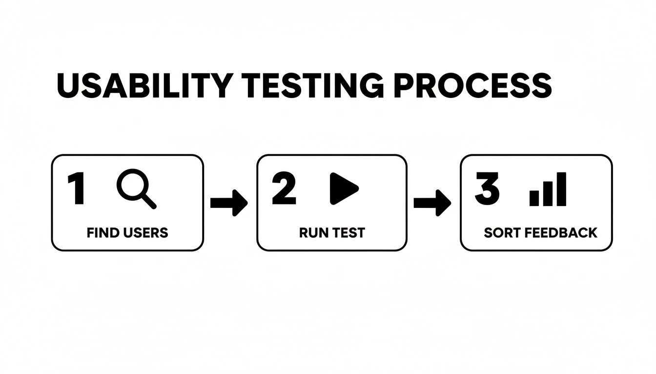
This simple flow is what it all boils down to—from finding real users to gathering the crucial feedback that fuels your prioritization.
The insights you get here are exactly what you need to build the right MVP. And the payoff is huge. Well-executed UX redesigns have been shown to produce an average 31% growth in conversions. Even just improving the UI can lift conversions by 200%, and a full-blown UX strategy can push that to an incredible 400%.
To make it happen, your design file needs to be impeccable. Use clear naming conventions, defined components, and specified styles. But go one step further: add annotations directly in the file to explain complex interactions, edge cases, or user flows. This one small step can save days of back-and-forth. This approach is a core part of a much bigger picture, which you can explore in our complete guide on product development for startups.
When you build that bridge between design and development, you ensure the product that gets shipped is the one you so carefully designed.
Measuring What Matters After You Launch
Congratulations, you shipped the MVP. Pop the champagne, but don't kick your feet up just yet. The launch isn't the finish line; it’s the starting gun. Now the real work begins.
All those carefully crafted hypotheses you built your product on are about to meet reality. This is the moment you stop guessing what users want and start watching what they actually do. For a startup, great UX isn't a one-and-done project. It's a continuous loop of building something, measuring its impact, and learning from the results.
What to Actually Track
Forget vanity metrics like total sign-ups or page views. They might feel good, but they don't tell you if your product is genuinely solving a problem for anyone. You need to focus on the numbers that reveal the health and usability of your product.
Start with a handful of core metrics that give you a direct signal on the user experience:
Task Success Rate: Can people actually do the main thing your app is for? What percentage of users can create their first project or invite a teammate? If this number is low, you have a serious workflow problem.
Time on Task: How long does it take someone to complete that core action? If it's taking ages, you've got friction in your UI that needs to be sanded down.
Adoption Rate: Of the new people who sign up, how many actually use a key feature in their first week? This tells you if your value prop is landing and if people can even find the good stuff.
Customer Satisfaction (CSAT): It can be as simple as asking, "How satisfied were you with this experience?" right after they complete a task. You'll get an immediate pulse on how people are feeling.
Tracking these metrics is how you turn UX from a subjective debate into a data-driven conversation. It gives you a baseline, so you can measure the real impact of every design change and prove what’s working and what isn't.
The Story Behind the Numbers
Data tells you what is happening, but it almost never tells you why. That 15% drop in your Task Success Rate is a critical signal, but it’s just a number on a dashboard. To get the full picture, you have to pair that quantitative data with qualitative feedback.
This is where you find the human stories behind the stats.
Set up a simple system to pull in feedback from everywhere. Look for patterns in support tickets, read your app store reviews (yes, even the angry ones), and see what people are saying on social media. I’ve found that a single, 30-minute user interview can provide more context and "aha!" moments than a month's worth of analytics.
When you blend the "quant" with the "qual," you get a powerful compass for what to build next. That drop in your success rate? Your support tickets will likely point to the exact, confusing step in your onboarding flow. And just like that, you know precisely what your next design sprint should focus on—solving real problems for real people.
Common UX Questions We Hear from Startups
Look, building a startup is a chaotic, thrilling ride. It’s no surprise that founders have a ton of questions about user experience, especially when they're trying to move fast, stay on budget, and actually build something people want. Let's dig into a few of the questions that come up time and time again.
One of the big ones is, "When is the right time to hire our first UX person?" The answer isn't about hitting a certain revenue number or team size. It's about bottlenecks.
You need dedicated UX help the moment design decisions start slowing you down. If you or your co-founder are spending more than 10-15 hours a week fiddling with mockups instead of, you know, running the company, it's time.
Can We Even Afford Good UX?
This question often comes from a place of fear, and it's totally understandable when cash is tight. But I encourage founders to reframe it: "Can we afford not to invest in UX?"
Launching a product without solid user research or a clear interface is just burning money. You end up wasting engineering cycles on features nobody asked for, paying more to acquire customers, and watching them leave because they're confused.
Good UX isn't an expense; it's a tool for de-risking your entire venture. It ensures you're building a product people will actually pay for and enjoy using, saving you from costly mistakes down the line.
Here are a few other rapid-fire questions we get all the time:
Do we need a full-time designer from day one? Honestly, probably not. Many startups get incredible value from a flexible agency partner or a sharp freelancer to get their MVP validated. You can bring someone in-house once you have a clearer roadmap.
What's the real difference between UI and UX? It's simple. UX (User Experience) is the whole journey—how a person feels from the moment they discover your product to the moment they achieve their goal. UI (User Interface) is just the stuff they click and see along the way, like buttons and screens. Think of UX as the entire road trip and UI as the car's dashboard and road signs.
How do we prove the ROI on this? Easy. Connect UX work directly to your business goals. Show how a redesigned onboarding flow boosted your activation rate, or how a clearer pricing page increased trial-to-paid conversions. The data will tell the story.
At Shalev Agency, our whole game is helping startups turn these questions into a clear, actionable UX strategy. We partner with you to ship products that actually drive growth, letting you get back to building the business. Get in touch and let's figure it out together.