Learn how to approach UX design for SaaS with a practical guide that covers everything from user research and journey mapping to prototyping and iteration.
Jan 11, 2026

Great UX design for a SaaS product isn't about shiny objects or a long list of features. It’s about building a tool so intuitive and effective that it seamlessly blends into your user's daily work. The goal is to solve real problems so well that customers feel the value instantly, stick around, and tell their friends about you. This is a whole different ballgame than traditional UX because you’re designing for an ongoing relationship, not a single transaction.
Starting with Why Before What

The most successful SaaS products aren’t built on a foundation of cool ideas. They’re built on a deep, almost obsessive understanding of what their users are actually struggling with.
This initial discovery phase isn’t optional. I’ve seen it time and time again: skipping this step is the single biggest reason promising SaaS products never get off the ground. You have to get out of your own head and dig into the "why" that drives your users' behavior.
The real goal here is to find the genuine pain, not just what people say they want. A user might tell you they want a "one-click report export," but the real pain is the three hours they burn every Friday manually pulling data for a team meeting. Solving that deeper problem is where you create something indispensable.
Conducting User Research on a Budget
So many early-stage teams think they can't afford proper user research. That's just not true. You don't need a huge budget to get game-changing insights.
User Interviews: This is your secret weapon. Seriously. Just aim to have 5-7 real conversations with people who fit your target profile. This isn't a sales pitch; it's a fact-finding mission. Ask open-ended questions about their workflows, what makes them want to pull their hair out, and the clunky workarounds they've invented.
Surveys: Tools like Google Forms or SurveyMonkey are perfect for getting some numbers to back up what you're hearing. You can quickly ask about the tools they use, their most common tasks, and get some basic demographic info.
Competitor Analysis: Go look at your competitors, but don't just study their features. Go straight to their users' feedback on sites like G2 or Capterra. What do people love? Even better, what are they constantly complaining about? Those complaints are pure gold—they're your opportunities.
Remember to tailor your approach. A B2B SaaS for accountants needs a different line of questioning than a B2C app for marathon runners. The accountant cares about efficiency and compliance, while the runner is probably looking for motivation and community.
Running Effective User Interviews
Just talking to users isn't enough—you have to ask the right questions to get past the surface-level answers. Avoid leading questions like, "Wouldn't it be great if you could do X?" People will almost always say yes. Instead, focus on what they've actually done in the past.
A much better way to phrase it is, "Can you walk me through the last time you had to create your monthly expense report? Tell me about that. What parts of that process were the most frustrating?" This gets them telling a story about a real experience, and that's where the genuine friction points reveal themselves.
Your mission is to become an expert on their problems. For example, while doing research for a project management tool, you might discover a manager's biggest headache isn't tracking individual tasks. It's communicating project status to executives who will never log into the tool. That single insight could lead to a killer feature like automated, shareable summary reports—something you might have never dreamed up on your own.
By mixing these methods, you build a solid foundation based on evidence, not just your gut feelings. This is how you ensure you're designing a solution for a problem people will actually pay you to solve, setting the stage for every other step in the UX design for SaaS process.
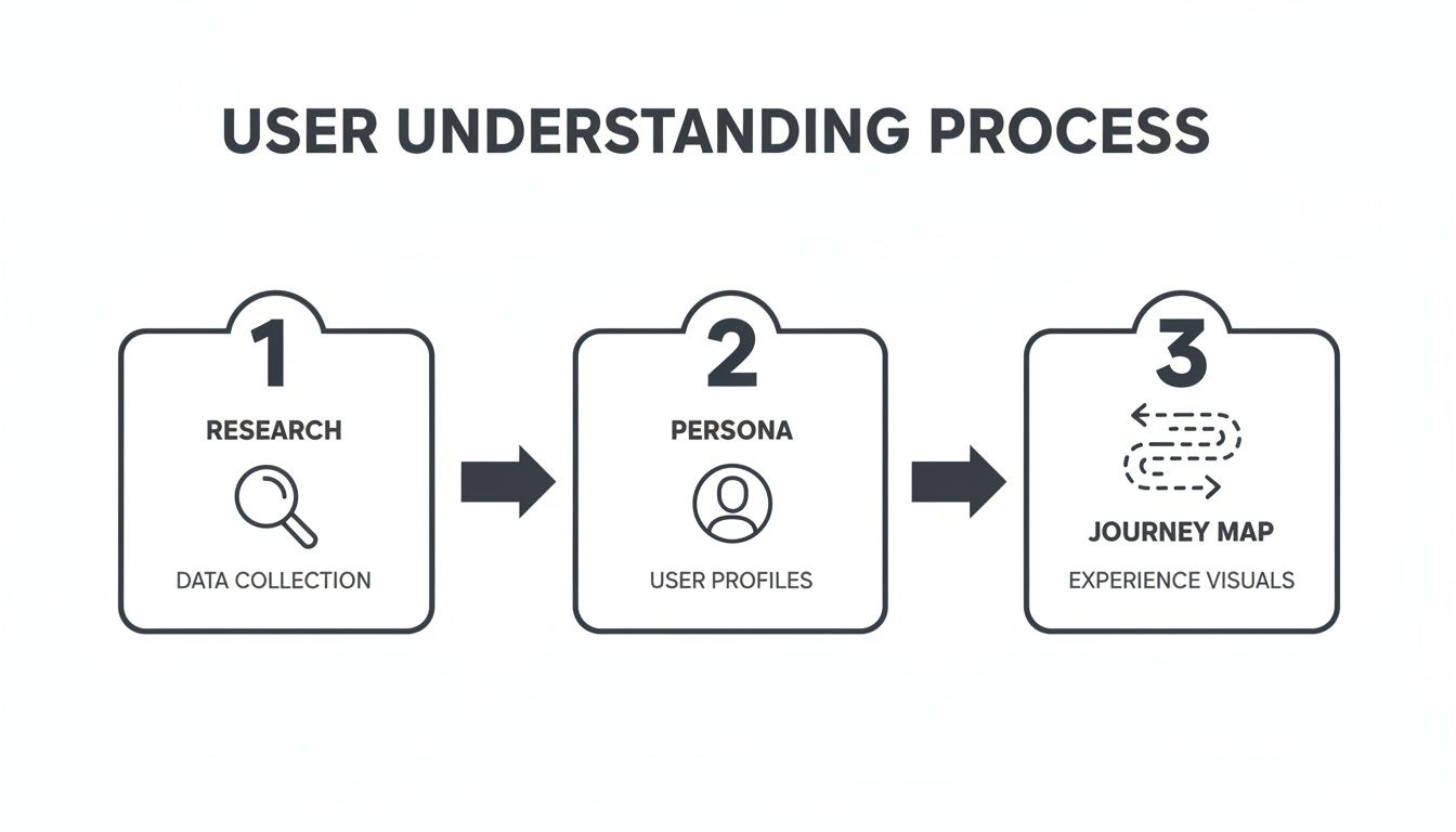
Giving Your Users a Name and a Story
You’ve done the hard work of talking to real people. Now you have a mountain of interview notes, survey data, and transcripts. The next challenge is to shape all that raw information into something your team can actually use.
This is where you bring your users to life. We’re talking about giving them a name, a face, and a story that everyone—from your lead engineer to your first marketing hire—can connect with and design for.
That’s what user personas and journey maps are all about. They’re not just some fluffy design exercise; they are the tools that anchor every single product decision in real human needs. A solid persona stops the team from building for themselves and keeps the focus squarely on the people who will actually pay for and use your software.
Creating Personas That Feel Real
A good persona is so much more than a simple demographic summary. It digs deep into the motivations, goals, and daily headaches of your target user, blending all the patterns you spotted during your research.
Instead of a generic "User is a 35-year-old manager," you want something that tells a story: "Meet Sarah. She's a project manager who sinks 4 hours every week manually pulling together status reports for her boss. She hates it, feeling like she’s wasting precious time she could be using to actually mentor her team." See the difference?
To build a persona that resonates, make sure you include:
A Realistic Name and Photo: It sounds simple, but this makes the persona instantly more human and relatable.
Goals: What are they ultimately trying to accomplish in their job? (e.g., "Ship projects on time and under budget.")
Frustrations: What specific things are constantly getting in their way? (e.g., "I have zero visibility into what other teams are actually working on.")
Motivations: What's the internal fire that drives them? (e.g., "Getting recognized by leadership for running an efficient team.")
A Key Quote: Boil down their core problem into one powerful sentence. Something like, "I feel like I'm always chasing people just to get a simple update."
One of the most common traps is creating a whole cast of personas. For an early-stage SaaS, that's a recipe for disaster. Stick to one or two primary personas. This ruthless focus keeps your team aligned and prevents you from building a Frankenstein's monster of features that serves no one well.
Visualizing the Entire User Journey
Once you know who you're building for, it's time to map out how they'll experience your product. A user journey map tells the visual story of every single touchpoint, from the first time a user hears your name to the moment they can't imagine their workday without you.
This map is your secret weapon for finding points of friction and opportunities to create those "wow" moments. It forces you to look beyond the app itself and consider the entire customer lifecycle. If you want to dive deeper into this foundational stage, our guide on UX design for startups is a great resource for aligning these user needs with your business goals right from the start.
A standard SaaS journey map usually breaks down into a few key stages:
Awareness: How do they even find out you exist? A blog post? A recommendation?
Consideration: What do they look at to decide if you’re the right tool? Pricing page? Demo video?
Onboarding: What are the first few critical steps they take right after signing up?
Adoption: How do they weave your tool into their daily habits and discover its real value?
Advocacy: What makes them love the product so much they start telling their friends about it?
For every stage, you’ll want to jot down what the user is doing, thinking, and feeling. This process will unearth the answers to crucial questions like, "Where are people getting stuck during setup?" or "What's the 'aha!' moment that converts a casual user into a die-hard fan?" Answering these is the very essence of effective UX design for SaaS.
Building a Smart Product Blueprint
Now that you have a solid grasp of your users and their journey, it's time to shift gears. We're moving from who you're building for to what, exactly, you need to build. This is where you lay the architectural foundation for your product, making sure it’s a logical, intuitive system—not just a random pile of features.
This stage really boils down to two key activities: nailing the Information Architecture (IA) and defining your Minimum Viable Product (MVP). IA is all about organizing your app so people can find what they need without having to think too hard. A sharp MVP definition ensures you launch something that's genuinely valuable from day one.
The research and mapping you've already done directly feeds into this blueprinting phase.
This connection is crucial. It ensures every structural decision you make is grounded in the real user needs you uncovered earlier.
Structuring Your Product Intuitively
At its core, Information Architecture is the science of making things findable. Think of a well-organized library—books are sorted by genre, then by author, so you can walk right to what you need. Your SaaS app needs that same level of thoughtful structure.
A confusing IA is a massive source of user frustration. If someone expects to find their billing info under "Account Settings" but you've hidden it away in a "Subscription" tab, you've created a frustrating dead end. This is where your personas and journey maps become your best friends, guiding how you structure navigation and place features.
To get a head start on translating user insights into a functional blueprint, you might find some of the newer AI UI UX tools helpful in generating initial layouts and flows.
Prioritizing What to Build First
One of the biggest traps for any early-stage SaaS team is feature bloat. The temptation to build everything for everyone right out of the gate is real, but it's a fast track to a confusing product that never actually ships. The goal here is to launch an MVP that solves one core problem exceptionally well.
The MoSCoW method is a fantastic, straightforward framework for this kind of ruthless prioritization. It forces you and your team to sort every potential feature into one of four buckets:
Must-have: Non-negotiable features. The product simply won't work or deliver its core value without them.
Should-have: Important features, but not critical for the initial launch. These are high on the list for the next release.
Could-have: These are the "nice-to-have" features that you'll only tackle if you have extra time and resources.
Won't-have (this time): Features that are explicitly out of scope for this version.
This isn't just a list-making exercise. The real value of the MoSCoW method is the conversation it forces. It gets product, design, and engineering in a room to agree on what truly matters for launch, which is your best defense against scope creep.
To make this more concrete, let's look at how this might play out for a new project management SaaS tool.
SaaS MVP Feature Prioritization Using The MoSCoW Method
Category | Feature Example | Justification |
|---|---|---|
Must-have | Create a new task with a title and due date. | The absolute core function. Without this, it's not a project management tool. |
Must-have | User login and authentication. | Essential for security and ensuring users can access their own data. |
Should-have | Assign tasks to other team members. | Collaboration is key, but the V1 could be for a single user to prove the concept. |
Should-have | Commenting on tasks. | Greatly enhances usability and communication, but not strictly required for basic task tracking. |
Could-have | Customizable project templates. | A helpful feature for power users, but not necessary for the initial launch. |
Could-have | Gantt chart view. | A nice visual aid for complex projects, but a simple list view is sufficient for an MVP. |
Won't-have | Third-party integrations (e.g., Slack, Google Drive). | Adds significant complexity and should be based on user feedback post-launch. |
Won't-have | Mobile app. | The web app must prove its value first. A mobile app is a separate, major project. |
Using a framework like MoSCoW forces you to balance what users need with what your team can realistically build. It's how you get a focused, valuable product to market quickly—a fundamental goal of effective UX design for SaaS.
For example, a "Must-have" for an analytics SaaS would be connecting a data source and seeing a basic traffic dashboard. For more guidance on this crucial first view, check out our guide on dashboard design best practices.
Designing for Real-World SaaS Workflows
Alright, you've got the blueprint. Now comes the fun part: giving your product a personality. This is where we move past the structural diagrams and start shaping the actual interactions and UI patterns that make a SaaS tool feel intuitive and powerful, not just functional.
The real goal here is to design for the messy, interrupted reality of a user's workday. No one’s workflow is a perfect, straight line. It's full of distractions, mistakes, and moments of "what do I do now?" Great UX design for SaaS sees those moments coming and builds a clear, helpful path forward.
Crafting a Seamless Onboarding Flow
Those first few minutes a user spends in your app are everything. It’s your one shot to guide them to that "aha!" moment. If you fail, they'll likely churn and never come back.
A great onboarding flow isn't a long, boring tour of every single feature. It's a focused, guided journey to their first win.
Think about a social media scheduling tool. The user's first win isn't learning about every single setting; it's getting their very first post scheduled. Your onboarding needs to be laser-focused on getting them to that specific outcome as fast as possible. You can get a much deeper look into this with these detailed SaaS onboarding best practices.
Here's how to build momentum from the get-go:
Action-oriented tooltips: Don't just point out a button. Prompt an action. Think "Click here to connect your first account" instead of "This is the accounts button."
Progress bars or checklists: These are simple but powerful. Visually showing users how close they are to finishing setup gives them a reason to keep going.
Pre-populated data: Never greet a user with a totally blank screen. A sample project or some demo data helps them immediately see how the tool works and what's possible.
Designing Dashboards and Settings for Clarity
Your dashboard is the user's command center. It needs to give them an instant answer to the question, "What do I need to know or do right now?" A dashboard cluttered with every metric imaginable is just noise. A truly effective one surfaces only the most relevant information based on that user's role and recent activity.
Settings pages, on the other hand, are all about empowering the user. They need to be organized logically, with clear headings that match how a user thinks. Grouping related items—like "Notifications," "Billing," and "Integrations"—makes the experience feel predictable and less intimidating.
A big shift is happening in SaaS design. We're moving away from stripped-down minimalism toward what you could call "intelligent density." Power users, especially in B2B SaaS, want information-rich interfaces that help them work faster, not UIs that hide everything behind extra clicks.
Analysis of over 500 top-tier SaaS products reveals that sophisticated users are demanding interfaces that look more like a financial trading terminal than a simple website. The old-school, one-size-fits-all user journey is a primary reason new users fail to find value in a product.
Handling the In-Between Moments
So much of what makes an experience feel great or terrible comes down to the small, often-overlooked details. How your app behaves during loading, on an empty page, or after an error can be the difference between a frustrating tool and a helpful partner.
Empty States: An empty dashboard is a huge missed opportunity. Instead of just saying "You have no projects," guide them to the next logical step: "Create your first project to get started."
Loading Indicators: Use skeleton loaders that mimic the final page layout. This manages expectations and makes the wait feel shorter. For quick, simple actions, a basic spinner is fine.
Error Messages: "An error occurred" is useless. Be specific. Explain what happened in plain English and tell the user exactly how to fix it.
When you're designing for how people actually work, you have to nail these core interactions. Following established best UX design practices is a great starting point. By thoughtfully designing these core flows and micro-interactions, you’re not just building software; you're building a competitive advantage.
Testing and Iterating Your Way to Growth
An idea is just that—an idea. What separates a successful SaaS business from a forgotten one is validation. The real magic happens when you move from static design files to a living, breathing experience that people can actually interact with. This is where your assumptions face the tough reality of user behavior.
This whole process isn't about fishing for compliments on your design. It's about a relentless hunt for what's broken. You're looking for the confusing workflows, the frustrating dead ends, and the moments of friction before you've asked an engineer to write a single line of code. Catching these problems early will save you an incredible amount of time, money, and headaches down the road.
Choosing the Right Prototype Fidelity
Prototyping is really just about creating a simulation of your product to test specific questions. The trick is to pick the right level of detail—what we call "fidelity"—for what you're trying to learn. You don't always need a pixel-perfect, fully interactive model.
Low-Fidelity (Lo-Fi) Prototypes: Think paper sketches or basic digital wireframes. These are fantastic for testing the big-picture stuff, like your core concept or overall information architecture. Are the main navigation labels clear? Does the signup flow make sense at a high level? Lo-fi is fast, cheap, and keeps the feedback focused on the fundamentals, not the color palette.
High-Fidelity (Hi-Fi) Prototypes: This is where you get into the clickable, interactive mockups that look and feel almost real. Built with tools like Figma or Adobe XD, they are essential for testing specific user interactions, micro-animations, and complex workflows. This is how you find out if people can actually figure out that advanced filtering feature you spent two weeks designing.
My rule of thumb is simple: Use lo-fi to validate the idea and hi-fi to validate the execution. A classic mistake I see teams make is jumping straight to hi-fi. You'll end up debating button styles when you should be asking if the feature is even solving a real problem.
How to Run Usability Tests That Actually Work
Once your prototype is ready, it's time to get it in front of real people. You don't need a fancy usability lab for this. A simple video call and a handful of users from your target audience are all you need to uncover game-changing insights.
Your job is to observe, not to lead. Give the user a clear task to complete, like, "Imagine you've just logged in for the day and need to create a new report for your team. Can you show me how you'd do that?"
Then, the hard part: be quiet. Watch where they click, notice where they hesitate, and see where they get completely stuck. Encourage them to think out loud so you can hear their thought process. You'll be amazed at what you learn. Just five to seven users will typically uncover 85% of the major usability issues.
Turning User Feedback into Real Business Growth
Testing shows you what's broken. But to really drive growth, you have to connect that user feedback to the metrics that matter to your business. This is how you shift UX design for SaaS from being seen as a cost center to a core driver of revenue.
The quality of the user experience is directly tied to customer retention and conversion. In fact, a staggering 88% of consumers say they are less likely to return to a site after a bad experience. On the flip side, thoughtful UX can slash bounce rates by 10-15%, and something as simple as a clear visual hierarchy can boost a user's effectiveness by up to 40%. You can dive deeper into these kinds of findings on userguiding.com.
After a round of testing, analyze your findings by looking at your core SaaS metrics:
Activation Rate: Did testing reveal friction in your onboarding? If you fix that flow, you should see a direct lift in the number of new users completing those key setup steps.
Feature Adoption: Are people using that new feature you just shipped? If your usability tests showed users were confused about its purpose, that's likely the reason for low adoption. The feedback gives you a clear road map for what to fix.
Time-to-Value: How fast are users getting to that "aha!" moment where they see the real value in your product? Your tests will pinpoint exactly where they get bogged down, helping you cut out unnecessary steps and get them to success faster.
This creates a powerful, continuous loop. You test a design, identify the problems, ship an improvement, and then measure its impact on these critical metrics. This iterative cycle is the engine that turns great UX into sustainable growth.
A Few Lingering Questions
When you're deep in the weeds of building a SaaS product, a lot of questions about UX design can pop up. Let's run through some of the most common ones I hear from founders and product managers.
How Can I Actually Measure the ROI of Good UX?
You tie it directly to the business metrics you already care about. It’s not about vague feelings; it's about tracking hard numbers before and after you make significant UX improvements. When you see those numbers move in the right direction, that's your ROI.
Keep a close eye on a few key indicators:
User Activation Rate: Are more new sign-ups actually doing the one thing they need to do to see value?
Customer Retention: Is your churn rate going down? This is a huge one.
Feature Adoption: Are people finally discovering and using that powerful feature you built?
Conversion Rates: Are more trial users pulling out their credit cards?
Don't forget to check in with your support team. A sudden drop in "how do I do this?" tickets is one of the most satisfying and direct signs that your UX investment is paying off.
What's the Biggest UX Mistake Early SaaS Companies Make?
Easy. Skipping user research. Hands down, it's the most common and damaging mistake I see.
Founders are incredibly passionate, which is great, but that passion can lead them to build a solution based on their own assumptions. They end up creating a beautifully engineered product that solves a problem nobody actually has.
The result is always the same: a product that confuses people, leading to terrible adoption rates and sky-high churn. Just a handful of honest conversations with real, potential customers can save you months of building the wrong thing.
You simply can't design a great SaaS product in a vacuum. Assuming you know what your users want without actually talking to them is the fastest way to build something nobody will pay for.
What's the Ballpark Cost for UX Design on a SaaS MVP?
This is a tough one because it really depends on your product's complexity and who you work with. The range is wide, stretching anywhere from $15,000 to over $100,000. The first and most critical step is to get an ironclad scope of work defined.
But think of it this way: spending on quality UX upfront is a massive cost-saver in the long run. It prevents expensive development do-overs and dramatically shortens your path to finding real product-market fit.
Should We Hire an Agency or an In-House Designer First?
For most early-stage startups, an agency is the smarter, more capital-efficient move. It gives you instant access to a whole team of specialists—researchers, strategists, UI/UX designers—without the heavy overhead and long recruitment process of hiring full-time.
An experienced agency can put you on the fast track to launching a validated, well-designed MVP.
Once your company finds its footing and you have a steady stream of design needs, that's usually the right time to start building out your in-house team. It just makes more financial and operational sense at that stage.
Ready to turn your SaaS idea into a product that users love? At Shalev Agency, we help growing teams ship faster with research-backed UX, crisp UI, and pragmatic engineering. Let's build your next big thing.