Discover essential dashboard design best practices to create clear, intuitive, and actionable dashboards that drive better business decisions.
Jan 11, 2026

When it comes to designing a great dashboard, one principle stands above all others: instant clarity. The very best dashboards get their most critical message across in about three seconds, giving users a complete picture of performance at a single glance. Getting this right comes down to ruthlessly prioritizing your key metrics and establishing a rock-solid visual hierarchy.
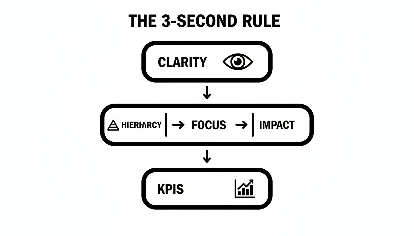
The Three-Second Rule for Instant Data Clarity
Picture yourself walking into a mission control room. You wouldn't want to be greeted by a hundred blinking, unlabeled lights. You'd want to see a couple of big, obvious indicators—green for "all systems go," red for "we have a problem"—that tell you what's happening right away. That's the whole idea behind the "Three-Second Rule" in dashboard design. It’s all about creating an experience so intuitive that people can absorb the main takeaways almost instantly.
This rule is the antidote to a common ailment known as analysis paralysis, where a user is so overwhelmed with information that they can't make a decision. A cluttered dashboard, packed with dozens of charts and numbers, forces people to waste precious time just trying to figure out what they're looking at, instead of acting on it.
Defeating Information Overload
The first step to making the Three-Second Rule work is to be absolutely ruthless with your prioritization. You have to nail down the handful of Key Performance Indicators (KPIs) that actually matter for the user's goals. Just ask yourself, "If the user could only see three numbers, what would they be?" This question helps you cut through the noise and zero in on metrics that truly drive action.
The 3-Second Rule isn't just a nice idea; it's a cornerstone of effective design. Research from visualization experts shows that dashboards built on this principle can boost decision-making speed by up to 40% because users aren't digging through a mountain of data. You can find more on this data-driven approach over at resolution.de.
Once you've locked in your core KPIs, the next step is to create a clear visual hierarchy. Think about it like the front page of a newspaper—the most important headline is always at the top in the biggest font. Your dashboard needs to follow the same logic.
Size and Placement: Put your most important KPI in the top-left corner, which is where our eyes naturally start. Make it the biggest thing on the screen.
Color and Contrast: Use color with purpose, not just for decoration. A bright, high-contrast color should be reserved for critical alerts or major changes. A more muted palette for everything else keeps the focus where it belongs.
Whitespace: Don't be afraid to leave some empty space. Whitespace gives the design room to breathe, reduces cognitive load, and makes the whole layout feel much more organized and calm.
A dashboard is not a report. Its purpose is not to provide all the answers, but to surface the most important questions quickly. The Three-Second Rule ensures it does just that.
To help you apply these concepts, here’s a quick summary of the core principles.
Key Principles of the 3-Second Rule
This table breaks down the essential ideas for designing a dashboard that communicates its core message in three seconds or less.
Principle | Description | Example Application |
|---|---|---|
Ruthless Prioritization | Focus only on the 1-3 most critical KPIs that directly inform user actions. | A sales dashboard shows "MRR vs. Target" and "New Leads" instead of 10 different sales activity charts. |
Strong Visual Hierarchy | Use size, color, and placement to guide the user's eye to the most important data first. | The main KPI is displayed in a large font at the top-left, with secondary metrics in smaller components below it. |
Minimalist Aesthetic | Remove all non-essential elements, including unnecessary charts, text, and decorative graphics. | Use a single, high-contrast color for alerts and a neutral palette for everything else. Avoid 3D effects or gradients. |
At-a-Glance Context | Provide simple context, like targets or historical trends, without cluttering the view. | A single number is paired with a small sparkline and a percentage change (e.g., "+5% vs. last month"). |
By keeping these principles in mind, you can turn a dense, confusing wall of data into a sharp, actionable tool.
Putting the Rule into Practice
Let's take a sales team's dashboard. Instead of cramming in 20 different charts, a three-second dashboard would put three metrics front and center: Monthly Recurring Revenue (MRR) vs. Target, New Leads Today, and Deals Closing This Week. These are the vital signs of the sales operation.
By following these dashboard design best practices, you can transform data from a passive collection of numbers into an active tool for making faster, smarter decisions. Getting the layout right is a critical skill, and it shares a lot of DNA with other areas of design. In fact, if you're interested in how visual hierarchy works in other contexts, you might find our guide on landing page design best practices useful.
Defining Your Dashboard's Core Purpose and Audience
Before you even think about picking a chart or a color scheme, the first and most important step is to answer two simple questions: Who is this for? and What problem does it solve for them?
A dashboard without a clear mission is just digital noise. It’s a pretty collection of charts and numbers that looks impressive but doesn't actually help anyone. When you try to build a dashboard for everyone, you end up building one that works for no one.
Think of it like building a car. You wouldn't use the same blueprint for a Formula 1 race car, a family minivan, and a long-haul semi-truck. Each driver has completely different needs. The racer needs speed and real-time engine data. The family needs safety features and lots of space. The trucker needs reliability and massive cargo capacity. It's the same with dashboards—a CEO needs a high-level view of company health, while a marketing specialist needs to see the nitty-gritty details of a specific campaign.
Start with Why Before What
The best dashboards are born from conversations, not just requests. Kicking off the project with stakeholder interviews and user workshops is essential. But the goal isn't to just ask, "What metrics do you want to see?" That's a surefire way to get a long, unfocused wish list.
Instead, you need to dig deeper to understand their day-to-day work, their biggest headaches, and what success looks like to them.
Try asking questions that get to the heart of the matter:
What are the top 3-5 decisions you make every week that this dashboard could improve? This frames the dashboard as a decision-making tool.
What business questions are you struggling to answer quickly right now? This uncovers the real pain points.
How do you know if you're having a good day or a good month? This helps you identify the numbers that truly matter.
These conversations reveal the dashboard's true purpose. It’s not just about showing data; it’s about helping people make smarter, faster decisions. A product manager’s "why" might be to find where users are dropping off in a new feature. A sales leader's "why" is all about tracking their team's progress toward quarterly revenue goals.
A dashboard is a decision-making tool, not a data repository. Its primary purpose is to provide the right information, to the right person, at the right time, to inform a specific action.
This all comes back to a core principle in dashboard design: The 3-Second Rule. Can a user understand the key takeaway in three seconds or less? Getting this right starts with absolute clarity on who you're building for and what they need to know.
As you can see, a clear purpose is the foundation for everything else. It dictates the hierarchy, what you focus on, and ultimately, which KPIs will have the biggest impact.
Crafting Detailed User Personas
Once you've figured out the "why," it's time to get specific about the "who" by creating user personas. A persona is just a simple profile of your ideal user. It's more than just a job title; it captures their goals, how comfortable they are with data, and what they'll actually do with the dashboard. This is one of the most crucial dashboard design best practices because it keeps a real person in mind with every single design choice you make.
A solid persona should include:
Role and Responsibilities: What's their job, and what are they on the hook for?
Primary Goals: What are they trying to accomplish in their role?
Key Tasks: What will they use the dashboard for? (e.g., quick monitoring, deep investigation, pulling reports)
Data Literacy: Are they a data scientist, or do they get nervous around spreadsheets?
Let’s take a SaaS company as an example. A marketing manager might need to see high-level metrics like Cost Per Acquisition and Conversion Rate to decide where to put their budget next month. But the customer support lead couldn't care less about that; they need to see operational data like Average Ticket Response Time and Customer Satisfaction Score to manage their team's workload.
By defining these different needs upfront, you can avoid the "one-size-fits-all" trap. This targeted approach ensures every single element on the screen is there for a reason, helping a specific person get from a question to an answer as smoothly as possible.
Choosing the Right Visuals to Tell Your Data Story
Picking the right chart for your data is a bit like choosing the right tool for a job. You wouldn't use a sledgehammer to hang a picture frame, right? In the same way, your choice of visualization can either bring your data's story to life or turn it into a confusing mess. The goal is to make the main insight so obvious that it practically jumps off the screen.
This is where good dashboard design really shines. It's not about making charts look fancy; it's about turning raw, boring numbers into a story people can actually understand and act on. The right visual can create that "aha!" moment where a complex dataset suddenly makes perfect sense.
This means you have to think beyond the default settings in your software. Pie charts, for example, are incredibly popular but are often a terrible choice. Our brains just aren't wired to accurately compare the size of angled slices, which makes them easy to misread. A simple bar chart is almost always a clearer, more honest way to show how different parts make up a whole.
Matching the Chart to the Data's Purpose
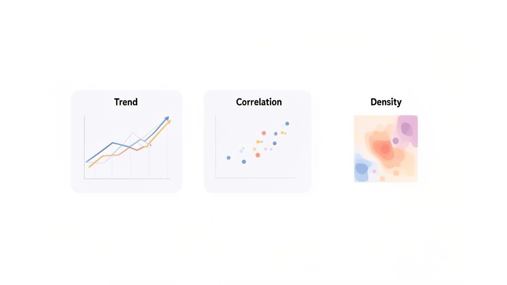
The secret to getting it right is to first figure out what you're trying to communicate. Are you showing how something has changed over time? Comparing different groups? Or trying to see if two things are related? Each of these questions has a chart type that's perfectly suited for the task.
Let's break down the most common jobs and the best charts for them:
Showing Change Over Time: If you need to track a metric like monthly sales or daily website visitors, the line chart is your go-to. It's fantastic for showing trends, patterns, and dips over a continuous period.
Comparing Categories: When you need to see how distinct groups stack up—like sales figures for different product lines—a bar chart is the undisputed champion. It makes comparing values quick and painless.
Showing Parts of a Whole: To show what percentage of your budget goes to different departments, a stacked bar chart or a treemap is a much better option than a pie chart, especially if you have more than a couple of categories.
Revealing Relationships: Need to know if your ad spending is actually leading to more sales? A scatter plot is the perfect tool. It visualizes the connection (or lack of one) between two different sets of numbers.
A great chart doesn't just show data; it answers a business question. The visualization should be so clear that the question it answers is immediately obvious to the viewer.
Following this simple rule ensures that every single chart on your dashboard has a clear and valuable purpose.
Real-World Examples in Action
Picture a SaaS dashboard built for a product manager. A line chart tracking user engagement over the last 90 days would instantly show if a new feature is taking off or flopping. Add a bar chart comparing adoption rates for different features, and you've got a powerful story about how people are using the product.
Or think about a marketing dashboard. A scatter plot could show if there's a connection between how long a blog post is and how many times it gets shared, giving the content team a clue on what to write next. A heat map showing where people click on the homepage could highlight which buttons are working and which are being ignored.
These aren't just random choices; they are strategic decisions designed to make the data useful. As you think about your own data story, checking out some well-designed financial dashboard examples can give you some great ideas for communicating information effectively.
Common Chart Selection Mistakes to Avoid
Even with the best of intentions, it's easy to pick a chart that accidentally misleads people. Staying away from these common traps is crucial for building a trustworthy dashboard.
Using a Pie Chart for More Than 3 Categories: It becomes a rainbow-colored puzzle that's almost impossible to read accurately.
Choosing 3D Charts: They might look cool, but the 3D effect distorts the data and makes it hard to compare values. Always stick to clean, simple 2D charts.
Inconsistent Color Schemes: Using colors randomly just creates chaos. Assign one color to a specific category and use it consistently across the entire dashboard.
Omitting a Zero Baseline: For bar charts, the value axis must always start at zero. Starting it higher is a classic way to exaggerate small differences and deceive your audience.
In the end, choosing the right visual is an act of empathy for your user. You're their guide through a sea of data, and your chart choices can either lead them to a clear destination or leave them lost and confused. By matching the chart to its true purpose, you can build dashboards that deliver genuine, actionable insights instead of just a page full of numbers.
Mastering Layout and Visual Hierarchy for Better Focus
A great dashboard isn't just about the data you show; it's about how you arrange it. Without a thoughtful layout, even the most critical metrics can get lost in a sea of visual noise. The secret to transforming a cluttered screen into a clear, intuitive tool is mastering layout and visual hierarchy.
Think of it like a pilot's cockpit. The most vital information—altitude, speed, heading—is placed directly in the pilot's line of sight for instant access. Secondary gauges, like fuel levels, are still important but are positioned for a quick glance. Your dashboard should work the same way.
This kind of strategic placement is what makes a dashboard feel effortless to use, not like a puzzle you have to solve.
Tap Into Natural Reading Patterns
You don’t have to reinvent the wheel to create a layout that works. The most effective designs lean on patterns that align with how our eyes naturally scan a screen.
Here are the two most common ones you'll see:
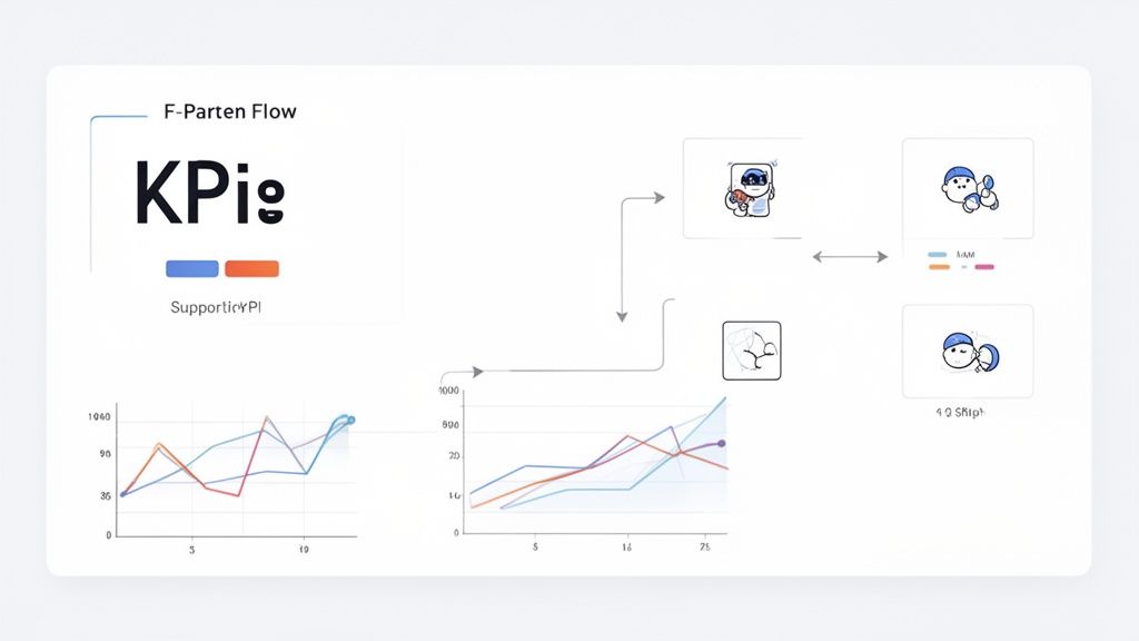
The F-Pattern: Most of us scan web content in a rough "F" shape. We read across the top, then jump down a bit and read another shorter horizontal line, and finally scan down the left side. To make this work for you, place your most important KPIs and summaries along that top bar and down the left-hand column.
The Z-Pattern: For dashboards that are more visual and less text-heavy, the Z-pattern is a great fit. The eye moves from top-left to top-right, then diagonally to the bottom-left, and finally across to the bottom-right. It’s perfect for guiding a user through a workflow or a specific story.
By arranging your dashboard components along these natural viewing paths, you lower the mental effort required from your users, helping them find what they need in seconds.
The Hidden Power of Whitespace
One of the biggest mistakes designers make is cramming information into every available pixel. It feels productive, but it just creates visual clutter and makes it impossible to focus. The solution is surprisingly simple: embrace whitespace.
Whitespace, or negative space, is just the empty area around your charts and text. It isn’t wasted space—it’s an active design tool. It gives your content room to breathe, improves readability, and draws a clear line between different sections of your dashboard.
According to visualization pioneer Edward Tufte, a high "data-ink ratio" is a cornerstone of good design. This means getting rid of non-essential visual fluff to maximize the ink devoted to the actual data. This simple principle can boost clarity by 50% or more on a cluttered dashboard.
This "less is more" mindset helps you resist the urge to add flashy backgrounds or decorative icons that don't serve a real purpose. If you want to dive deeper, the team at Datapad.io has some excellent resources on this topic.
Choosing the Right Chart for the Job
Your layout guides the eye, but the charts you choose do the heavy lifting of communication. Picking the wrong chart type is like trying to explain a movie plot using only pie charts—it just won't work. The goal is to match the chart to the story your data is telling.
For instance, a line chart is perfect for showing a trend over the past six months, but a bar chart is far better for comparing sales across different regions. To help you make the right call, here’s a quick guide to some of the most common chart types and where they shine.
Common Chart Types and Their Best Use Cases
Chart Type | Best For Visualizing | Avoid When |
|---|---|---|
Line Chart | Trends over time (e.g., monthly revenue, daily users) | Comparing categories or showing parts of a whole |
Bar Chart | Comparing distinct categories (e.g., sales per region) | Showing trends over a long period; too many categories |
Pie Chart | Parts of a whole (e.g., market share percentages) | Comparing categories or when you have more than 5-6 slices |
Scatter Plot | Relationships between two variables (e.g., ad spend vs. conversions) | Visualizing single-variable data or trends over time |
Heat Map | Highlighting concentration in a matrix (e.g., user clicks on a page) | Showing precise numerical values or comparisons |
Choosing the right visualization makes the data’s message instantly clear. When you get it right, your users won't have to work to understand the information; the chart will do the talking for them.
Designing for Seamless Interaction and Usability
The best dashboards aren't just static pictures of data; they're dynamic tools built for exploration. A great design doesn't just show you numbers—it invites you to ask questions, dig deeper, and find those "aha!" moments that a high-level summary can't give you. This is where interaction and usability come in, turning a flat report into an active, engaging experience.
The trick is to add powerful features without making things complicated. Think of it like a well-designed power drill. It has multiple settings, but the main controls feel completely natural. In the same way, a dashboard’s interactive elements should feel like an extension of your own curiosity, not another puzzle you have to solve.
This means every filter, button, and drill-down feature needs a clear purpose. When someone clicks on something, the dashboard should respond instantly and predictably. That builds confidence and encourages them to keep exploring.
Empowering Users with Intuitive Controls
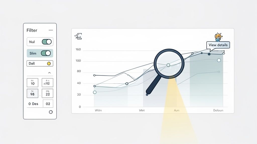
The heart of an interactive dashboard is giving people control over the data they're looking at. Usually, this comes down to filters, date pickers, and the ability to drill down into the details. These features let users slice and dice information on their own terms, making the dashboard relevant to their specific questions.
Here are the key interactive elements you’ll want to build in:
Intuitive Filters: Let users narrow down data by things like region, product line, or marketing channel. The controls should be obvious—dropdowns, checkboxes, and search bars are your best friends here.
Clear Date Pickers: Offer simple, pre-set options for common timeframes (like "Last 30 Days" or "This Quarter") but also include a custom date range selector for those who need to get more granular.
Drill-Down Paths: Let people click on a high-level number (like total sales) to see what's behind it (like sales broken down by each rep). This creates layers of information that users can peel back without ever leaving the main view.
When you implement these controls, you turn the dashboard from a one-way broadcast into a two-way conversation with the data. If you're building interfaces that need to feel effortless, the fundamentals of UX design for startups offer some great parallel principles.
Enhancing Clarity with Contextual Information
Interaction is about more than just clicking buttons. A truly usable dashboard gives people context right when and where they need it, which cuts down on confusion and builds their confidence. This is where the little details make a huge difference.
A usable dashboard anticipates the user's next question and provides the answer with minimal effort. Features like tooltips and clear labels aren't just decorations; they are essential guides that make data exploration smooth and frustration-free.
Think about adding these small but powerful usability features:
Helpful Tooltips: When someone hovers over a chart or a metric, a small pop-up should appear with more detail—the exact number, a quick definition, or some extra context. This keeps the main view clean.
Consistent Icons and Labels: Use icons everyone understands (like a calendar for a date picker) and keep your labels consistent across the entire dashboard. Predictability reduces the mental work for the user.
Loading Indicators: If a chart takes a few seconds to load new data, show a spinner or loading bar. This simple feedback reassures the user that the system is working and hasn't just frozen.
Clear Error Messages: If something goes wrong, don't just show a generic "Error." Give them a simple, human-readable message that explains the problem and suggests what to do next.
Putting these elements together creates an experience that feels seamless and forgiving. By focusing on both powerful interactions and these thoughtful little details, you build a dashboard that doesn't just present data—it empowers people to explore it with genuine curiosity.
Ensuring Accessibility and Responsive Design
What good are brilliant insights if half your team can't access them? In a world where work happens everywhere—from a huge desktop monitor in the office to a tablet on a train—building for flexibility isn't just a nice-to-have. It's a core part of effective dashboard design.
Think of it like building a physical office. You wouldn't design a building with only stairs, effectively blocking access for anyone with mobility challenges. A digital dashboard is no different. It has to be inclusive, ensuring every single person on your team can get to the data, regardless of their abilities or the device in their hand.
Designing for Every User
Accessibility is all about making sure people with disabilities can use your dashboard just as easily as anyone else. This goes way beyond just checking off a few boxes on a compliance list; it’s about creating an equal and empowering experience for everyone. With over 1 billion people worldwide living with some form of disability, this is a massive and critical consideration.
Here are a few key practices to get right:
High Color Contrast: Make sure your text and charts are actually readable. Use a contrast checker to ensure your color choices meet the Web Content Accessibility Guidelines (WCAG). It's a simple step that makes a world of difference.
Text Alternatives: Every single visual element that conveys meaning—from a bar chart to a simple icon—needs descriptive alt text. This is what screen readers announce to users who can't see the screen.
Keyboard Navigation: Can you use everything on the dashboard without a mouse? All your filters, buttons, and drill-downs must be fully usable with just a keyboard.
A truly accessible dashboard turns data from a privilege for the few into a shared resource for the entire team. It broadens the impact of your insights by making them universally available.
Creating a Responsive Layout
Beyond accessibility, your dashboard has to work on different screen sizes. A layout that looks fantastic on your 27-inch monitor can quickly become a jumbled, unusable mess on a phone. That's where responsive design saves the day.
A responsive layout doesn't just shrink everything down. It intelligently rearranges the components—stacking charts, resizing text, and simplifying menus—to fit the space perfectly. For example, a four-column grid on a desktop might reflow into a single, scrollable column on a mobile device.
This kind of adaptability is fundamental to modern interface design, a principle we live by as a web app development agency. By building on a flexible grid, you ensure that the most important information stays front and center, no matter how or where someone is viewing it.
Common Questions About Dashboard Design
Even when you know the principles, the actual process of designing a dashboard can throw you a few curveballs. Let's tackle some of the most common questions that pop up, so you can move from theory to a killer real-world dashboard with confidence.
Think of this as your quick-reference guide for those "what do I do now?" moments.
How Many Visualizations Should I Put on One Dashboard?
There’s no magic number, but a great rule of thumb is less is more. You should aim for somewhere between 5 and 9 visualizations. This isn't just a random range; it's based on how much information our brains can comfortably process at once without getting overwhelmed.
The real test is the 5-second rule: can someone look at your dashboard and get the main story in five seconds? If it’s cluttered with too many charts, the answer is a hard no. Be ruthless. Every single chart has to earn its spot by directly supporting the dashboard's main goal.
The point of a dashboard isn’t to show every piece of data you have. It’s to surface the most important questions, fast.
What's the Difference Between a Dashboard and a Report?
This is a big one, and it's easy to get them mixed up. They both show data, but they have completely different jobs.
Dashboards are for monitoring. Think of the dashboard in your car—it gives you a live, at-a-glance view of what’s happening right now so you can spot problems or trends immediately.
Reports are for deep analysis. They are static, detailed documents that dig into a specific topic over a certain period. You don't glance at a report; you read it to understand the details.
Simply put, a dashboard tells you what is happening. A report helps you understand why it happened.
What Are the Best Tools for Building Dashboards?
The "best" tool really depends on your team's skills, where your data lives, and your budget. For anyone looking to understand the tech that powers modern business analytics, it's worth learning What is Power Platform, as it includes some of the most popular BI tools on the market.
Here’s a quick breakdown to help you choose:
Tool Category | Best For | Examples |
|---|---|---|
Business Intelligence (BI) Platforms | Complex data analysis and enterprise-level dashboards. | Tableau, Power BI, Looker |
Spreadsheet Software | Simple, small-scale dashboards when your data is already there. | Microsoft Excel, Google Sheets |
Custom Code Libraries | Fully custom, unique dashboards embedded in an app. | D3.js, Chart.js, Highcharts |
Picking the right tool is less about finding the one with the most bells and whistles and more about what fits your team's workflow and goals.
At Shalev Agency, we turn complex data into clear, actionable dashboards that drive results. If you need a partner to design and build internal tools or products that save time and boost clarity, let's talk about your project.