Learn how to build a high-converting sales landing page. Discover proven strategies for headlines, copy, and design to turn visitors into paying customers.
Jan 11, 2026

A sales landing page is a special kind of webpage built for one reason and one reason only: to get a visitor to take a specific action that leads to a sale. Forget the multiple links, menus, and distractions you see on a typical homepage. A sales page is your digital closer, laser-focused on a single goal, whether that's getting someone to buy your product or book a demo.
What Makes a Sales Landing Page Your Best Salesperson
Think of your website's homepage like the busy entrance to a huge department store. You’ve got signs pointing to menswear, electronics, home goods, and maybe even a food court. A visitor has tons of options and can easily wander off without buying anything.
A sales landing page, on the other hand, is like a pop-up shop with just one amazing product in the window. There are no other departments to get lost in, no confusing exits—just a straight, clear path from the moment someone walks in to the moment they check out. This intense focus is precisely what makes it so incredibly effective at turning clicks into customers.
The Power of Singular Focus
The magic of a great sales page comes from eliminating choice. When you remove the main navigation menu, sidebar links, and footer distractions, you create a completely controlled environment. Every single element, from the headline down to the final call-to-action button, is there to support that one conversion goal.
And this isn't just a nice theory; it gets real results. Across different industries, landing pages see median conversion rates of around 6.6%, with the best ones pushing past 11%. In fact, just removing the main navigation can lift conversions by 10% because you're taking away the visitor's escape hatches. We’ve seen this time and again—when you want someone to do something, you have to remove anything that isn’t that one thing. You can find more insights about landing page performance and its impact on the user experience.
A great sales landing page is your most effective salesperson. It works 24/7, never needs a coffee break, and is perfectly scripted to address your ideal customer's exact needs and pain points.
How It Differs From a Homepage
It's crucial to understand that a sales page and a homepage are two different tools for two different jobs. They both represent your brand, but they serve completely different purposes.
To make it crystal clear, here’s a quick breakdown of how they stack up against each other.
Sales Landing Page vs Homepage: A Quick Comparison
Attribute | Sales Landing Page | Homepage |
|---|---|---|
Primary Goal | Drive a single, specific action (e.g., buy now, sign up). | Introduce the brand and guide visitors to multiple sections. |
Traffic Source | Targeted traffic from ads, emails, or social campaigns. | General traffic from direct visits, brand search, or referrals. |
Content Focus | Persuasive copy and visuals about one specific offer. | Broad overview of the company, products, and services. |
Navigation | Usually has no main navigation menu to limit distractions. | Features a full navigation menu to encourage exploration. |
Number of CTAs | Typically one primary Call-to-Action repeated on the page. | Multiple CTAs for different user journeys. |
At the end of the day, a homepage is built for exploration, while a sales landing page is built for conversion. Both are essential parts of a healthy marketing strategy, but they are absolutely not interchangeable. Sending your paid ad traffic to a generic homepage is like paying for a prime billboard and then hiding it in a maze—you're just making it harder for people to give you their money.
The Anatomy of a High-Converting Sales Page
A sales page that actually converts isn't just a happy accident; it's a finely-tuned machine. Every single element, from the headline down to the footer, has a job to do: guiding a visitor from a place of curiosity to a confident "yes." To build one that works, you have to understand proven landing page design best practices.
The best way to think about your page is like a conversation. You kick things off with a strong opening (your headline), give them a compelling reason to stick around (the value prop), build some trust (with visuals and social proof), and then, you ask for the sale (the call to action).
The Headline and Sub-headline
Your headline is, without a doubt, the most important piece of writing on the entire page. It’s the very first thing people see, and if it doesn't immediately click with them, they're gone. A killer headline isn't trying to be clever; it's laser-focused on clarity.
It has one job: answer the visitor’s unspoken question, "What's in it for me?"
For example, a headline like "The Future of Project Management" is vague and uninspiring. A much better approach would be something like, "Finish Projects 50% Faster and Never Miss a Deadline Again." See the difference? It hits a specific pain point and promises a tangible result.
The sub-headline is the headline's trusty sidekick. It’s there to add a little more context or drop another key benefit that pulls the reader further down the page.
A Clear and Irresistible Offer
The offer is the heart and soul of your sales page. It’s the product, the service, the thing you want your visitor to get. But a great offer is more than just the item itself—it's the entire value proposition you’re wrapping around it.
To make an offer feel truly irresistible, you need to spell out a few things:
What it is: The exact product, plan, or resource they're getting.
Who it's for: The specific type of person who will benefit most.
What problem it solves: The nagging pain point it makes disappear.
The transformation it delivers: How their life or work will be better after they buy.
This isn’t about listing features. It’s about translating those features into real-world benefits. A feature is what your product does; a benefit is how it makes your customer's life easier, better, or more successful.
Persuasive Copy and Compelling Visuals
We'll get into the nitty-gritty of copywriting later, but for now, know that your sales page copy must be persuasive, crystal clear, and all about the benefits. Use short sentences. Write scannable paragraphs. Talk to your audience like you're talking to a real person, using their language to solve their problems.
High-quality visuals—images, videos, GIFs—aren't just there to look pretty. They serve a strategic purpose.
Product shots let people see what they’re actually getting.
Hero shots show a real person happily using your product.
Videos can demo a complex feature or deliver a powerful testimonial.
Good visuals break up the text, make the page less intimidating, and build an emotional desire for what you're selling.
Trust-Building Social Proof
Let's be honest: people are skeptical. They're far more likely to buy something when they see that other people have already bought it and loved it. That's where social proof comes in.
A visitor lands on your page with a healthy dose of skepticism. Social proof is your tool for dismantling that skepticism and building a foundation of trust.
You have lots of options for showcasing social proof:
Customer testimonials: Real quotes from happy customers, ideally with a name and photo to make them more credible.
Case studies: Deeper dives into a customer's success story.
Trust seals and certifications: Logos from security providers (like Norton or McAfee) or industry authorities.
"As seen on" logos: Showcasing media outlets or big-name brands that have featured you.
Placing social proof right next to your call-to-action button is a pro move. It gives visitors that final nudge of reassurance right when they’re about to make a decision. For a deeper look at building trust, check out our complete guide on what makes a good landing page truly effective.
The All-Important Call to Action (CTA)
The Call to Action is the moment of truth. It's the final instruction you give your visitor, so it needs to be direct, compelling, and impossible to misunderstand. Generic CTAs like "Submit" or "Click Here" are just wasted opportunities.
Instead, use action-oriented words that hint at the benefit. "Get My Free Ebook" is infinitely better than "Download." In fact, personalizing your CTAs can boost conversions by over 200%. This is one of those small tweaks with a huge impact, just like how adding a phone number can lift signups by 14.8% or how lead magnets can drive 55% of all form submissions on a page.
Your CTA button needs to pop visually, so use a color that contrasts with the rest of your page. And don't be shy about repeating it. A good rule of thumb is to place a CTA after every major section, making it easy for someone to take action the moment they feel ready.
Building Your Sales Page From the Ground Up
Alright, we've covered the essential parts of a sales page. Now, let's get our hands dirty and actually build one. Creating a landing page that pulls in sales isn't about random creative whims; it's a methodical process. The real work starts way before you touch a design tool or write a line of code. It all begins with a solid strategy.
First, you need to get crystal clear on three fundamental questions:
Who are you talking to? And I mean really talking to. Forget basic demographics. What keeps your ideal customer up at night? What are their biggest headaches, deepest desires, and the nagging doubts that stop them from buying?
What are you offering? Nail down the core value of your product or service in one powerful sentence. What's the real transformation you provide?
What do you want them to do? Decide on one single, non-negotiable goal for this page. Is it to click "Buy Now," book a demo, or download something? Every single element on the page must push them toward that one action.
Charting the User Journey
Once your strategy is locked in, it's time to map out the visitor's path. This is where you create a wireframe—a simple, black-and-white blueprint of your page. A wireframe is your best friend because it forces you to focus on structure and flow without getting sidetracked by pretty colors and fonts.
The whole point is to establish a strong visual hierarchy. This just means arranging things so the visitor's eyes naturally go where you want them to go, in the right order. Your headline needs to grab them by the collar first. Then, you hit them with your irresistible offer, back it up with social proof, and finally, present a clear call to action.
Think of it as telling a story. Each section builds on the one before it, guiding the visitor logically and persuasively to the final chapter: the conversion. This is your chance to decide where to place images, testimonials, and CTAs for the biggest punch.
This little diagram breaks down the core flow. It shows how a killer headline, a clear offer, and a compelling call-to-action all work together to turn a casual visitor into a customer.
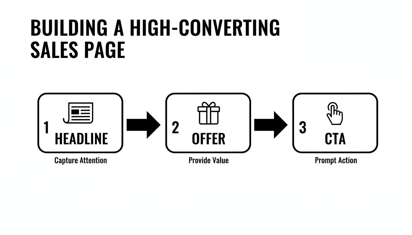
The journey from stranger to customer is all about a logical progression. You start by grabbing their attention and end by telling them exactly what to do next.
Designing for Every Device
These days, assuming people are on a desktop is a huge, costly mistake. Over half of all web traffic comes from mobile, so a mobile-first design isn't just a nice-to-have; it's a must. This means you design the mobile version of your sales page first, then adapt it for bigger screens like tablets and desktops.
This approach forces you to be ruthless. On a tiny screen, there's no space for fluff. You have to prioritize the most critical information and make sure your buttons are big enough for clumsy thumbs to tap easily.
A page that’s awkward or hard to read on a phone is a page that won’t convert. Period. Test your design on actual phones and tablets, not just a browser simulator, to see how it really feels.
Technical Foundations for Success
A beautiful, persuasive sales page is completely useless if it's slow. Page speed is a massive conversion factor. We've seen studies show that a page loading in under 1 second can hit a conversion rate over 31%. That number plummets to just under 10% if the page takes 5 seconds to load. A slow page isn't just annoying; it's actively losing you money.
To get your page up to speed, you need to:
Compress your images. Use tools to shrink image file sizes without making them look pixelated.
Minimize your code. Clean up any clunky HTML, CSS, and JavaScript that's slowing things down.
Use good hosting. Your web host plays a bigger role in page speed than most people think.
Beyond speed, you have to pick the right platform to build on. Your options range from dedicated landing page builders like Unbounce or Leadpages to more flexible powerhouses like Webflow or a fully custom-coded site. The best choice really depends on your team's tech skills, budget, and how much custom work you need. For example, teams that need serious design freedom and complex integrations often go for Webflow. We cover how these choices affect conversions in our guide on landing page design best practices.
The Agency Approach to Building a Sales Landing Page
Here at the agency, we treat every sales page like a mission-critical project. It's a highly collaborative and iterative process to make sure the final product isn't just pretty but is truly engineered to perform. We kick things off with discovery sessions to get everyone aligned on the audience and the offer, then we jump into tools like Figma to map out the wireframes and user flow.
Once the blueprint gets the green light, our design team builds a high-fidelity mockup that brings the brand's look and feel to life. At the same time, our dev team is planning the technical side, focusing on things like scalability, speed, and clean code. Running these tracks in parallel ensures design and development stay perfectly in sync, which prevents those awful last-minute surprises and guarantees a smooth launch. It's this structured approach that turns a simple idea into a powerful, revenue-generating asset.
Writing Compelling Copy That Sells
You can have the most beautiful sales page in the world, but if the words fall flat, it's just a pretty picture. Think of it like a Ferrari with an empty gas tank—it looks incredible but isn't going anywhere. Your copy is the engine. It’s what grabs attention, builds desire, and ultimately convinces a visitor to act.
Great sales copy isn't about using fancy words or sounding "corporate." It’s about being clear, showing empathy, and making a real connection with your reader. Your one and only job is to make them feel completely understood and confident that your product is the exact solution they’ve been looking for.
Thankfully, you don't have to start from a blank page. You can lean on proven copywriting frameworks to structure your message. These aren't rigid rules but more like battle-tested recipes that help your argument flow logically, guiding the reader straight to your call to action.
Mastering Proven Copywriting Frameworks
For a sales landing page, two frameworks stand out as simple, reliable, and incredibly effective: PAS and AIDA. They give you a roadmap for building a persuasive argument from the ground up.
1. PAS (Problem-Agitate-Solution) This one is my personal favorite because it taps directly into your customer’s pain points. It’s direct, empathetic, and perfectly positions your offer as the only logical answer.
Problem: Kick things off by calling out the specific problem your audience is wrestling with. Use their language, not yours, to show you get it. (e.g., "Are you sick of wasting hours every Monday pulling the same old reports?")
Agitate: Now, don't just state the problem—twist the knife a little. Describe the real frustration, the wasted time, and what happens if the problem isn't solved. (e.g., "That's precious time you could spend on big-picture strategy, but instead, you're stuck in spreadsheet hell, just copying and pasting.")
Solution: With the pain fresh in their mind, introduce your product as the clear, simple way to make it all disappear. (e.g., "Our dashboard automates your reporting in minutes, giving you your Monday back.")
2. AIDA (Attention-Interest-Desire-Action) AIDA works by building momentum, moving the reader from a casual glance to a confident decision. It's a classic for a reason.
Attention: Hook them immediately with a powerful, benefit-focused headline.
Interest: Keep them reading with fascinating facts, relatable stories, or surprising stats about their problem.
Desire: This is the critical shift from features to benefits. Don’t just list what your product does; paint a vivid picture of how much better their life will be with it.
Action: Leave no room for doubt. Tell them exactly what to do next with a clear and compelling call to action.
Your sales copy isn't about you or your company. It's about your customer. The best copy makes the reader the hero of their own story, and your product is just the magic sword that helps them win.
From Features to Benefits
One of the most common mistakes I see on a sales landing page is a long list of features. A feature is what your product is or does. A benefit is the amazing outcome the customer gets because of that feature.
Remember, people don't buy a drill because they want a drill; they buy it because they want a hole in the wall. You have to connect every feature back to a tangible, emotional payoff for the user.
Feature (What it is) | Benefit (What it does for them) |
|---|---|
"Our software uses AI-powered analytics." | "Make smarter decisions and find hidden profit opportunities without needing a data science degree." |
"This backpack is made from water-resistant nylon." | "Your laptop and documents stay completely safe and dry, even if you get caught in a sudden downpour." |
"We offer 24/7 customer support." | "Get expert help the moment you need it, so you never feel stuck or alone." |
This simple change in perspective is a game-changer. It turns the conversation from "Here's our cool stuff" to "Here's how your life is about to get so much better."
The Power of Microcopy
Finally, don't sleep on the little words. The tiny bits of text on your page—what we call microcopy—can have a huge impact. This includes the text on your buttons, the helpful hints in your forms, and the little reassurances right next to your CTA.
A button that just says "Submit" is a wasted opportunity. Instead, make it about the value they're about to get:
"Get Your Free Template"
"Start My 14-Day Trial"
"Book My Free Demo"
Good microcopy reduces anxiety and friction. A tiny line under an email field like, "We hate spam as much as you do," can be the final nudge someone needs to convert. On a sales page, every single word counts.
Testing and Optimizing Your Page for Better Results
Getting your sales page live isn't the end of the job—it’s just the beginning. A page that works today can always work harder tomorrow. I've learned from years of experience that a great sales landing page is never really 'finished.' It's a living asset that you have to keep refining with data-driven testing.
Think of it this way: your first draft is your best-educated guess. Now it's time to let your audience's actual behavior tell you what really works. This is how you turn guesswork into a reliable system for increasing your sales over time.
Setting Up Analytics and Tracking KPIs
Before you even think about changing a single word, you need your measurement tools in place. Without data, you’re just flying blind. You have to track Key Performance Indicators (KPIs) to know if the changes you're making are actually helping.
Your main focus should be on a few core metrics:
Conversion Rate: This is your North Star. It's the percentage of visitors who do what you want them to do (like buying something or booking a demo). Even a small lift here can have a massive impact on your bottom line.
Cost Per Acquisition (CPA): If you're paying for traffic, this tells you exactly how much it costs to land one customer. The goal is always to get this number lower without sacrificing lead quality.
Bounce Rate: This is the percentage of people who hit your page and leave immediately. A high bounce rate can be a red flag that your headline is off or your offer isn't hitting the mark.
Time on Page: Simply, how long are people sticking around? If this number is low, your copy probably isn't engaging enough to keep their attention.
Get these set up in a tool like Google Analytics. Knowing your baseline numbers is absolutely critical before you can start running any meaningful experiments.
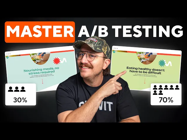
The Core of Optimization: A/B Testing
A/B testing, or split testing, is the engine that drives optimization. The idea is pretty simple: you create two versions of your page—Version A (the original) and Version B (the new challenger)—and show them to different groups of visitors to see which one performs better.
The trick is to be methodical. You must test only one thing at a time. If you change both the headline and the button color, you'll have no clue which change actually made the difference.
So, what should you test? I always recommend starting with the elements that have the biggest potential impact.
The Headline: Try a benefit-focused headline against one that pokes at a pain point. For example, "Finish Projects 50% Faster" versus "Stop Missing Project Deadlines."
The Call to Action (CTA): Play with the button text ("Get Started Now" vs. "Claim Your Free Trial"), the color (a high-contrast color often works well), and even its placement.
The Offer: Sometimes, just framing the offer differently makes all the difference. A "30-day money-back guarantee" might feel safer to your audience than a "14-day free trial."
Layout and Visuals: Test a version with a powerful video testimonial against one with static images. You could even pit a long-form page against a shorter, more direct version.
A/B testing isn't about finding some mythical "perfect" page. It’s about building a culture of continuous improvement, where every test teaches you something valuable about what your customers really want.
Going Deeper with User Behavior Tools
A/B tests tell you what is happening, but they don't always explain why. To get that deeper layer of insight, you need to actually watch how people are interacting with your page.
Heatmaps are fantastic for this. These tools, like Hotjar, create visual reports showing where people are clicking, moving their mouse, and how far down the page they scroll. A heatmap might show you that 75% of users never scroll past your first section, which is a clear signal to move your most important message up.
Session recordings take it a step further by giving you anonymous video playbacks of real user visits. Watching these can be an eye-opening experience. You might see someone rage-clicking a broken button or hesitating over a confusing form field—problems you would never spot just by looking at analytics. To really get a handle on this, check out these 10 proven e-commerce conversion rate optimization tips.
When you combine the quantitative data from A/B tests with the qualitative insights from user behavior tools, you create a powerful feedback loop for improvement. Our guide on conversion rate optimization best practices is a great resource if you want to dive deeper into this process. This disciplined approach is how you turn a good landing page into a finely-tuned conversion machine.
Answering Your Top Sales Landing Page Questions
Once you start building a sales landing page, you’ll inevitably run into some nitty-gritty questions. The details matter—a lot. Getting them right can make the difference between a page that falls flat and one that becomes a conversion machine. Let's tackle the three most common questions we get from founders and marketing teams.
How Many Form Fields Is Too Many?
The golden rule here is simple: only ask for what you absolutely need. Every single field you add is another bit of friction, another potential reason for someone to bounce.
Think about what you’re offering. If it’s something low-commitment, like a newsletter subscription or a free checklist, just ask for an email. That's it. You want to make it ridiculously easy for them to get the good stuff.
Now, if you're offering something with higher stakes, like a one-on-one demo or a custom quote, it's fair to ask for more. A name, company, and maybe their role can help your sales team qualify the lead. But even then, start with the absolute minimum. You can always gather more information later in the process.
Should I Really Remove the Navigation Menu?
Yes. One hundred percent. Think of a navigation menu as a collection of escape hatches. Your sales landing page has one job—and only one job—to get the conversion. Any link that leads away from that goal is a distraction.
By stripping out the main navigation, footer links, and other shiny objects, you create a self-contained, focused environment.
This simple tweak is one of the most powerful optimizations you can make. It forces your visitor to engage with your offer and make a clear choice: convert or leave.
This isn’t about tricking or trapping anyone. It’s about giving them a clear, uncluttered path to the value you promised. You're closing the door to a noisy hallway so you can have a focused conversation.
What’s a Good Conversion Rate, Anyway?
This is the million-dollar question, and the honest answer is: it depends. You’ll see stats all over the internet citing an average of 2-5%, but comparing yourself to a different industry or business model is a recipe for frustration. A page selling a $2,000 online course will naturally convert at a much lower rate than a page offering a free e-book.
Instead of chasing a magic number, focus on your own data. Your most important benchmark is your last result. If your page hit 3% last month, your only goal should be to beat that this month through smart, consistent testing. While the best pages can certainly hit 10% or more, the real victory comes from the relentless process of improvement.
At Shalev Agency, we live and breathe this stuff, building high-quality websites and internal tools that are built to convert from the get-go. If you need a partner to help you ship faster and get real results, see how we can help.