Discover what makes a good landing page with our definitive guide. Learn how to optimize headlines, CTAs, design, and trust signals to boost your conversions.
Jan 11, 2026

So, what actually makes a good landing page? It’s not just a random page on your website. Think of it as a highly focused, standalone page built for one single purpose: getting a visitor to take a specific action.
Unlike your homepage, which is like a busy lobby with doors leading everywhere, a landing page is a private room with only one exit. It strips away all the usual distractions—like site navigation or links to other content—to guide the visitor toward a single goal, whether that's signing up for a newsletter, downloading an ebook, or making a purchase.
The Anatomy of a Landing Page That Actually Converts
Imagine you have a salesperson who is an absolute master at selling one specific product. They know exactly what to say, when to say it, and how to close the deal. That’s your landing page. It’s a specialist, not a generalist.
This razor-sharp focus is its superpower. Every single element, from the headline down to the button text, works together to persuade the visitor. There are no competing messages, no confusing options—just a clear, straight path to conversion. You’re making it incredibly easy for them to say "yes."
How the Core Pieces Fit Together
To pull this off, a few key components need to work in perfect sync. Each one has a specific job to do in convincing your visitor to act.
A Killer Headline: This is your first—and maybe only—shot. It has to grab their attention instantly and scream the main benefit of what you’re offering.
Persuasive Copy: This is where you back up the headline's big promise. The copy needs to explain the value, speak directly to the visitor's problems, and build a genuine desire for your solution.
A Can't-Miss Call-to-Action (CTA): This is the finish line. The CTA button must stand out visually and use simple, action-focused words (like "Get My Free Guide" instead of just "Submit").
This diagram shows how these pieces flow together visually.
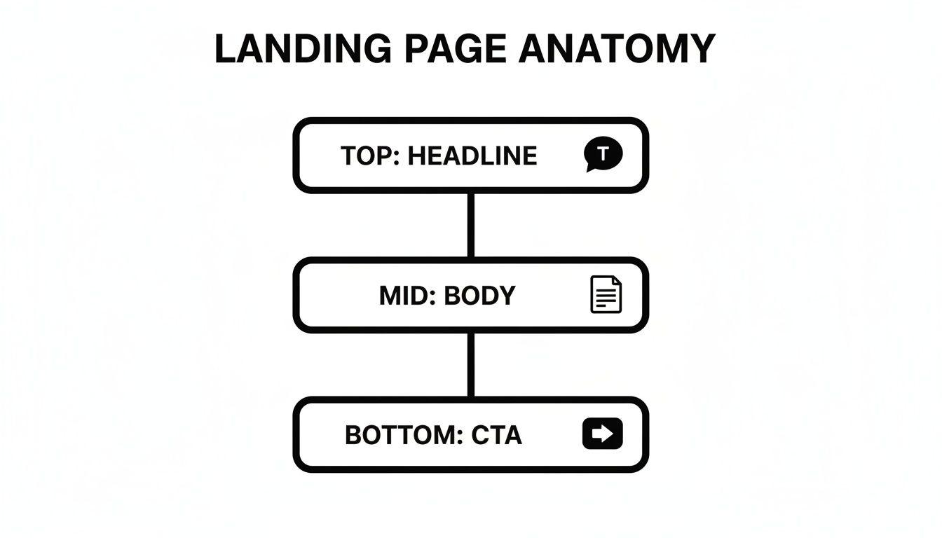
As you can see, the structure naturally guides a visitor's eyes from the attention-grabbing headline, through the supporting details, and right to the final action you want them to take.
To really nail this, you need to understand the non-negotiable elements that make a landing page work. This table breaks them down.
Essential Components of a Landing Page That Converts
Component | Purpose | Key Objective |
|---|---|---|
Headline & Sub-headline | To grab attention and communicate the core value proposition instantly. | Make the visitor want to keep reading. |
Hero Image or Video | To visually represent the offer and create an emotional connection. | Show, don't just tell, the benefit. |
Persuasive Copy | To explain the benefits, address pain points, and overcome objections. | Build a logical and emotional case for the offer. |
Call-to-Action (CTA) | To prompt the user to take the desired next step. | Make the action clear, easy, and compelling. |
Trust Signals | To build credibility and reduce visitor anxiety. | Show proof with testimonials, logos, or reviews. |
Lead Capture Form | To collect visitor information in exchange for the offer. | Keep it short and ask only for what's necessary. |
Each of these parts has a role to play. When they all work together, the page becomes a seamless, persuasive experience.
A great landing page doesn’t just list features; it tells a story. It anticipates the visitor's doubts, answers their unspoken questions, and builds a bridge of trust that leads directly to conversion.
Getting these elements right is foundational. To go deeper, it’s worth exploring the top landing page design best practices that successful marketers use. These principles cover everything from layout psychology to color theory, and they are what separate a page that looks nice from one that actually gets results.
Crafting Your Headline and Hero Section
You’ve got less than three seconds to hook a visitor. Seriously, that’s it. In that tiny window, the very first thing they see—your hero section—has to convince them they’re in the right place. It needs to instantly and clearly answer their unspoken question: "What's in it for me?"
If you fail here, they’re gone. It's that simple.
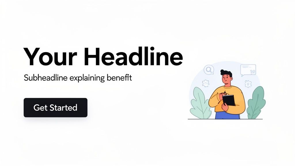
Think of your hero section like a book cover. It’s not just one thing; it's a powerful trio—a punchy headline, a clarifying sub-headline, and a compelling visual. Together, they tell one single, persuasive story that makes someone want to keep reading. Get this part wrong, and that back button gets clicked before you know what happened.
The Power of a Benefit-Driven Headline
Let's be clear: your headline is the most important sentence on your entire landing page. Its job is not to be clever or witty. Its job is to be brutally clear and communicate the single biggest benefit of your offer.
A classic mistake is leading with features. A headline like "Advanced AI-Powered Task Manager" tells me what your product is. A much stronger headline, "Automate Your To-Do List and Save 10 Hours a Week," tells me what it does for me. Feel the difference?
A great headline focuses on the desired outcome, not the mechanism that achieves it. It sells the destination, not the airplane.
This small but mighty shift—from features to benefits—is at the very heart of high-converting landing pages. It taps directly into your visitor's problems and goals, making your offer feel immediately relevant.
Writing Headlines That Grab Attention
The good news is you don’t need a degree in copywriting to write a killer headline. There are plenty of proven formulas that can give you a fantastic starting point.
Here are a few structures that consistently work wonders:
The "How To" Formula: This is a classic for a reason. It speaks directly to a user's goal. Think: "How to Master SEO in 30 Days."
The Question Formula: Pique their curiosity by asking a question they're already asking themselves. For example: "Tired of Juggling Multiple Marketing Tools?"
The Direct Benefit Formula: This is often the simplest and most powerful approach. A famous example is Slack’s old headline: "Be More Productive at Work with Less Effort."
Play around with these. Try to write a few versions of your headline using each formula. Keep it short, sharp, and always focused on what the user gets out of it.
Choosing Visuals That Connect
The image or video in your hero section is just as crucial as your headline. It can create an emotional connection and provide context in a split second—something words alone can't do. But a bad visual can be worse than no visual at all.
Whatever you do, stay away from generic stock photos. We've all seen them, and they scream "inauthentic," which instantly erodes trust.
Instead, a strong hero image should do one of three things:
Show the Product in Context: Have a physical product? Show a clean, high-quality shot of it being used by someone who looks like your ideal customer.
Illustrate the End Result: If you're selling a service or a digital product, show the successful outcome. For a fitness app, that might be a photo of someone looking happy and full of energy.
Create an Emotional Connection: Use images of real people who reflect the emotion your audience wants to feel—be it relief, confidence, or success.
When your headline, sub-headline, and hero image all work in perfect harmony, you create an irresistible first impression. It stops visitors in their tracks and gives them every reason to scroll down and hear what else you have to say.
Writing Persuasive Copy That Drives Action
Alright, so your hero section got them to stick around. Now what? The rest of the copy on your landing page has to do the real work. This is your chance to make a convincing case for why your offer is the right choice, moving someone from "just looking" to "I need this."
Great copy isn’t about using big words or industry jargon. It’s about telling a simple, clear story that makes clicking your call-to-action button feel like the most natural next step.
The secret is to stop talking about features and start talking about benefits. A feature is what your product has—say, "a 12-megapixel camera." A benefit is what your customer gets—"capture crystal-clear family photos you'll cherish forever." People don't buy drills; they buy holes in the wall. Always remember that.
Your copy needs to connect with their real-world problems and desires. Paint a vivid picture of how much better their life will be once they take you up on your offer. When you do that, it stops feeling like a sale and starts feeling like a solution.
Focus on Benefits and Solve Problems
Every single person who lands on your page is there because they have a problem they're trying to solve. Your copy's one and only job is to convince them you understand that problem inside and out—and that you have the perfect answer.
Put yourself in their shoes. What are their biggest headaches? What are they truly trying to accomplish? Frame everything you write around those points.
A tried-and-true framework for this is Problem-Agitate-Solution (PAS):
Problem: State the pain point they're dealing with right now.
Agitate: Dive a little deeper. Remind them of the frustration and annoyance that problem causes.
Solution: Present your offer as the obvious, simple way to make all that pain go away.
This simple storytelling arc creates an emotional connection, making your solution feel like a genuine relief, not just another product on the market.
Use Scannable Formatting and Storytelling
Let's be honest: nobody reads a wall of text online. People scan. They skim. Your formatting is just as crucial as the words you choose.
Break up your content. Use clear headings, short paragraphs, and bullet points to make your key messages pop. This creates a visual path for the reader's eye, guiding them effortlessly from one important point to the next. Easy-to-scan content is a cornerstone of what makes a good landing page work.
Beyond the basics, there are proven persuasion techniques in writing to master copy that converts readers that can take your page to the next level. These are the methods that help you build desire and knock down a visitor's objections before they even fully form.
Build Credibility with Social Proof
Even the most amazing copy will be met with a healthy dose of skepticism. You have to prove you can deliver on your promises, and that's where social proof comes in. Sprinkle in testimonials, case studies, or logos from clients they'll recognize.
A great trick is to place a powerful customer quote right after you make a big claim. It’s like having someone else jump in and say, “Yep, it’s true!” This instant validation makes your words far more believable.
The data backs up a "less is more" approach. Short, focused landing pages with one clear CTA convert 13.5% better than long, rambling ones. In fact, pages with fewer than 500 words can outperform those with over 1,000 words by a whopping 50%. Keep it concise to keep your visitor focused on the goal.
Ultimately, you're building a narrative. Each piece of your copy should flow smoothly into the next, building momentum until clicking that button feels like the only logical conclusion. If you're looking for more strategies to capture visitor interest, our guide on how to increase lead generation is a great next read.
Designing for Clarity and Conversion
Great design isn't about being flashy or jumping on the latest trends; it's the silent partner in persuasion. It works behind the scenes, creating a smooth, intuitive journey that leads your visitor straight to the one action you want them to take. When it's done right, good design makes converting feel like the most natural next step.
Think of your landing page as a well-lit path through a forest. Every design choice—the colors, the spacing, the layout—is a signpost, gently nudging the visitor toward their destination: your call-to-action button. If that path is cluttered or the signs are confusing, they'll wander off and you'll lose them for good.
This is what a good landing page is all about—it's a masterclass in focus, where every single pixel has a job to do.
The Power of Visual Hierarchy
Visual hierarchy is simply the art of arranging things on the page to show what’s most important. It’s how you tell visitors, without words, what to look at first, second, and third. With a strong hierarchy, your most critical message—your headline and your CTA—are impossible to miss.
You can create this effect with a few simple but powerful tools:
Size and Scale: Bigger things grab our attention first. Your main headline should always be the largest text on the page, and your CTA button needs to be big enough to stand out.
Color and Contrast: A bright, colorful button on a muted background is like a magnet for the eyes. Use high contrast to make your CTA practically jump off the page.
Whitespace: Don't be scared of empty space! Whitespace (or negative space) is your best friend for reducing clutter. It gives your important elements room to breathe, making them easier to focus on.
When you get these principles right, you create a visual flow that guides users logically from your value proposition straight to the conversion point. If you want to go deeper on this, check out our guide on website design for conversion.
Remove All Distractions
One of the boldest—and most effective—design moves you can make is to completely remove your website’s main navigation bar. It sounds wrong, I know, but a landing page isn't just another page on your site. Its job is to create a singular focus.
A landing page with lots of links is like a salesperson who keeps pointing out other stores you could visit. By removing navigation, footers, and other ways to leave, you close all the exits and keep the visitor focused on the one path you want them to take.
This one simple change can have a massive impact on your conversion rates. It turns your page from a place for browsing into a focused conversion machine.
Design for Mobile First
With most web traffic now coming from smartphones, a "mobile-first" approach isn't just a good idea—it's non-negotiable. This means you design the mobile experience first, then adapt it for bigger screens, not the other way around.
On a small screen, clarity is everything. That means you need:
Large, readable fonts so people aren't pinching and zooming.
Thumb-friendly buttons with plenty of space around them to prevent accidental taps.
A single-column layout that feels natural and intuitive to scroll through.
A clunky mobile experience will kill your conversions instantly. Make sure your page loads fast and looks amazing on any device to capture every single lead.
Crafting a Frictionless Form
Finally, if your CTA leads to a form, that form's design is absolutely critical. The goal here is to make filling it out as quick and painless as possible. Every single field you add creates more friction and gives someone another reason to give up.
Here’s how to build a form that people will actually complete:
Ask for Essentials Only: Only request the information you absolutely need right now. Do you really need a phone number for an ebook download? Probably not.
Use a Single-Column Layout: It’s much easier for people to follow down the page, especially on their phones.
Provide Clear Error Messages: If someone messes up a field, tell them exactly what’s wrong and how to fix it. Don't make them guess.
By designing every element with clarity and conversion as your North Star, you build a page that not only looks professional but also works tirelessly to achieve its one, specific goal.
7. Build Trust and Overcome Skepticism
Even with the slickest design and the most compelling copy, a visitor won't take the next step if they don’t trust you. In a world full of online noise and empty promises, people are naturally skeptical. Your landing page has to actively break down that wall of doubt.
Think of it like this: trust is the currency of conversion. Without it, you’re just a stranger asking for an email address or a credit card number. That’s a tough sell. Every single element on your page needs to work together to make visitors feel safe, confident, and understood.
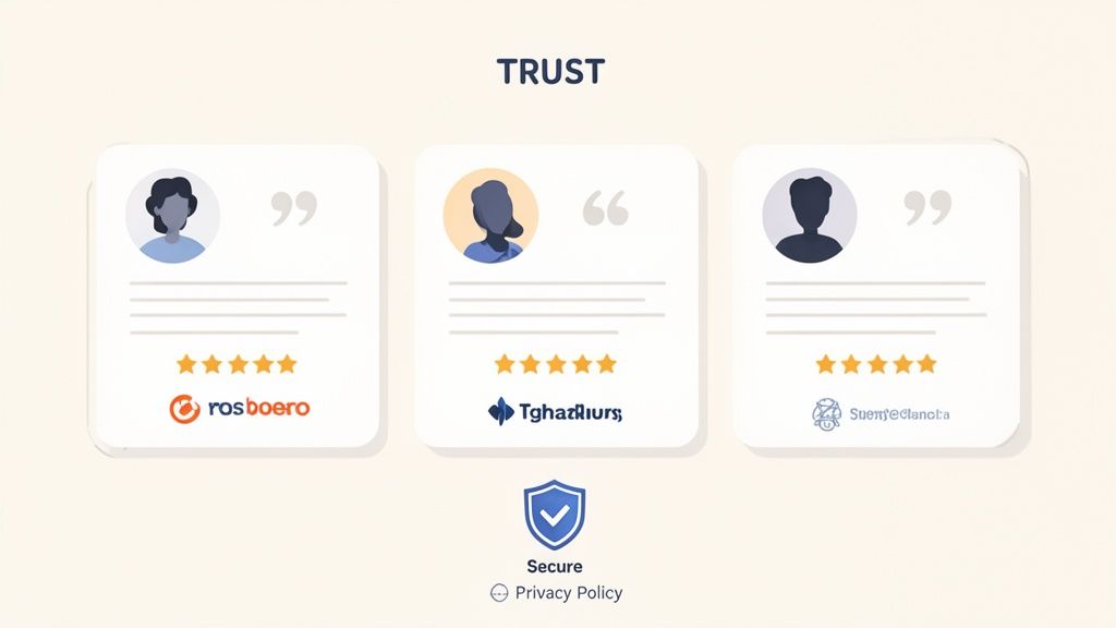
The best way to build this trust? Let other people do the talking for you. This is the whole idea behind social proof, a powerful psychological trigger where we look to others to decide how we should act. It’s why you’ll choose a restaurant with a line out the door over the empty one next to it. The crowd tells you it must be good.
Put Powerful Social Proof to Work
Social proof isn't just a nice little addition; it's a core part of your conversion engine. When someone sees that real people or well-known companies have already gotten value from you, their hesitation starts to melt away.
Here are the most effective forms of social proof to use on your landing page:
Customer Testimonials: Specific, authentic quotes from happy customers are pure gold. Always use a real name, title, and photo to make them believable.
Client Logos: If you're in B2B, showing the logos of companies you've worked with is an instant stamp of approval. It’s a visual shortcut to credibility.
Detailed Case Studies: For bigger-ticket items, nothing beats a solid case study that walks through a customer's problem and shows how you delivered a fantastic result with real data.
Reviews and Ratings: We're all wired to understand star ratings. They’re a quick, visual signal of quality that works wonders for e-commerce products and local services.
Don't just stick these anywhere. Place them right next to your call-to-action or alongside a major benefit you're promising. This timing is crucial—it backs up your claims right at the moment of decision.
Social proof is effective because it shifts the conversation from "what this company says about itself" to "what other people are saying about it." That third-party validation is infinitely more powerful than any marketing slogan you could ever write.
More Ways to Build Credibility
While social proof is a heavyweight champ, it’s not the only tool in your belt. Other, more subtle signals can work together to reassure visitors that you're a legitimate, secure business they can feel good about.
Make sure you've covered these trust signals:
Security Badges: Logos from names like Norton or McAfee, or simply highlighting your SSL certificate (the little padlock), instantly tell people their data is safe with you.
A Clear Privacy Policy: Having an easy-to-find link to your privacy policy shows you’re transparent and respect people's data—a huge concern for everyone online.
Easy-to-Find Contact Info: A phone number, email address, or physical location proves you're a real company with real people behind it, not some fly-by-night operation.
Guarantees or Return Policies: A money-back guarantee or a simple return policy completely removes the financial risk for your visitor. It makes saying "yes" a whole lot easier.
Each of these elements chips away at a visitor’s natural skepticism. When you combine them, you create a strong sense of security that is absolutely essential for a landing page that converts.
Tuning Your Page and Measuring What Works
Getting your landing page live isn't crossing the finish line—it's just the starting gun. Think of your first version as a best guess. The real work starts now, using real-world data to turn that guess into a high-performing conversion machine.
This entire process rests on a critical technical foundation: page speed. We live in an age of instant gratification, and a slow-loading page is a guaranteed way to lose potential customers. Even a one-second delay in mobile load times can slash conversion rates by up to 20%. That’s not a small hiccup; it’s a direct hit to your revenue because people will simply leave before they even see what you’re offering.
The Art of Getting Better Through Testing
Once your page is technically solid and loads quickly, it’s time to fine-tune your messaging with A/B testing. This isn't about making random changes based on a gut feeling. It’s a disciplined, scientific way to figure out what actually connects with your audience.
A/B testing, also known as split testing, is essentially a controlled experiment for your page. You create two versions—an "A" version (the control) and a "B" version (the challenger)—with just one key difference between them. For example, you might test:
A completely different headline that highlights a new benefit.
A new color for your call-to-action button to see if it stands out more.
A customer testimonial versus a detailed case study to see which one builds more trust.
You then send half of your traffic to version A and the other half to version B. The data will tell you, without a doubt, which one performs better. This takes the guesswork out of the equation and gives you clear, actionable insights. For a practical walkthrough, check out our guide on simple A/B testing for Framer.
Tracking the Right Numbers to See What Matters
To know if your tests are actually making a difference, you have to track the right metrics. Your conversion rate—the percentage of visitors who take the action you want—is your ultimate guide. But other numbers provide the full story.
The goal is to move beyond simply knowing what happened and start understanding why it happened. This is how you make intelligent, repeatable improvements instead of just getting lucky once.
Here are the key metrics you should be watching:
Bounce Rate: The percentage of visitors who land on your page and leave without doing anything else. A high bounce rate might signal a weak headline, slow load times, or a disconnect with your ad.
Time on Page: How long people are sticking around. Longer times usually mean they’re engaged and actually reading what you've written.
Click-Through Rate (CTR): The percentage of visitors who click your call-to-action. This is a direct measure of how compelling your CTA is.
Recent studies show just how much performance can vary. While the median landing page conversion rate in a massive study was a respectable 6.6%, a poor user experience is enough to make 88% of visitors give up and leave. And with mobile traffic growing every day, hitting or beating that benchmark is non-negotiable.
Here's another powerful stat: scaling from just 10 to 40 landing pages can boost leads by as much as 12x. This really drives home the power of a refined, data-driven strategy. You can find more fascinating insights in these landing page conversion stats on amraandelma.com.
Landing Page FAQs
You’ve got the basics down, but let's face it, the real world throws curveballs. Here are some quick answers to the questions that pop up most often when you're in the trenches, building and refining your landing pages.
How Many CTAs Should a Landing Page Have?
Keep it simple: one primary call-to-action (CTA). That's it. The entire point of a landing page is to eliminate distractions and channel a visitor toward a single, specific goal. When you add more options, you introduce confusion and give people an excuse to leave.
Think of your landing page as an express lane to a single destination. Every extra link or button is a potential off-ramp. You can absolutely place that same CTA button multiple times on the page—one above the fold and another at the bottom, for example—but they must always point to the same action.
What’s a Good Conversion Rate for a Landing Page?
This is the million-dollar question, and the honest answer is: it depends. A “good” rate is completely relative to your industry, your traffic source, and what you’re asking people to do. The median conversion rate across all industries sits around 6.6%, but that number can be seriously misleading.
A high-ticket B2B service might be thrilled with a 2-3% conversion rate, while a free e-book download could easily hit 10% or more. So instead of fixating on a universal benchmark, focus on these two things:
Your Niche: Look up what’s considered average for your specific industry.
Your Own Progress: The most important metric is your own. Track your current rate and aim to consistently beat it.
The real win isn't hitting some arbitrary number—it's about continuous improvement. A highly tuned landing page can and often does achieve double-digit conversion rates, blowing past the general averages.
Should I Use a Video on My Landing Page?
Absolutely. A well-placed video can do wonders for your conversion rate. It’s an amazing way to explain a complex idea quickly, build a human connection, or just show your product in action. Video grabs attention in a way static text and images just can't.
But here’s the catch: a bad video is worse than no video at all. If you're going to do it, you have to nail the execution. Make sure your video is:
High-Quality: Shaky, low-res footage screams unprofessionalism and tanks your credibility.
Short and Sweet: Get straight to the point. Your video needs to support the page's one goal, not go off on a tangent.
Fast to Load: A video that buffers forever will kill your page speed and send visitors clicking the back button.
When done right, a video with a compelling thumbnail acts like a magnet, drawing people in and convincing them to take action. It's a powerful tool to have in your kit.
Ready to build landing pages that don't just look good, but actually convert? At Shalev Agency, we combine research-backed design and development to create high-performing websites that drive real results. Let's build something great together.