
Discover 10 actionable conversion rate optimization best practices. This guide covers A/B testing, UX, and messaging to help you boost conversions today.
Jan 11, 2026

Simply driving traffic to your website isn't enough. The real challenge, and the greatest opportunity, lies in converting that traffic into meaningful actions like signups, leads, and sales. This is where Conversion Rate Optimization (CRO) becomes your most valuable asset. It is the systematic process of improving your website and product experience to increase the percentage of visitors who complete a desired goal.
Before delving into specific techniques, it's crucial to grasp a comprehensive understanding of what Conversion Rate Optimization is and why it's vital for your business. A solid foundation in its core principles turns random tactics into a structured, repeatable strategy for growth.
This guide moves beyond generic advice to deliver ten essential, research-backed conversion rate optimization best practices. We provide actionable frameworks, specific examples, and implementation tips designed for growing startups and agile marketing teams. You won't find vague theories here, just a clear roadmap to making impactful changes.
We will cover a range of critical areas, including:
A/B Testing: The scientific method for finding what truly works.
Landing Page and Form Optimization: Reducing friction at critical conversion points.
User Research and Heat Mapping: Understanding why users behave the way they do.
Trust Signals and Mobile Design: Building confidence and serving users on any device.
Each practice is a powerful lever you can pull to turn more visitors into loyal customers. By implementing these data-driven strategies, you can stop guessing and start building a sustainable engine for growth, ensuring every visitor has the best possible chance to convert.
1. A/B Testing (Split Testing)
A/B testing, also known as split testing, is a controlled experiment where you compare two versions of a webpage or app element to see which one performs better. It's the most reliable way to remove guesswork from your optimization efforts. The process involves randomly showing one version (the "control" or original) to one group of users and a second version (the "variant") to another group. You then analyze user behavior to determine which version more effectively achieves your goal, like getting more sign-ups or sales.
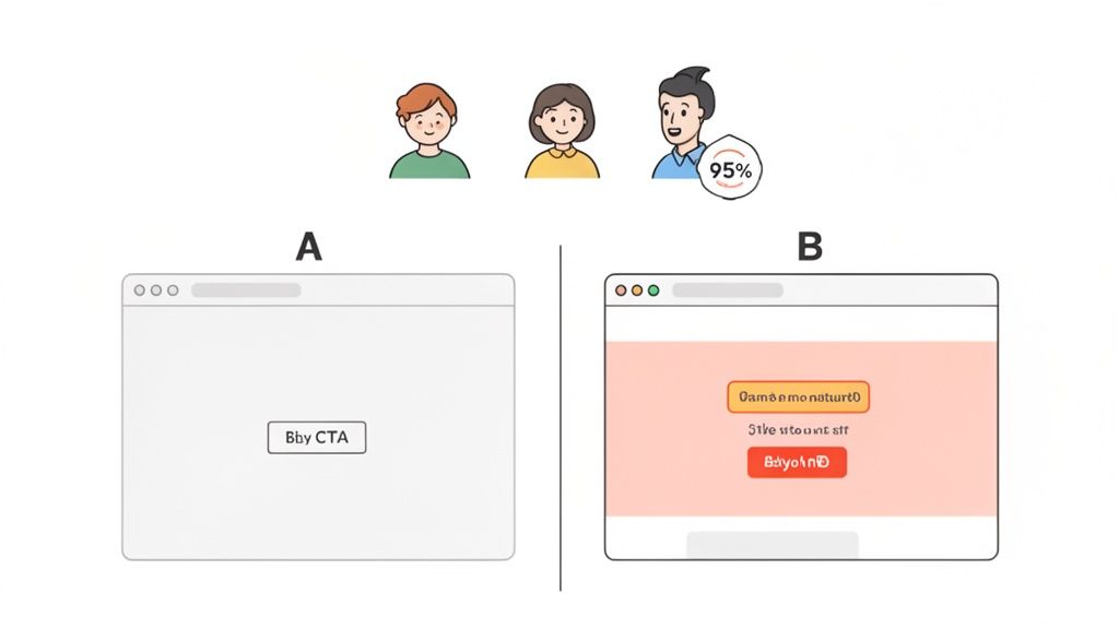
This method is fundamental to any serious conversion rate optimization best practices because it provides statistical proof, not just opinions. Companies like Amazon and Google built their success on a culture of constant experimentation, testing everything from button colors to checkout flows. For instance, HubSpot famously ran numerous A/B tests on their call-to-action (CTA) buttons, discovering that simple changes in copy and color could increase click-through rates by over 40%.
How to Implement A/B Testing
To get started, focus on high-impact areas where a change could produce significant results. Prioritize your test ideas using a framework like ICE (Impact, Confidence, Ease) to decide what to tackle first.
Here are some practical tips for running effective tests:
Test One Variable at a Time: To know what actually caused the change, isolate a single element. If you change the headline, the button color, and the main image all at once, you won't know which change was responsible for the lift (or drop) in conversions.
Start with High-Impact Pages: Begin with pages that have high traffic but low conversion rates, such as your homepage, pricing page, or key landing pages. Small improvements here can have a big effect on your bottom line.
Ensure Statistical Significance: Use a sample size calculator before launching a test to ensure your results will be statistically valid. Running a test for too short a time or with too little traffic can lead to false conclusions.
Document Everything: Keep a detailed log of every test you run, including your hypothesis, the variant details, the results, and what you learned. This repository becomes an invaluable source of institutional knowledge.
For teams building on modern platforms, implementing these experiments is more accessible than ever. You can find straightforward guides that cover the essentials, like this resource on simple A/B testing for Framer, which shows you how to get a test up and running quickly.
2. Heat Mapping and Session Recording
While A/B testing tells you what works better, heat maps and session recordings tell you why. Heat mapping provides a visual, aggregated overview of user behavior by showing where people click, move their mouse, and how far they scroll down a page. Session recordings are playbacks of individual user journeys, letting you watch exactly how a real person interacts with your website, complete with their mouse movements, clicks, and form interactions.
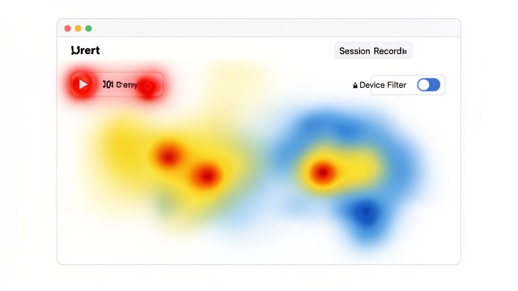
These qualitative tools are crucial for any effective conversion rate optimization best practices because they expose user friction points that quantitative data alone can't reveal. For instance, Crazy Egg helped a client discover users were repeatedly clicking on non-clickable images, signaling a need for a design change. Similarly, e-commerce sites have used these tools to spot "rage clicks" on broken size filters, identifying a bug that was directly costing them sales. Popular tools like Hotjar and the free Microsoft Clarity make this type of analysis accessible to everyone.
How to Implement Heat Maps and Session Recordings
To get started, install a tracking code on your site and begin collecting data on your most critical pages. Focus on identifying patterns of confusion or frustration that you can turn into actionable hypotheses for A/B tests.
Here are some practical tips for analyzing user behavior:
Prioritize High-Value Pages: Begin with your highest-traffic pages, key landing pages, and multi-step funnels like your checkout or sign-up process. These are the areas where fixing friction will have the biggest impact.
Segment Your Data: Don't just watch random sessions. Filter recordings for users who abandoned their cart versus those who completed a purchase. This comparison will show you what successful users do differently.
Look for Behavioral Patterns: Watch for common issues like rage clicks (rapidly clicking in one spot), U-turns (quickly leaving a page after arriving), or scroll maps that show most users never see your primary CTA. These are clear signals that something is wrong.
Establish a Review Cadence: Make it a weekly habit to review a handful of session recordings and check your heat maps. Create a simple process to document findings and share them with your design, product, and engineering teams.
By watching real user sessions, you can build empathy and gain a deeper understanding of their experience, which is the foundation for making meaningful improvements.
3. Landing Page Optimization (LPRO)
Landing page optimization is the systematic process of improving every element on a dedicated webpage to increase its conversion rate. Unlike a general homepage cluttered with navigation links, a landing page is built with a single, focused objective, such as generating leads, driving sales, or encouraging sign-ups. It’s a core discipline within conversion rate optimization best practices because it directly supports paid ad campaigns and targeted marketing efforts by aligning the message, design, and call-to-action with a specific visitor intent.
The power of LPRO comes from its focus. By removing distractions and creating a direct path to the conversion goal, you reduce friction and guide visitors exactly where you want them to go. Pioneers like Unbounce and Leadpages have built their entire businesses on this principle, with case studies showing that focused changes can yield massive returns. For example, SaaS companies often see a 30-40% improvement in conversions just by simplifying their demo request forms, and Notion's free plan page drives huge signup volume with a crystal-clear value proposition.
How to Implement Landing Page Optimization
Effective LPRO starts with message matching, ensuring the promise made in your ad is immediately fulfilled by the landing page's headline. From there, every element should work together to build trust and persuade the visitor to act. Beyond just the layout, the content and user experience on these pages are crucial; for practical tips on how to improve the conversion rate of your web pages, delve deeper into proven strategies.
Here are some practical tips for optimizing your landing pages:
Align Headline with Visitor Intent: Your headline is the first thing visitors read. It must instantly confirm they are in the right place by directly addressing their pain point or the benefit promised in the ad they clicked.
Focus on Benefits, Not Features: Instead of listing what your product does, explain what your customer gets. Frame your copy around outcomes and solutions to their problems.
Minimize Form Friction: Only ask for the information you absolutely need. Every additional field you add increases the chance a visitor will abandon the form. Reduce friction in proportion to the value you're offering.
Add Trust Signals: Display customer logos, testimonials, security badges, and industry certifications prominently. These elements reduce anxiety and build credibility, making visitors more comfortable converting.
To see these principles in action, you can explore detailed breakdowns of what makes a good landing page and apply those lessons to your own campaigns.
4. Form Field Optimization
Form optimization is the practice of strategically reducing and restructuring form fields to lower friction for the user. Every field you ask a visitor to fill out is a potential roadblock, and even one unnecessary field can significantly harm submission rates. This process is about finding the perfect balance between capturing essential information and making the sign-up process as effortless as possible.
This approach is a core component of conversion rate optimization best practices because forms are the final gatekeepers to leads, sales, and sign-ups. Companies like HubSpot famously found that reducing their form fields from 11 to 3 increased submissions by a staggering 120%. Similarly, Unbounce clients have reported conversion increases of 30-50% through form optimization alone, proving its direct impact on business goals. It’s a high-leverage activity where small changes yield big results.
How to Implement Form Field Optimization
The goal is to eliminate any non-essential requests for information that could cause a user to abandon the process. Start by auditing your current forms to identify which fields are truly necessary versus those that are just "nice to have."
Here are some practical tips for optimizing your forms:
Be Ruthless with Field Reduction: Scrutinize every field. Do you absolutely need a phone number right now? Can you get the company name later? ConvertKit saw a significant engagement increase by simplifying their signup form to just name and email.
Use a Single-Column Layout: Research consistently shows that single-column forms are easier for users to process and complete. They create a clear, linear path, reducing the cognitive load required to fill them out.
Implement Progressive Profiling: For B2B lead generation, don't ask for everything at once. Capture an email on the first interaction. On their next visit, ask for their company name. Later, ask for their role. This method builds a customer profile over time without overwhelming them initially.
Provide Smart Defaults and Clear Labels: Pre-fill information when possible, like location based on IP address. Ensure every field has a clear, visible label above it (not just placeholder text that disappears) and that error messages are specific and helpful, such as 'Please enter a valid email address' instead of a generic 'Invalid entry'.
5. Value Proposition Clarity and Messaging Optimization
Your value proposition is a clear, concise statement that tells visitors why they should do business with you instead of your competitors. Optimizing this message ensures that visitors instantly understand the core benefit of your product or service. This isn't about listing features; it's about articulating the value and solutions you offer in a way that resonates directly with your target audience's needs and pain points.
This practice is crucial to effective conversion rate optimization best practices because if users don't "get" what you do within the first few seconds, they will leave. A strong, clear message grabs attention and compels them to learn more. For example, ConvertKit positions itself as "the creator marketing platform" instead of just another email service, speaking directly to its niche audience. Similarly, Slack shifted its messaging from a feature-focused "Be less busy" to an emotional, benefit-driven "Be more together," which better captured its collaborative value.
How to Optimize Your Messaging
To refine your value proposition, you need to get inside your customers' heads and use their language to describe their problems and your solution. It's about bridging the gap between what you offer and what they truly want.
Here are some practical tips for improving your messaging:
Use Your Customer's Language: Conduct interviews and read reviews to understand the exact words your customers use to describe their problems and the value they get from your product. Avoid internal jargon at all costs.
Maintain Message Continuity: Ensure the message in your paid ads, social media posts, and your landing page headline are perfectly aligned. A disconnect here is a major cause of high bounce rates.
Test Different Angles: Your product has multiple benefits. A/B test different value proposition angles to see what connects most. Try focusing on the primary benefit, an emotional outcome, or an urgency-based message.
Be Specific and Quantifiable: Instead of vague claims like "much faster," use specific numbers like "cuts processing time by 50%." Tangible, specific benefits are more believable and compelling.
6. Call-to-Action (CTA) Optimization
A call-to-action is the button or link that prompts a user to take a specific action, like "Buy Now" or "Sign Up." CTA optimization involves strategically designing this element's copy, color, size, and placement to maximize clicks. It's one of the most direct and high-impact conversion rate optimization best practices because it focuses on the final step a user takes before converting. A well-placed, compelling CTA can guide users and remove hesitation at the critical moment of decision.
Small changes can yield enormous results. For instance, HubSpot discovered that specific, action-oriented copy like "Start free trial" performed 15-20% better than the more generic "Get started." Similarly, Mixpanel found that a high-contrast orange button outperformed a green one by 34%, not because orange is inherently better, but because it stood out more against their page design. This shows that optimization is about psychology and visibility, not just aesthetics.
How to Implement CTA Optimization
Effective CTAs are clear, compelling, and impossible to miss. They answer the user's question, "What should I do next?" while reinforcing the value of taking that action. To get started, audit your key pages and identify the primary action you want users to take.
Here are some practical tips for creating high-performing CTAs:
Use Action-Oriented, First-Person Copy: Frame the action from the user's perspective. "Get My Free Guide" often performs better than "Download Your Guide" because it creates a sense of ownership.
Prioritize Contrast and Visibility: Your CTA button should be the most visually striking element on the page. Use a color that contrasts sharply with the background to draw the eye, and ensure it’s large enough to be easily tapped on mobile devices.
Place CTAs in Logical Positions: The primary CTA should be visible "above the fold" without requiring a scroll. For longer pages, repeat the CTA at logical endpoints or use a sticky header that keeps it visible as the user scrolls.
Add Supporting Microcopy: Reduce last-minute friction by adding a short line of text near the button. Phrases like "No credit card required" or "Join 10,000+ happy customers" can address final hesitations and provide social proof.
7. User Research and Testing (Qualitative Methods)
While analytics tell you what users are doing, qualitative user research tells you why. This practice involves directly engaging with your users through methods like interviews, usability testing, and surveys to gather deep, contextual insights. It's about understanding the motivations, frustrations, and thought processes behind their actions, providing the human context that raw data can't capture. This is a foundational part of conversion rate optimization best practices because it helps you form hypotheses grounded in real user problems, not just assumptions.
For example, Airbnb's user research revealed that hosts felt their own photos weren't good enough, which created friction in the sign-up process. This insight led to their professional photography service, which dramatically increased bookings. Similarly, ConvertKit's interviews with creators uncovered a deep fear of platform lock-in, which directly informed their core messaging about easy migrations and ownership, boosting conversions. These wins came from understanding user psychology, not just from looking at a dashboard.
How to Implement User Research
Integrating qualitative feedback doesn't require a massive budget or a dedicated research team. The key is to make it a consistent habit and focus on gathering actionable insights that can inform your A/B testing strategy and design decisions.
Here are some practical tips for conducting effective user research:
Recruit the Right People: Focus on recruiting participants who match your target user profile. Specificity matters more than convenience; feedback from the wrong audience can lead you in the wrong direction.
Ask Open-Ended Questions: Avoid leading questions like "Wasn't that easy to use?" Instead, ask things like, "Tell me about your experience completing that task." This encourages users to share their genuine thoughts.
Test with 5-8 Users: Research from the Nielsen Norman Group shows you can uncover most major usability issues by testing with just five to eight users per round. After that, you'll encounter diminishing returns.
Create Realistic Scenarios: Give users tasks that reflect their actual goals on your site, such as "Find a blue t-shirt under $30 and add it to your cart." This provides much richer feedback than asking them to just browse abstractly.
Record and Debrief: Always record sessions (with permission) so your team can review them later. Hold a quick debrief with your team immediately after each session to capture fresh observations and identify emerging patterns.
8. Mobile Optimization and Responsive Design
With mobile devices driving the majority of web traffic, optimizing for smaller screens is no longer optional; it's a fundamental requirement for survival. Mobile optimization involves creating a seamless and efficient user experience specifically for phones and tablets. This goes beyond simple responsive design and includes considerations like touch-friendly navigation, fast load times, and streamlined user flows, which are critical because mobile conversion rates notoriously lag behind desktop.
The impact of mobile performance on conversions is well-documented. Google's research shows that even a one-second delay in mobile page load can reduce conversions by up to 20%. Similarly, Amazon famously discovered that every 100-millisecond improvement in load time led to a 1% increase in revenue. These figures underscore why mobile experience is one of the most powerful conversion rate optimization best practices you can focus on. Failing to provide a fast, intuitive mobile site is like closing your store to half of your potential customers.
How to Implement Mobile Optimization
A mobile-first design approach is the most effective strategy. This means designing for the smallest screen first and then progressively enhancing the experience for larger screens like tablets and desktops. This forces you to prioritize essential content and functionality from the start.
Here are some practical tips for optimizing your mobile experience:
Prioritize Above-the-Fold Content: Mobile screens have very limited real estate. Place your primary value proposition and main call-to-action (CTA) immediately visible without requiring users to scroll.
Simplify Forms: Typing on a mobile keyboard is more difficult than on a desktop. Reduce the number of form fields to the absolute minimum, use larger input fields, and enable auto-fill options wherever possible.
Make CTAs Thumb-Friendly: Use large, full-width buttons for your main CTAs. This makes them easy to tap accurately with a thumb, reducing frustration and accidental clicks on other elements.
Optimize for Speed: Compress images, implement lazy loading for content below the fold, and defer non-critical scripts. Test your site's performance on actual 3G or 4G networks, not just fast WiFi, to understand the real-world user experience.
9. Trust Signals and Social Proof Optimization
Trust signals and social proof are credibility markers that reduce a visitor's perceived risk and hesitation. By strategically placing elements like testimonials, customer logos, and security badges, you tap into the powerful psychological principle that people trust the experiences and endorsements of others. This is a core component of conversion rate optimization best practices because it builds confidence right when a user is deciding whether to act.
When potential customers see that established brands or peers are already using and benefiting from your product, their anxiety about making the wrong choice decreases. Slack, for instance, prominently displays logos from companies like Airbnb and NASA to instantly establish credibility. Similarly, Grammarly showcases its user base with a simple, powerful number: "30 million people use Grammarly daily," which creates a sense of safety in numbers. These signals make the decision to convert feel less like a risk and more like joining a successful group.
How to Implement Trust Signals and Social Proof
The goal is to place the right signal in the right place at the right time to overcome specific user objections. Start by identifying points of friction in your user journey, like the checkout page or a form submission, and add credibility markers there.
Here are some practical tips for adding effective trust signals:
Be Specific and Authentic: Vague testimonials like "Great product!" are weak. Use testimonials that tell a story, including the customer's name, company, and photo. Quantified results are even better: "Increased team productivity by 20%" is far more compelling than "We're more productive."
Place Signals Strategically: Don't just relegate social proof to a single page. Add security badges near payment forms, customer logos on the homepage, and a key testimonial right below your main call-to-action to address last-minute doubts.
Use High-Impact Logos for B2B: If you serve other businesses, a "logo cloud" of well-known customers can be more persuasive than individual quotes. The instant recognition of a trusted brand transfers some of that trust to you.
Keep Proof Fresh and Relevant: An outdated testimonial can hurt your credibility more than it helps. Regularly update your customer stories, case studies, and logos to show that your product is delivering value right now.
10. Funnel Analysis and Abandonment Reduction
Funnel analysis is the systematic process of mapping and measuring the steps users take to complete a goal on your site, from initial awareness to final conversion. It’s a critical diagnostic tool that reveals exactly where users are dropping off in their journey. By identifying these points of friction, you can pinpoint the biggest opportunities to reduce abandonment and improve your overall conversion rate.
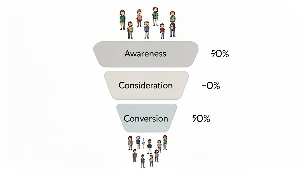
This method moves you from guessing what’s wrong to knowing precisely where the problem is. For example, an e-commerce store might see a huge drop-off between the "Add to Cart" and "Begin Checkout" steps, indicating a problem with the cart page itself. Similarly, a SaaS company can analyze its signup funnel to discover if users are abandoning at the email verification step. This data-driven approach, central to modern conversion rate optimization best practices, allows you to focus your efforts where they will have the most significant impact.
How to Implement Funnel Analysis
To begin, define the critical conversion paths for your business, such as the purchase process, lead generation flow, or user onboarding sequence. Tools like Google Analytics, Mixpanel, and Amplitude are built to visualize these funnels and quantify drop-offs at each stage.
Here are some practical tips for effective funnel analysis:
Segment Your Funnels: Don't just look at the overall funnel. Segment the data by traffic source, device, or user type to uncover specific issues. You might find that mobile users struggle with your checkout form, while desktop users sail through.
Prioritize by Impact: Focus on the biggest leaks first. A 40% drop-off at an early stage is a more urgent problem than a 5% drop-off near the end, even if the final step feels more important.
Combine with Qualitative Data: Once you identify where users are dropping off, use session recordings and heatmaps on those specific pages to understand why. Are they confused by a form field? Is a button not visible?
Test Simplification: A common cause of abandonment is complexity. Experiment with removing form fields, combining steps, or clarifying instructions at high-drop-off points to reduce friction.
Analyzing the initial user journey is especially important. For an in-depth look at this critical stage, see these insights on effective application on-boarding strategies that help retain users from the very first interaction.
Top 10 CRO Best Practices Comparison
Method | Implementation complexity | Resource requirements | Expected outcomes | Ideal use cases | Key advantages |
|---|---|---|---|---|---|
A/B Testing (Split Testing) | Medium–High — experiment setup, tracking, stats | Testing platform, analytics, sufficient traffic, analyst time | Statistically validated lifts in target metrics | High-traffic pages, feature rollouts, hypothesis validation | Data-driven decisions, reduces rollout risk |
Heat Mapping and Session Recording | Low–Medium — install scripts, privacy controls | Heatmap/session tools, analyst time, compliance steps | Qualitative insight into user behavior and friction | Diagnose confusing pages, prioritize UX fixes | Visualizes behavior; uncovers usability issues quickly |
Landing Page Optimization (LPRO) | Medium — design, copy, testing cycles | Designers, copywriters, testing tools, campaign traffic | Higher conversion rates and clearer attribution | Campaign landing pages, user acquisition funnels | Focused pages yield measurable ROI; easier to iterate |
Form Field Optimization | Low–Medium — form redesign, validation logic | Dev time, analytics, stakeholder alignment | Increased form completions and improved data quality | Lead gen forms, signups, checkout flows | High impact from small changes; reduces friction |
Value Proposition & Messaging Optimization | Medium — research and copy iteration | User research, copywriting, A/B testing | Better relevance, engagement, and conversion quality | Early-stage startups, positioning, landing pages | Clarifies fit with audience; reduces cognitive friction |
Call-to-Action (CTA) Optimization | Low — design/copy adjustments and tests | Designer/copy resource, A/B tool, traffic | Immediate uplifts in CTR and conversion rates | Buttons on pages/forms, sticky headers, CTAs in funnels | High-impact, low-effort; quick measurable wins |
User Research & Testing (Qualitative) | Medium — recruiting, facilitation, synthesis | Researchers, participants, recording tools, time | Deep understanding of motivations and usability issues | Product discovery, prototype validation, onboarding | Explains why users behave a certain way; guides hypotheses |
Mobile Optimization & Responsive Design | Medium–High — engineering and performance work | Front-end engineers, QA, device testing, performance tools | Improved mobile conversion, faster load times, SEO gains | Sites with majority mobile traffic, ecommerce, SaaS | Broad impact on traffic and conversions; required for mobile-first users |
Trust Signals & Social Proof Optimization | Low — content collection and placement | Content sourcing, design, legal/verification checks | Increased perceived credibility and conversion lift | New/unknown brands, B2B, high-ticket offerings | Low-cost credibility boost; reduces buyer hesitation |
Funnel Analysis & Abandonment Reduction | Medium–High — event instrumentation and analysis | Analytics platform, engineering for tracking, analysts | Prioritized fixes, reduced drop-offs, measurable gains | Multi-step checkouts, onboarding, lead funnels | Identifies highest-impact leak points; quantifies problems |
Turning Insights Into Impact: Your Next Steps in CRO
We've explored a detailed roadmap of conversion rate optimization best practices, moving from the broad strokes of A/B testing and funnel analysis to the fine details of CTA copy and form field design. Each strategy, whether it’s understanding user behavior through heatmaps or building confidence with social proof, represents a powerful lever for growth. The common thread connecting them all is a fundamental shift in perspective: from guessing what users want to systematically discovering it.
The journey to a high-converting digital experience isn't about finding a single "magic bullet." Instead, it's about building a durable, repeatable process of inquiry and improvement. It’s a culture, not a campaign. True mastery comes from internalizing the core principle that every element of your user's journey is an opportunity for learning and refinement.
From Theory to Tangible Growth
The most successful teams don't just read about CRO; they live it. They are relentlessly curious, treating user friction not as a failure but as a puzzle to be solved. They understand that a failed test is just as valuable as a successful one, as it still provides a critical insight into customer psychology and behavior. This mindset is what separates stagnating products from those that achieve continuous, compound growth.
To put this into practice, your immediate goal should be to move from passive learning to active experimentation. Don’t try to implement all ten best practices at once. That's a recipe for overwhelm and inaction. Instead, start with a single, high-impact area.
Your Action Plan for the Next 30 Days
To make this concrete, here’s a simple, actionable framework to get started immediately:
Identify Your Biggest Leak: Use your analytics to perform a basic funnel analysis. Where is the most significant drop-off occurring? Is it from the product page to the cart? From the cart to the checkout page? This is your starting point.
Form a Hypothesis: Based on the user research methods we discussed (like session recordings or surveys), create a specific, testable hypothesis. For example: "We believe users are abandoning the checkout form because it asks for too much information upfront. By reducing the initial form to only essential fields and creating a two-step process, we can increase form completion rates by 15%."
Choose Your Method: Will a simple A/B test of the form suffice? Do you need to redesign the entire landing page? Select the most direct tactic to validate your hypothesis.
Execute and Measure: Run your test until you reach statistical significance. Whether your hypothesis is proven right or wrong, document the results and, most importantly, the learnings. What did this teach you about your users?
Iterate and Repeat: Take what you learned and apply it to your next test. This continuous loop of hypothesizing, testing, and learning is the engine of conversion rate optimization.
By adopting this structured approach, you turn abstract conversion rate optimization best practices into a concrete system for generating revenue and improving user satisfaction. You stop making changes based on opinion and start making decisions based on evidence. This discipline is the foundation of sustainable growth, ensuring your business not only acquires customers but also creates experiences that retain them. The goal is to build a flywheel where every insight fuels the next experiment, creating momentum that drives your key metrics upward.
Ready to turn these best practices into a powerful growth engine for your business? Building an in-house CRO program takes time and expertise. Shalev Agency specializes in providing the end-to-end design, development, and strategic oversight needed to implement a rigorous optimization process from day one. Let us help you build high-converting digital products and experiences that drive real results. Visit Shalev Agency to see how we can accelerate your growth.