Boost activation and retention with a practical guide to application on boarding. Learn metrics, patterns, and design tips to accelerate growth.
Jan 11, 2026

Application onboarding is that critical first handshake between a new user and your product. It’s your chance to guide them from "What is this thing?" to "Wow, this is exactly what I needed!" In short, it’s the process of turning a curious signup into an active, successful customer by showing them the value, fast.
What Is Application On Boarding And Why It Matters
Think of application onboarding like a great tour guide in a new city. A bad guide just dumps a map in your lap and rattles off a hundred street names, leaving you overwhelmed. A great guide, on the other hand, asks what you’re interested in and takes you straight to that hidden gem—a stunning viewpoint or a fantastic local cafe.
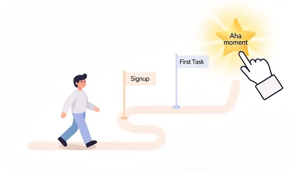
That’s what your onboarding should do. It's not about showing off every single feature. It's about leading the user to their first meaningful win as quickly and smoothly as possible. This journey bridges the gap between their initial sign-up and that first "aha moment" where they truly get it.
The Foundation For User Success
A well-designed onboarding experience does more than just teach people how to use your app; it builds their confidence and creates momentum. When you guide users through a few essential first steps and celebrate those small wins, you empower them to solve their problems on their own. This first taste of success sets the tone for their entire relationship with your product.
Getting this first impression right is so important because it:
Drastically reduces user churn. People who "get it" don't leave. When users quickly see how your product helps them, they have no reason to look elsewhere.
Increases activation rates. Onboarding is what turns passive sign-ups into active users who have completed key actions and are starting to form habits.
Builds long-term retention. A fantastic first experience creates a foundation of trust and satisfaction, making it much more likely users will stick around for the long haul.
In essence, application on boarding is your first and best chance to prove your product’s promise. It’s where you convert a user's initial curiosity into genuine belief in your solution.
The Business Impact Of A Great First Impression
The power of a good first experience isn’t limited to software. Research shows that a great onboarding experience makes new employees 18 times more committed and 30 times more satisfied. The same logic applies directly to your product.
A smooth onboarding flow leads to faster adoption and higher engagement, which are the building blocks of a healthy business. These happy, successful users are also the ones who become your most powerful brand advocates. As you can see from the far-reaching impact of onboarding processes, nailing this first interaction isn’t just good UX—it's a critical driver of growth.
The Core Goals of Effective Application On Boarding
To make this happen, your onboarding needs clear objectives. It's not just a friendly welcome; it's a strategic process designed to achieve specific goals that tie directly to business outcomes.
Here’s a breakdown of what a strong onboarding flow should accomplish.
Onboarding Goal | Description | Business Impact |
|---|---|---|
User Activation | Guide users to complete key actions that deliver the core value of your product. This is their "aha moment." | Increases user retention and LTV. |
Feature Adoption | Introduce the most important features in context, showing users how and why they should use them. | Boosts product engagement and reduces feature blindness. |
Reduce Time-to-Value | Shorten the time it takes for a new user to experience a meaningful benefit from your product. | Lowers churn rates and improves user satisfaction scores. |
Set User Expectations | Clearly communicate what your product can do and how it will help the user achieve their goals. | Reduces support tickets and aligns user needs with product capabilities. |
Ultimately, each of these goals works together to create a user who is not just using your product, but succeeding with it.
The KPIs That Truly Measure Onboarding Success
So, you want to build a great onboarding experience? The first step is figuring out what "great" actually means for your product. Just counting new sign-ups won't tell you the whole story. You need to dig deeper and track the key performance indicators (KPIs) that show whether people are actually getting it—engaging with your app and finding it valuable.
Think of these metrics as your north star. They guide your decisions, show you what's working, and prove that your efforts are paying off. It's like baking a cake. You can have all the right ingredients (new users), but that doesn't guarantee a delicious result. The real proof is in the process. Did you preheat the oven? Mix everything correctly? The KPIs are the taste test for your onboarding flow.
Activation Rate
If you only track one thing, make it the user activation rate. This is the big one. It measures the percentage of new users who complete a few crucial actions that let them experience your product's core value—that "aha moment" you're aiming for.
For a project management tool, an "activated" user might be someone who, within their first three days, creates a project, invites a teammate, and assigns a task. This metric is powerful because it separates the passive sign-ups from the truly engaged users. A high activation rate is a clear sign that your onboarding is successfully showing people why your product is awesome.
Your activation event isn't just some random click. It's the absolute minimum a user needs to do to start seeing real, tangible value. Nailing this definition is ground zero for a successful onboarding strategy.
Time to Value (TTV)
Activation tells you if users find value. Time to Value (TTV) tells you how fast they find it. This KPI simply tracks how long it takes a new user to get to that "aha moment." Your job is to make this journey as short and sweet as possible.
The faster people see the benefits, the less likely they are to get frustrated and leave. For a social media scheduler, a great TTV might be under five minutes—just enough time to connect an account and schedule that first post. For complex B2B software, it might be a couple of days. No matter the timeframe, you should always be looking for ways to shrink it.
Core Feature Adoption
Once a user is activated, the journey isn't over. You also need to track core feature adoption. This metric looks at whether people are using the key features that make your product sticky and indispensable in the long run.
A good onboarding flow doesn't just get people in the front door; it gives them a tour of the most important rooms. You can measure this by tracking the percentage of new users who try out a specific feature within their first 30 days. If you see low adoption for a killer feature, it's often a sign that your onboarding isn't doing a good enough job of showing it off. Fixing this can have a huge impact and directly lead to better outcomes. In fact, it's a key part of what we discuss in our guide on how to improve website conversion rates.
Early-Stage Retention
Finally, early-stage retention is the ultimate report card for your onboarding. It tells you if you're building lasting habits. We usually look at this at a few key milestones:
Day 1 Retention: Did they come back the very next day? This points to a strong first impression.
Day 7 Retention: Are they starting to form a habit? This suggests they're finding real, ongoing value.
Day 30 Retention: Has your product become part of their routine? This is a fantastic indicator of a future long-term customer.
These early numbers are a direct reflection of how well your onboarding works. If you see a huge drop-off after Day 1, for example, it's a massive red flag that your initial experience just isn't hitting the mark.
Choosing Your Application Onboarding Pattern
Think of it this way: there are countless ways to explore a new city, and just as many ways to guide a new user through your app. There’s no single "best" application onboarding pattern. The right one for you boils down to your product's complexity and what you need your user to do to get that first taste of success.
Some apps are best learned through a hands-on, guided tour. Others are better when features unfold naturally over time. It's like learning a new board game. For a simple one, you can probably learn the rules as you go. But for a complex strategy game, you'll want someone to walk you through the first few rounds. Your app's first impression should be just as carefully considered.
Finding The Right Fit For Your App
Picking an onboarding style is a big strategic decision. It directly impacts how quickly—or even if—users find your app's value. The goal is to give just enough guidance to be helpful without getting in the way or making them feel overwhelmed. To pull this off, you have to really understand your product's core purpose and what your users are trying to achieve right out of the gate.
Here are the most common and effective patterns you'll see in the wild:
Progressive Disclosure: This is all about revealing features and information only when the user actually needs them. It's a lifesaver for complex tools like Figma or Photoshop, preventing new users from being hit with a tidal wave of buttons and options. By introducing complexity step-by-step, it builds user confidence and makes the app feel much more approachable.
Interactive Walkthroughs: Why just show users what to do when you can have them do it? This is the "learn by doing" approach. Language-learning apps like Duolingo are masters of this, guiding you through your very first translation. It's incredibly effective for products that have a clear, step-by-step workflow.
Contextual Tips and Hotspots: These are the small, timely nudges—like tooltips or pop-ups—that appear when a user encounters a new feature for the first time. They deliver a quick hit of information exactly when and where it's needed. This makes them perfect for feature-rich platforms where users tend to explore at their own pace.
The chart below breaks down how you measure the outcome of these patterns. It’s pretty simple, really—either your onboarding is working, or it isn’t.
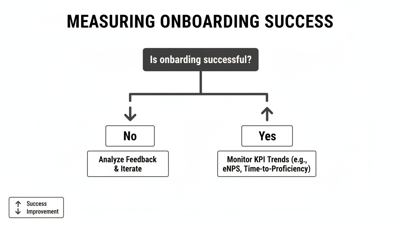
This decision tree makes it clear: if you're hitting your goals, you monitor and optimize. If you're not, it's time to head back to the drawing board and figure out what’s broken in the flow.
Which Onboarding Pattern Fits Your Product?
Still not sure which path to take? This table breaks down which pattern might work best based on your product's complexity and your users' goals.
Onboarding Pattern | Best For | Pros | Cons |
|---|---|---|---|
Progressive Disclosure | Complex, feature-rich apps (e.g., SaaS platforms, creative tools). | - Reduces cognitive load. | - Can hide important features. |
Interactive Walkthroughs | Products with a clear, linear "first task" (e.g., project setup, first post). | - High engagement. | - Can feel restrictive or forced. |
Contextual Tips | Apps with non-linear workflows where users explore freely. | - Unobtrusive and timely. | - Easily missed or dismissed. |
Ultimately, the goal is to make a user's first few moments with your product feel intuitive and rewarding, not like they’re studying for an exam.
Blending Patterns For A Better Experience
Remember, you don't have to choose just one. In fact, the most effective onboarding experiences often mix and match different patterns to create a seamless journey. You could, for instance, use a quick interactive walkthrough to teach the absolute core function, then rely on contextual tips to introduce other features as the user discovers them over time.
The best application onboarding feels less like a mandatory tutorial and more like a helpful guide that respects the user's intelligence and time. It anticipates their needs and offers support at the perfect moment.
The market is taking notice, too. The global market for onboarding software is expected to hit $1.34 billion by 2025, and it's all driven by this need for smarter user education. This growth highlights just how critical it is to use well-designed, automated patterns to help users succeed without needing a human to hold their hand. As you can discover in these employee onboarding statistics, the core principle is the same whether you're onboarding an employee or a user: a great automated experience saves time and sets them up for long-term success.
How To Design An Engaging Onboarding Flow
A great onboarding flow is really all about human psychology. It’s not just a tour of features; it's a carefully crafted experience that builds momentum and makes a new user feel smart and capable right from the first click.
The secret isn't to show them everything at once. It's about helping them get a meaningful win—fast. That first taste of success is what gets people hooked and gives them the confidence to explore on their own.
Celebrate Early Wins To Build Momentum
Those first few minutes inside your app are make-or-break. Your onboarding needs to guide a new user to a tangible "aha!" moment that proves they made the right choice by signing up.
Think of it like learning a new board game. The best ones don't just hand you the rulebook. They walk you through the first few turns, helping you score your initial points so you can immediately feel the satisfaction of making progress. Your app should do the same.
Pinpoint the "Quick Win": What’s the simplest action a user can take that delivers real value? Build your entire flow around that.
Acknowledge their progress: A little positive microcopy ("Great job!"), a simple animation, or a virtual high-five can go a long way in celebrating a completed step.
Show, don't just tell: Instead of just pointing at buttons, guide them through completing their first real task, like sending their first message or creating a project.
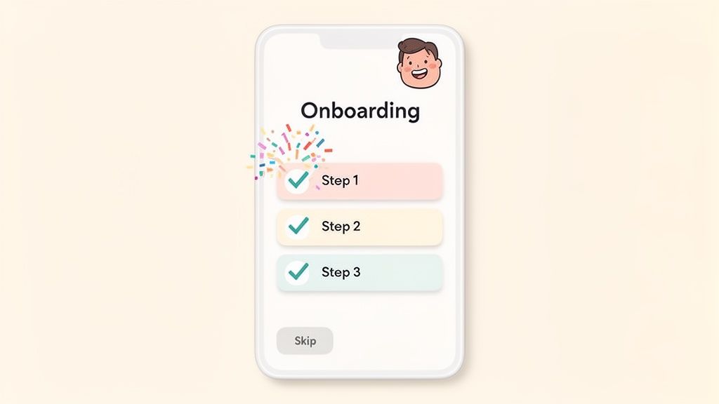
Use Checklists To Visualize Progress
People are wired to love completing tasks. A simple onboarding checklist gives users a clear roadmap of what to do next and delivers that satisfying little dopamine hit as they tick off each item.
A well-designed checklist is both a guide and a motivator. It breaks down what could be a complex setup into small, manageable chunks, making the whole process feel less intimidating. It shows people exactly where they are and how close they are to being fully up and running.
The most powerful onboarding checklists don't just list tasks; they frame each item as a benefit. Instead of "Add teammates," try "Collaborate with your team." This simple shift connects the action to the value the user is looking for.
Personalize The Journey
Your users aren't all the same, so why should their first experience with your product be? Personalizing the flow based on a user's role, goals, or experience level makes the process far more relevant and effective.
You can start with a simple question during signup, like, "What's the main thing you want to do today?" Their answer can then customize the entire onboarding experience, letting you skip irrelevant steps and focus on the features they actually care about. To really nail this, it helps to understand the 10 essential user onboarding best practices that top-tier products follow.
This kind of personalization shows you understand your user's goals. It’s a core principle we stick to when working on UX design for SaaS products because it makes the user feel helped, not herded.
And one last thing: always, always provide a "skip" option. Forcing an expert user through a beginner's tutorial is a surefire way to frustrate them. Respecting their time is one of the easiest wins you can score. After all, when companies get this right for their own teams, they see employee retention boost by 52% and productivity surge by 60%. The same logic drives incredible results for software adoption.
How To Implement and Improve Your Onboarding Process
A great onboarding experience isn't a "set it and forget it" feature. Think of it as a living, breathing part of your product that needs ongoing attention. The best product teams I know treat their onboarding as a dynamic process—they're constantly testing, measuring, and tweaking it based on how real people are actually using the app.
Getting your first version live is just the starting line, not the finish. The real work starts when you begin to see what’s clicking with new users and, more importantly, where they're getting stuck. This creates a powerful feedback loop, ensuring your onboarding gets better as your product grows.
Combining Quantitative and Qualitative Data
To get the full picture of how your onboarding is performing, you need to understand both the "what" and the "why." Quantitative data from things like A/B tests gives you the hard numbers, but it's the qualitative feedback from actual users that gives you the story behind those numbers.
Quantitative Analysis (The What)
This is all about measuring user actions at scale. Your best friend here is A/B testing, which lets you scientifically compare different ideas to see what works best.
You can test just about anything:
Microcopy: Does changing a button from "Get Started" to "Create Your First Project" actually get more people to click? Let's test it.
Flow: Which works better for our users—a four-step interactive tutorial or a series of contextual tooltips that appear as they explore?
Design: Will adding a simple progress bar to our setup checklist encourage more people to finish it?
By tracking key metrics like your activation rate or time-to-value for each version, you get clear, data-backed proof of what moves the needle.
The secret to good A/B testing is simple: change only one thing at a time. If you change the headline and the button color, you’ll never know which one made the difference. Isolate your variables to get clean results.
Qualitative Analysis (The Why)
Numbers tell you what happened, but they almost never tell you why. That’s where qualitative feedback comes in. This is how you build genuine empathy and understand the emotional side of a user's first experience.
User Session Recordings: Seriously, watch videos of new users navigating your onboarding. You’ll see exactly where they hesitate, where they get confused and click the same thing five times, or where they sail through effortlessly. These recordings are a goldmine for spotting friction.
User Interviews: Just talk to people! Get a new user on a quick call and ask open-ended questions. "Was there anything that felt confusing when you first signed up?" or "What was the very first thing you wanted to accomplish?" Their answers are pure insight.
Don't underestimate this. Companies like Atlassian saw a 25% productivity gain in just three months by using survey feedback, and Walmart cut new-hire ramp-up time by 40% by focusing on the right metrics. It's a testament to a data-informed, iterative mindset.
When you pair these two methods, you get the complete story. Your A/B test might tell you that "Version B" of your tour is failing badly. But a session recording might show you why—a critical button is almost invisible on smaller screens.
This combined approach is fundamental to building an effective process, something we dive into deeper in our guide to SaaS onboarding best practices. To keep improving, it's also worth checking out these 10 Customer Onboarding Best Practices.
Common Questions About Application Onboarding
When you're deep in product development, it's easy to overcomplicate things. But getting your head around application onboarding doesn't have to be a headache. Let's tackle a few common questions to clear up the confusion and help you build an experience that actually helps new users.
How Long Should My Onboarding Process Be?
This is a classic "it depends" situation, but with a simple rule: make it just long enough to get the user to their first "aha moment" and not a second longer. You're aiming for efficiency, not just speed.
For a simple app, that might mean less than a minute. For a complex SaaS platform, it could be a guided, multi-step process that spans a couple of sessions. The key is to map out the absolute minimum number of steps a user needs to take to see why your product is awesome. Anything else is just friction.
What Is The Biggest Onboarding Mistake?
The most common trap is building a feature-dump tour instead of a value-driven guide. New users don’t care about every single button, toggle, and setting you've painstakingly built. They signed up because they have a problem to solve, and your job is to show them exactly how to solve it.
A great onboarding flow guides users to their first quick win. It's not about showing them everything the product can do, but rather helping them accomplish what they came to do. This focus on value is what builds initial trust and momentum.
Should I Let Users Skip The Onboarding?
Yes. Always. Without a doubt.
Forcing someone who knows what they're doing through a beginner's tutorial is one of the fastest ways to annoy them. Always give people a clear and obvious way to skip ahead and explore on their own. Power users and people familiar with similar tools will thank you for it.
How Often Should I Update My Onboarding Flow?
Think of your onboarding as a living part of your product, not a one-and-done project. It needs to evolve right alongside your app. A good cadence is to check its performance metrics every quarter and tweak it based on real user feedback and data.
And whenever you ship a major new feature or redesign, it's time for a full-blown onboarding review. A new user journey needs a new map. This is especially true as technology changes. With 92% of HR professionals aware of AI in onboarding and 28% already using it, there's a huge push for more personalized, data-driven experiences. If you want to dive deeper, you can explore insights on AI adoption in onboarding and see how it’s changing the game.
At Shalev Agency, we live and breathe this stuff. We build websites and products designed from the ground up to turn curious visitors into loyal advocates. If you need help creating an onboarding flow that actually works, let's talk about your project.