Discover the process website development from strategy to launch. This guide offers practical steps for design, engineering, and post-launch growth.
Jan 11, 2026

Building a website is a journey, starting with discovery and research, moving through design and engineering, and finally arriving at launch and ongoing improvements. It's a structured process that turns a business idea into a living, breathing digital experience where every single decision is backed by solid data and clear goals.
Laying the Groundwork for a Winning Website
Every great website starts not with a single line of code, but with a handful of really important questions. This initial discovery and strategy phase is the bedrock of the entire project. It’s what ensures the final product actually lines up with business goals and what users genuinely need.
Trying to skip this part is like building a house without a blueprint. Sure, you might end up with something that stands, but it won’t be what you wanted, it won't be stable, and it definitely won't be functional. The whole point here is to replace assumptions with absolute clarity. We do this by digging deep into the business model, interviewing stakeholders to get everyone on the same page, and doing a thorough competitive analysis to spot gaps and opportunities.
Defining Your Core Objectives
First things first: you have to define what a "win" looks like. Are you trying to boost qualified leads by 30%? Is the main goal to cut down on customer support tickets by making information easier to find? Maybe it's all about increasing e-commerce sales for a particular product line.
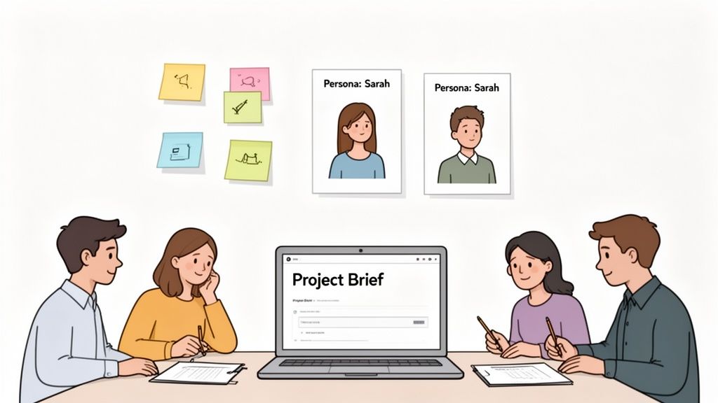
Whatever the goals are, they need to be specific, measurable, and agreed upon by everyone involved. We typically use a central project brief in a tool like Notion to lock these outcomes down. This document becomes our north star, guiding every decision that follows, from the visual design to the technical architecture.
For instance, a SaaS company’s primary goal might be to get more trial sign-ups. That single objective immediately shapes the entire project: the homepage copy has to be razor-sharp, the call-to-action (CTA) button needs to pop, and the sign-up form itself has to be ridiculously simple to fill out.
Understanding Your Audience and Market
Once you know what you’re trying to achieve, you have to figure out who you’re building this for. This is where creating user personas is so valuable. Personas are essentially fictional characters we build from real research to represent the different types of people who will use your site. They’re a powerful tool for building empathy and keeping the team focused on user needs.
A solid persona usually includes:
Demographics: Basic info like age, location, and job title.
Goals: What are they actually trying to do on your website?
Pain Points: What frustrates them about the current solutions available?
Behaviors: How do they look for information or decide what to buy?
Pouring effort into this stage pays off big time later. The foundation of any successful project is a flawless website project plan, which gives you clear, actionable steps from beginning to end and helps avoid expensive mistakes down the road.
This simple flow shows how a solid strategy is born from clear goals and good research.
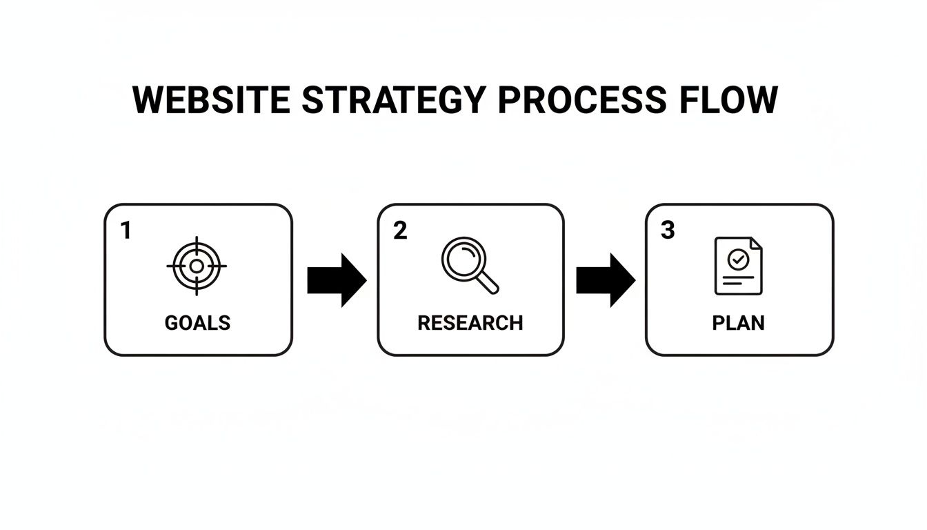
As you can see, a strong plan isn’t something you just pull out of thin air—it’s the direct result of having well-defined goals and doing your homework.
The global web design market is booming, projected to hit $92.06 billion by 2030, all thanks to more people getting online via their phones and computers. This growth isn't just a statistic; it shows why a professional, structured development process is no longer a "nice-to-have." It's essential for survival, especially when you consider that 75% of users admit to judging a company’s credibility based on its website design.
The discovery phase is, without a doubt, the most important part of the entire website development process. It's where you de-risk the project by making sure you're solving the right problem for the right people, which saves an incredible amount of time and money later on.
The work you do here culminates in a strategic plan—a real, tangible document that ties every feature and design choice back to a specific business goal and user need. This provides a clear path forward, ensuring the entire team, from designers to developers, is aligned and pulling in the same direction. For a deeper look at this, check out our guide on how to create a product roadmap.
Key Deliverables of the Discovery and Strategy Phase
During this foundational phase, we produce several key documents that guide the entire project. These aren't just for show; they are the strategic artifacts that keep everyone aligned and focused.
Deliverable | Purpose | Key Stakeholders |
|---|---|---|
Project Brief | A single source of truth defining project goals, scope, and success metrics. | Project Manager, Client, Team Leads |
User Personas | Fictional representations of target users to guide user-centric design. | UX/UI Designers, Marketing, Content Strategists |
Competitive Analysis | A report on competitors' strengths and weaknesses to find market opportunities. | Strategists, Marketing Team, Client |
Technical Brief | Outlines technology stack, integrations, and performance requirements. | Lead Developer, CTO, Project Manager |
Initial Roadmap | A high-level visual timeline of project phases, features, and milestones. | All Stakeholders |
These deliverables ensure that when we move into design and development, we're not just building something that looks good—we're building the right thing.
Shaping the User Journey and Visual Identity
Alright, with our strategy locked in, it’s time to move from the 'why' to the 'how.' This is where we start giving the project a tangible form, sketching out the digital space where users will actually interact with your brand. It’s a fascinating blend of cold, hard logic and creative flair, where we build the site's skeleton (Information Architecture), make it easy to use (UX), and then give it a stunning visual personality (UI).
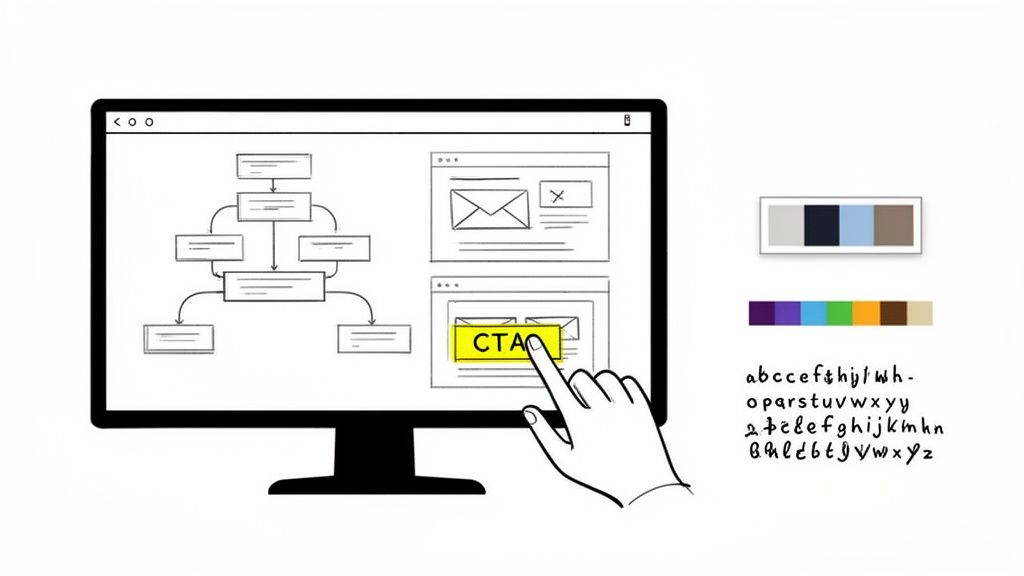
First things first: we need a blueprint. We kick this off by creating sitemaps and user flow diagrams. Think of a sitemap as the floor plan of your website—it shows every page and how they all connect. A user flow, on the other hand, is like tracing a specific person’s journey through that house, mapping out every step they take to do something important, like buying a product or signing up.
Getting these diagrams right from the start is absolutely critical. They help us spot potential dead ends or confusing paths long before we’ve designed a single pixel, ensuring the final navigation feels intuitive and natural.
From Bare-Bones Structure to Interactive Prototypes
Once we're happy with the site's architecture, we jump into wireframing. These are simple, black-and-white layouts of each page. The goal here is laser-focused: we're only thinking about structure, hierarchy, and function. No colors, no fonts, no images to distract us.
This stripped-down approach lets us answer the big questions early on:
Is the most important information front and center?
Are the calls-to-action obvious and easy to spot?
Does the layout naturally guide the user's eye where we want it to go?
Working in low-fidelity with tools like Figma or Balsamiq is fast and cheap. It’s way easier to move a few gray boxes around on a wireframe than it is to overhaul a polished, high-fidelity design. For complex projects, like refining the UX design for SaaS platforms, this wireframing stage is non-negotiable for getting intricate user workflows just right.
After the wireframes get the green light, we can finally start making things look good. This is where UI design enters the picture, breathing life and personality into that structural skeleton.
Defining Your Brand’s Visual Language
The UI design phase is all about translating your brand’s personality into a digital experience. We create a full-blown design system that nails down the color palette, typography, iconography, and spacing rules. This system is the single source of truth that keeps the entire website looking consistent, which is fundamental for building trust and brand recognition.
A well-crafted visual language does a lot of heavy lifting:
Color Palette: It evokes emotion and strategically draws the eye to key elements.
Typography: It enhances readability while reinforcing your brand’s voice—whether that's modern and clean or traditional and sophisticated.
Iconography: It offers quick, universal visual shortcuts for actions and features.
At this stage, we also build out interactive prototypes. We link all the static mockups together in a tool like Figma to simulate how the final site will work. This allows everyone involved to click through the site as if it were live, giving us a chance to gather crucial feedback on the flow and feel before a single line of code is written.
This isn't just about making things pretty—it's strategic visual communication. A seemingly small change, like moving a CTA button on a pricing page from the bottom to a more prominent spot, can have a massive impact. We once saw a 22% increase in sign-ups for a client just by changing their main CTA button to a more contrasting color.
The Power of High-Fidelity Design
High-fidelity mockups are the pixel-perfect versions of the final product. They show exactly how every page will look and feel on different devices, from a huge desktop monitor down to a smartphone.
This obsessive attention to detail helps us catch any last-minute inconsistencies and ensures the interface is not just beautiful but also fully functional and accessible to everyone. The deliverables from this phase—a complete set of UI mockups and a clickable prototype—become the definitive guide for the engineering team. It removes all the guesswork and makes sure the final build is a perfect match for the approved design. This is what truly separates a decent website from a great one.
Bringing Your Vision to Life Through Engineering
This is where all the planning and design finally become real. The engineering phase is where your polished Figma files are transformed from static pictures into a living, breathing website. It’s the most technical part of the journey, where smart architecture and clean code bring everything to life.
It all starts with one of the most important decisions you'll make: choosing the right technology stack. This isn't about chasing the latest trend—it's about picking the right tools for your specific job.
Selecting the Right Technology Stack
Getting the tech stack right from the beginning saves you from a world of pain down the road. For instance, a startup that’s heavily invested in content marketing and SEO would probably do great with a robust CMS like WordPress. It’s dependable, non-technical team members can easily update it, and the plugin ecosystem is massive.
But what if you're building a complex web app with lots of user interaction? In that case, something like a headless CMS paired with a modern JavaScript framework like React or Vue.js is a much better fit. This approach, often called the JAMstack, is fantastic for building websites that are incredibly fast, secure, and ready to scale.
The choice of technology is a foundational decision that impacts everything from site performance and scalability to how easily your team can manage content. We prioritize a pragmatic approach, matching the tech stack to your business goals, not the other way around.
The software development market is exploding, projected to hit $823.92 billion in 2025. That growth is fueled by millions of developers creating everything from simple websites to complex AI platforms. While some companies lean on low-code tools to move faster, a thoughtfully chosen custom stack almost always delivers better long-term value for a conversion-focused website. You can find more about developer trends and market growth on keyholesoftware.com.
Choosing the right tech stack can feel overwhelming. To make it a little clearer, here’s a breakdown of common stacks we see and what they're best suited for.
Common Tech Stacks for Different Website Needs
Website Type | Example Tech Stack | Best For |
|---|---|---|
Content-Heavy Sites | WordPress, Webflow, Ghost | Marketing websites, blogs, and portfolios where ease of content management is key. |
E-commerce Stores | Shopify, Magento, WooCommerce | Online stores that need secure payment processing, inventory management, and customer accounts. |
Web Applications | Headless CMS + React/Vue/Svelte | SaaS platforms, interactive dashboards, and products requiring complex user interactions and dynamic data. |
Simple Static Sites | Gatsby, Next.js, Hugo | Landing pages, promotional sites, or simple brochure websites where speed and security are paramount. |
Ultimately, the best stack is the one that aligns with your budget, team skills, and long-term business objectives.
Adopting an Agile Development Workflow
The old "waterfall" method—where you disappear for months and then do a big reveal—is dead. We work using agile principles, breaking the project down into small, focused cycles called sprints. Each sprint usually lasts one to two weeks and is dedicated to building and delivering a specific set of features.
This approach has some huge advantages:
You're always in the loop. We use shared Notion boards and Slack channels for constant communication, so you see progress as it happens.
We can pivot quickly. If you have new feedback or priorities shift, we can adjust course without derailing the entire project.
It builds momentum. Seeing real, tangible progress every couple of weeks keeps the whole team motivated and the project humming along.
For an early-stage startup, this is a game-changer. It means we can get a Minimum Viable Product (MVP) launched fast, letting you gather real-world user feedback and make decisions based on data, not just guesswork.
Building the Front-End and Back-End
With a solid plan and workflow, our developers get their hands dirty. The build is typically divided into two key areas: front-end and back-end.
Front-end development is everything your visitors see and click on. Our developers take the UI designs and turn them into clean HTML, CSS, and JavaScript. The main goal here is to create a fully responsive experience that looks great and functions flawlessly on any device, from a giant monitor to a tiny smartphone.
Back-end development is the powerful engine running behind the scenes. This is where we set up the server, the database, and all the application logic that makes your site work. It handles things like user logins, form submissions, and processing payments through gateways like Stripe.
A huge part of this phase is also connecting all the third-party tools your business relies on. Whether it's a CRM like HubSpot, an analytics tool, or a marketing automation platform, we make sure they all talk to your website seamlessly.
Throughout the build, we focus on writing code that isn't just functional but also clean, well-documented, and easy to maintain. This isn't just about getting the site launched; it's about building a digital asset that can grow and evolve right alongside your business.
Ensuring a Flawless Launch with Rigorous Testing
After all the planning, design, and coding, this is where the rubber meets the road. But hitting "go live" shouldn't feel like a roll of the dice. The Quality Assurance (QA) and testing phase is the final gatekeeper, the last line of defense that ensures everything you've poured weeks or months into is solid, bug-free, and ready for your audience.
This isn’t just about clicking around and hoping for the best. It's a methodical process of validation. We need to confirm that every single element—from the biggest new feature to the tiniest hyperlink—works exactly as it should. A smooth, successful launch is almost always the direct result of a meticulous, and sometimes tedious, testing plan.
The Core Pillars of Pre-Launch Testing
A really solid QA strategy is built on a few different types of testing, each designed to poke and prod a specific part of the website. If you skip any of these, you're leaving yourself open to some embarrassing—and often costly—problems after you've already launched.
We always break our testing down into these non-negotiable areas:
Functional Testing: This is the most basic but absolutely essential part. We test every single interactive element: links, forms, buttons, pop-ups, and user flows. Does that contact form actually send an email to the right person? Do the social sharing buttons pull the right image? We go through the site with a fine-toothed comb to make sure everything works according to the plan.
Compatibility Testing: People will visit your site from a dizzying array of devices, browsers, and operating systems. We check everything on Chrome, Firefox, and Safari, and on Windows, macOS, iOS, and Android. We resize windows and flip phones sideways to ensure the experience is consistent and reliable for everyone, not just for people with the latest iPhone.
Performance Testing: A slow website doesn't just annoy people; it gets actively punished by Google. Seriously, a one-second delay in page load time can cause a 7% drop in conversions. We run tests to measure load times, check server response, and find bottlenecks to make sure the site is as snappy as possible. For a deeper dive, you can explore our guide on how to improve website performance.
To really streamline this, mastering a strategy for automated testing for web applications is a game-changer. Automation can tirelessly handle the repetitive checks, which frees up the team to focus on trickier usability issues.
The Human Element in Usability Testing
While scripts and automated tests are fantastic for catching technical bugs, they can't tell you if your site is actually easy or enjoyable to use. That's a job for a real human.
Usability testing is all about watching actual people try to complete tasks on your site. This process always uncovers sticking points that the internal team, who knows the project inside and out, would completely miss. You might find out your main navigation is confusing, or that a step in the checkout process makes people want to give up. These human-centered insights are pure gold for making those final, critical tweaks.
A flawless launch isn't an accident. It's the outcome of a disciplined testing process that values both technical correctness and the end-user's experience. Overlooking QA is one of the most common—and avoidable—mistakes in website development.
Your Final Pre-Launch Checklist
As testing winds down and you’re getting that "ready to launch" feeling, it's time for one final pass. Think of this as the pilot's pre-flight check, making sure all the foundational pieces are in place for a successful deployment and for tracking what happens next.
Here’s what our final checklist almost always includes:
Analytics and Tracking: Is Google Analytics (or your tool of choice) installed, verified, and filtering out internal traffic? Are all conversion goals and key events configured?
SEO Fundamentals: Have all the title tags, meta descriptions, and image alt texts been optimized? Is the XML sitemap generated and ready to submit?
Final Content and Proofreading: Is all the "lorem ipsum" placeholder text gone? Has every single page been proofread one last time for typos? (Seriously, do it again.)
Security and Backups: Is the SSL certificate installed and forcing HTTPS across the entire site? Is a reliable, automated backup system in place?
Deployment Plan: Is there a clear, step-by-step plan for pushing the site to the live server? The goal is to minimize or completely avoid downtime.
Once every box is checked, you're ready. This structured approach turns a potentially nerve-wracking event into a controlled, confident launch.
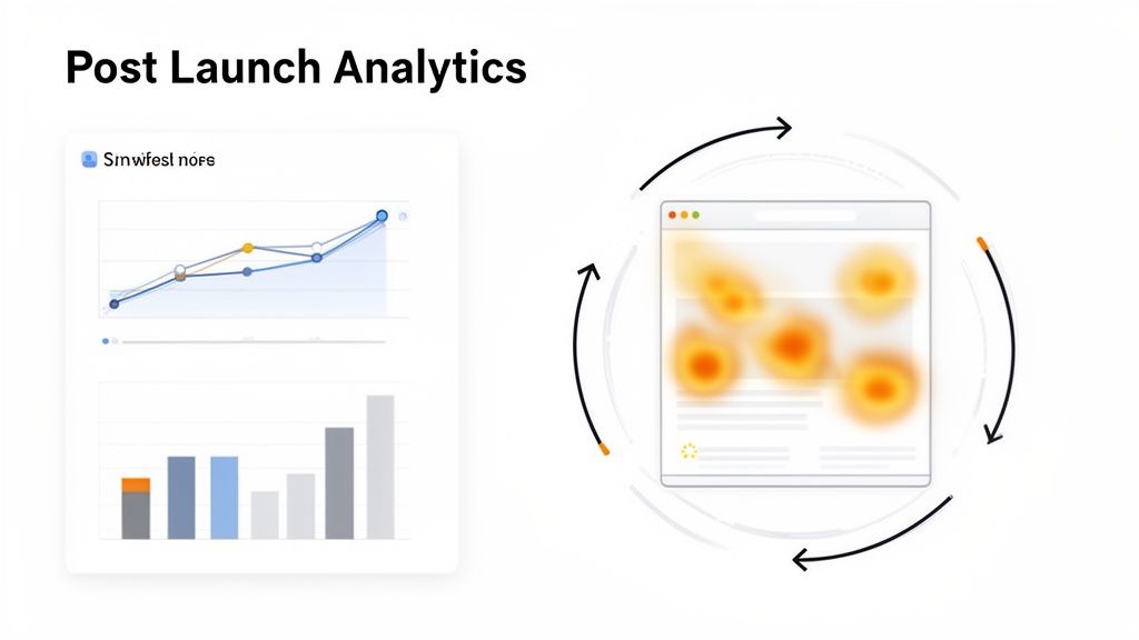
Driving Continuous Growth After Going Live
Congratulations, your site is live! It’s a huge moment, but it’s really just the starting line. Think of your new website not as a finished product, but as the first version of an ever-evolving asset. The real work—and the real growth—begins now.
This is where we shift from building the car to actually driving it, learning how it handles, and tuning it for better performance. The most successful websites are the ones that adapt based on real user behavior, and this post-launch phase is all about creating that feedback loop.
Turning Data into Actionable Insights
Your live site is now a fountain of data. The trick is knowing how to collect it and, more importantly, what to do with it. You'll need a couple of key tools in your arsenal to see both what users are doing and start to understand why.
Here’s the essential toolkit I recommend to every client:
Web Analytics (like Google Analytics): This is your command center for the hard numbers. It’s where you’ll track traffic sources, bounce rates, conversion goals, and see which pages are pulling their weight and which ones are letting you down.
Heatmapping Software (like Hotjar): These tools are amazing because they add a visual layer to your data. Heatmaps show you exactly where people are clicking, how far they scroll, and what they’re ignoring. It’s like looking over their shoulder.
User Session Recordings: Watching anonymized recordings of actual user sessions is one of the most eye-opening things you can do. You’ll see exactly where someone gets stuck, hesitates, or gets confused. It uncovers friction points that numbers alone will never show you.
When you use these tools together, you get the full picture. For instance, Google Analytics might flag a landing page with an 80% bounce rate. That's a problem, but it doesn't tell you why. A heatmap could then reveal that nobody is scrolling below the fold to see your main call-to-action. Suddenly, you have a clear, actionable insight.
Creating a Routine for Maintenance and Optimization
A website needs regular check-ups to stay healthy, just like a car needs oil changes. This isn't the most glamorous work, but skipping it is a recipe for disaster. Neglect can quickly lead to security breaches, sluggish performance, and a frustrating experience for your visitors.
Set up a simple, consistent maintenance schedule. Seriously, put it on the calendar.
Here's what should be on your checklist:
Software and Plugin Updates: Keep your CMS and any plugins updated. This is your first line of defense against security threats.
Regular Backups: Make sure you have an automated backup system running daily or weekly. This is your undo button if something ever goes terribly wrong.
Security Scans: Run regular scans for malware and other vulnerabilities.
Performance Audits: Check your site speed every so often. A fast site is a happy site.
This simple routine helps you catch small issues before they become massive headaches, keeping your site secure, fast, and reliable.
The best improvements don't come from guesswork. They come from a steady cycle of analyzing user data, forming a hypothesis, testing it, and measuring what happens. This is how a website becomes a true engine for business growth.
Implementing a Data-Driven Feedback Loop
With data flowing in and your site well-maintained, you can build a powerful system for continuous improvement. This is where you connect the dots between an insight and an action by testing your ideas in a structured way.
Let’s say your analytics show a ton of people are dropping off on your checkout page—specifically the shipping form. You watch a few session recordings and see users repeatedly fumbling with the address fields.
This leads to a clear hypothesis: "If we simplify the shipping form by removing optional fields, we can reduce cart abandonment."
Now you're ready to run an A/B test. You’ll show 50% of your visitors the original form and the other 50% a new, simplified version. After a week or two, you can look at the data and see which one resulted in more completed purchases.
This is the heart of conversion rate optimization (CRO). It’s a rinse-and-repeat process of making small, data-informed changes that produce measurable results. This ongoing cycle of learning and improving is what separates a good website from a great one.
Frequently Asked Questions About Website Development
Even after walking through the entire development process, you probably still have a few questions. That’s normal. Building a website is a big undertaking with a lot of moving pieces.
Here are answers to some of the most common questions we hear from founders and marketing leaders.
Let's clear up any lingering confusion so you can move forward with confidence.
How Long Does The Website Development Process Usually Take?
This is the classic "how long is a piece of string?" question, but I can give you some real-world benchmarks.
A straightforward marketing site with just a few core pages can realistically be designed and launched in 4-8 weeks. On the other hand, a complex web application with custom user accounts and integrations could easily take 6 months or more.
What really drives the timeline? It usually comes down to three things:
Scope & Complexity: The more custom features and integrations you need, the longer it takes.
Design Specificity: A fully custom design built from the ground up will always take more time than starting with a pre-built template.
Client Feedback: This is the wildcard. The faster your team provides clear feedback and approvals, the smoother and quicker the whole process will be.
The most common pitfalls in any web project are scope creep, poor communication, and an inadequate discovery phase. A clear project brief and regular check-ins are your best defense against all three.
What Is The Difference Between UX and UI Design?
It’s easy to get these two mixed up, but they're different disciplines that work hand-in-hand. I like to use a house-building analogy.
UX (User Experience) Design is the architect drawing the blueprints. It's all about structure, flow, and function. Are the rooms laid out logically? Can you easily get from the bedroom to the kitchen? UX focuses on making the website intuitive and easy to use through research, sitemaps, and wireframes.
UI (User Interface) Design is the interior designer. This is all about the look and feel—the paint colors, the light fixtures, the style of the furniture. UI designers work with typography, colors, and interactive elements to create a visually appealing and emotionally engaging experience.
You need a solid blueprint (UX) before you start decorating (UI). One without the other gives you a house that's either functional but ugly, or beautiful but impossible to live in. A great website absolutely needs both.
Should I Use A Template Or Invest In A Custom Design?
This really boils down to balancing your immediate needs against your long-term ambitions.
Templates are a great choice if you need to get something online quickly and on a tight budget. They’re perfect for very early-stage startups or simple brochure sites. The downside? You're stuck inside a box. It can be tough to stand out, and implementing unique features is often impossible.
A custom design is a bigger upfront investment, but it's built from scratch to solve your specific business problems and connect with your audience. For any company serious about growth, a custom site almost always delivers a higher return through stronger branding, better user engagement, and the flexibility to scale.
At Shalev Agency, we specialize in turning your vision into a high-performing digital asset. We partner with teams to design and build websites and products that not only look great but also drive real business outcomes. If you're ready to start your next project, let's talk.