
Discover how to improve website conversion rate with this actionable playbook. Learn to audit, fix, and test your site to turn more visitors into customers.
Jan 11, 2026
Before you touch a single headline or tweak a button color, you have to play detective. Trying to boost your conversion rate without first figuring out why people are leaving is like trying to fix a car without popping the hood. A conversion audit is all about finding the "leaks"—the specific moments of friction or confusion that are killing your sales.
You need to get beyond high-level metrics like bounce rate and dig into the nitty-gritty of the user experience. It’s about seeing your site through your visitors' eyes to spot the roadblocks that analytics alone will never show you.
Starting Your Conversion Audit to Find Leaks
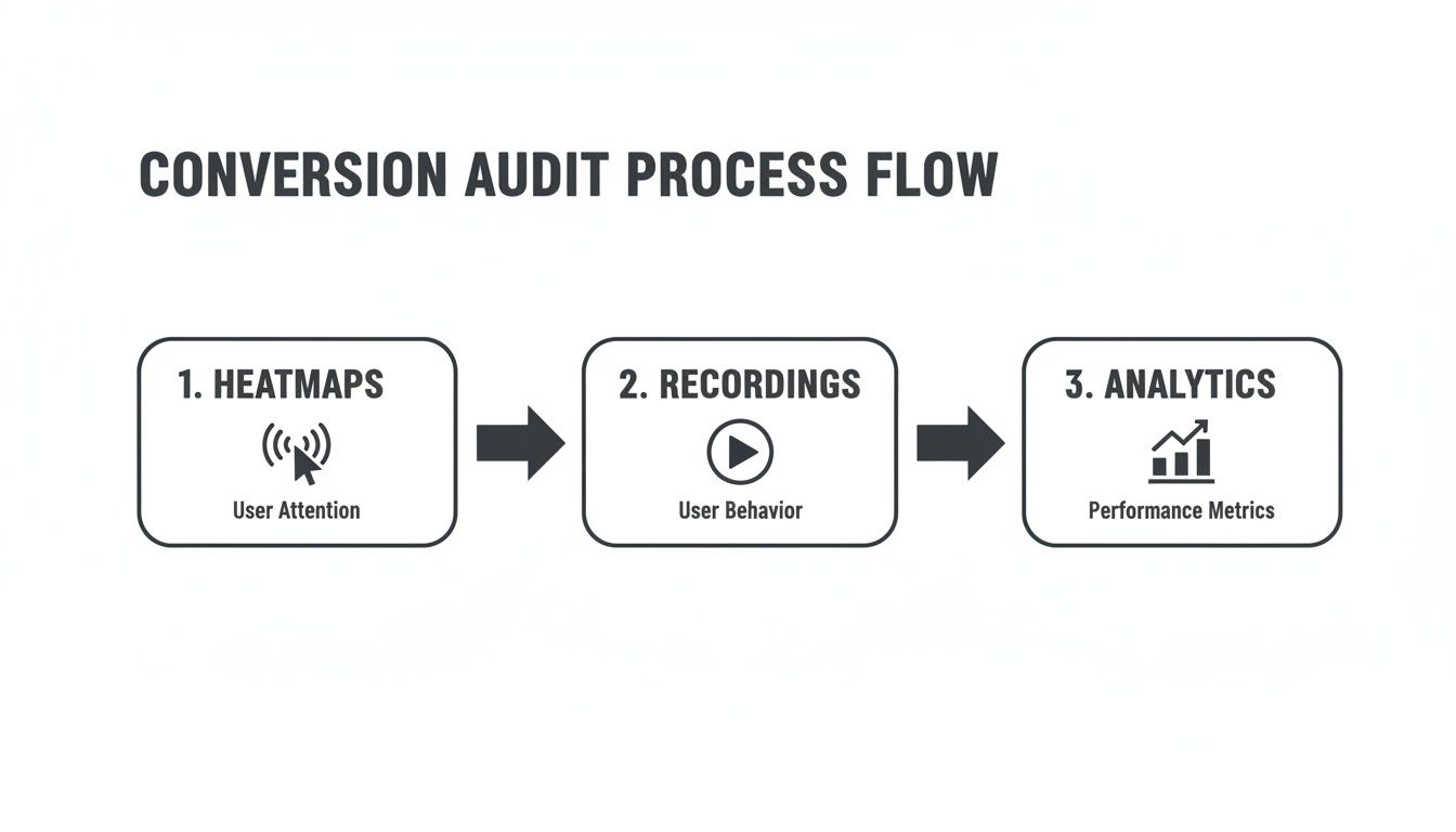
So, where do you begin? The goal is to build a complete picture of user behavior, combining visual data, individual user stories, and hard numbers.
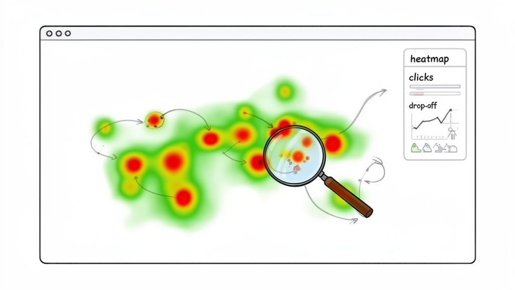
Visualizing User Behavior with Heatmaps
The first stop is usually heatmaps. They give you a bird's-eye view of what thousands of users are doing on your most important pages. Tools like Hotjar or Microsoft Clarity make this surprisingly easy to set up.
I always start by looking at three specific types of heatmaps:
Click Maps: These are fantastic for spotting frustration. If you see dozens of clicks on a headline or an image that isn't a link, you've found a design flaw. Users think it should be clickable, and when it isn't, they get annoyed.
Scroll Maps: This one is a reality check. You might have the world's most persuasive call-to-action, but if it's sitting at the bottom of a page that only 20% of users ever scroll to, it might as well not exist.
Move Maps: These track where users move their mouse, which is often a proxy for where they're looking. It helps you see if your value proposition and key selling points are even getting noticed.
Putting these three views together gives you a solid, visual foundation for your audit.
This simple workflow ensures you're gathering both the "what" and the "why" behind user behavior, leading to much smarter optimization ideas.
Watching Your Site Through Your Users' Eyes
Heatmaps show you the patterns, but session recordings show you the person. This is often the most eye-opening part of the whole process. You get to watch real people try to use your website, and it can be a humbling experience.
You'll see their mouse hesitate, you'll watch them click the same broken button five times (we call these "rage clicks"), and you'll see the exact moment they give up and leave.
A single 10-minute session recording can reveal more about user frustration than a spreadsheet with 10,000 rows of data. It's the difference between knowing what happened and understanding why.
I recommend focusing your attention on recordings from high-stakes pages, like your pricing page, a lead form, or the checkout flow. Look for users who scroll up and down aimlessly or abandon a form halfway through. These are your conversion leaks, caught on tape.
Finding the Leaks in Your Funnel Analytics
Okay, you've seen what users are doing visually. Now it's time to bring in the hard data to see how big the problems really are. Head over to your analytics platform, like Google Analytics, and start digging into your funnels.
The goal is to pinpoint the pages with the biggest drop-offs.
For an e-commerce site, your funnel might be: Product Page -> Add to Cart -> Start Checkout -> Purchase. Where are you losing the most people? If you discover that 70% of users who add an item to their cart never even start the checkout process, you’ve just found a massive leak that needs immediate attention.
Also, hunt for high-traffic pages that have terrible exit or bounce rates. A blog post with a 90% bounce rate is probably fine. But a pricing page with a 90% bounce rate? That's a five-alarm fire. People are getting there but leaving immediately. Combine this data with what you learned from session recordings, and you’ll have a crystal-clear idea of what needs fixing.
Gathering Honest Feedback from Your Users
Analytics are great at telling you what is happening on your website, but they’re completely silent on the why. To really move the needle on conversions, you have to get inside your visitors' heads. This means stepping away from the spreadsheets to get direct, unfiltered feedback from the people you’re trying to serve.
This qualitative insight is the secret ingredient. It’s the bridge between seeing a high bounce rate on your pricing page and finally understanding the specific objection that’s sending people away. The good news? You don’t need a massive research budget to get these kinds of answers.
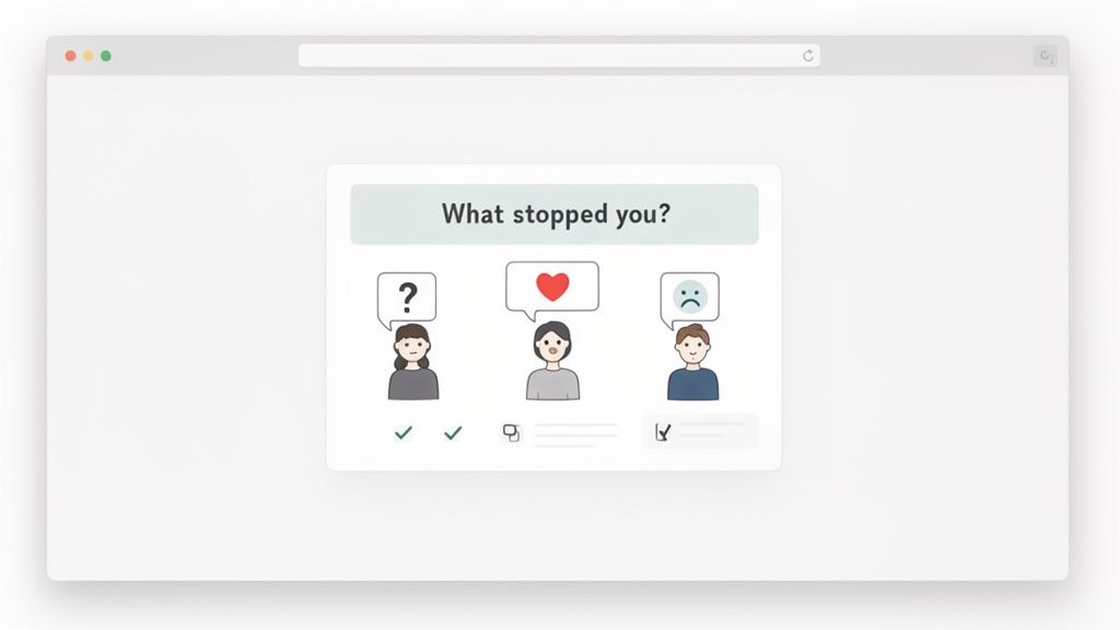
Setting Up Non-Intrusive On-Site Surveys
One of the easiest ways to start is with small, non-intrusive on-site surveys. I’m not talking about those obnoxious pop-ups that hijack the entire screen. Think more of a subtle prompt that appears at just the right moment to ask one critical question.
For instance, if someone is heading for the exit button on your pricing page, a small exit-intent survey could pop up asking: "What's the one thing stopping you from signing up today?"
The responses you get from a question like this are often pure gold. You might discover things like:
Your pricing tiers are totally confusing.
A crucial feature they need isn't mentioned anywhere.
They’re looking for security info and can’t find it.
These are the kinds of blockers you’d never spot by just staring at analytics. The key is to keep the questions open-ended and focused on uncovering friction or missing information.
Conducting Quick and Insightful User Interviews
While surveys are great for quick hits of insight, nothing beats a real conversation. User interviews might sound like a big, formal undertaking, but they don't have to be. Honestly, talking to just five customers can reveal some incredibly powerful patterns about what they’re trying to achieve and where they’re getting stuck.
A great place to start is with recent customers; their memory of the buying journey is still fresh. Offer a small incentive for their time—a gift card usually works well—and book a simple 20-minute video call.
The goal of a user interview isn't to ask them what they want. It's to understand their world, their problems, and how your product fits into it. Their story will tell you what they truly need.
Frame your questions around their experience before they even found you and during their decision-making process. Some of my go-to questions are:
"Can you walk me through the problem you were trying to solve when you first started looking for a solution like ours?"
"What was the biggest challenge you ran into while using our website?"
"What other options did you look at, and what ultimately made you choose us?"
This approach gets you the full context behind their actions. It helps you understand how the user experience on your site is just one part of their much larger customer journey. You can dig deeper into how to refine the customer experience vs user experience in our detailed guide.
After just a handful of these conversations, you’ll start hearing the same frustrations and motivations over and over again. Those patterns are your roadmap. They point directly to the changes that will actually make a difference, ensuring your next move is based on real user needs, not just what your team thinks is a good idea.
Prioritizing Fixes for the Biggest Wins
So, you've finished your audit. If you're like most people, your to-do list is now a mile long. You've probably found broken links, confusing navigation, and a checkout process that takes way too many clicks.
The gut reaction is to jump in and fix everything at once. Don't do it. That's a surefire way to burn out your team and see minimal results for all your hard work.
The real secret to making progress is to zero in on changes that give you the biggest bang for your buck. For any team with limited resources—and let’s be honest, that’s almost everyone—a solid prioritization system is a must. It keeps you from getting stuck on massive projects that barely move the needle.
Introducing the PIE Framework
To turn that messy list of issues into a focused action plan, I always come back to a simple but incredibly effective model: the PIE framework. It helps you score every potential fix on three core criteria: Potential, Importance, and Ease.
You just assign a score from 1 to 10 for each factor. This simple exercise helps you objectively compare tasks and see what rises to the top, replacing guesswork with a data-driven roadmap.
Let's break down what each of those letters really means:
Potential: How much room for improvement is there? Think about a high-traffic page with a dismal conversion rate—that's loaded with potential. A low-traffic "About Us" page? Not so much.
Importance: How valuable is the traffic to this page? Your pricing and checkout pages are mission-critical. Visitors there are ready to buy. A blog post from five years ago just doesn't carry the same weight for your bottom line.
Ease: How hard is this actually going to be to implement? Changing a headline might take your marketing team ten minutes. A complete checkout overhaul, on the other hand, is a heavy lift that ties up designers and developers for weeks.
Once you have a score for each, you just average them to get a final PIE score. The highest numbers on your list? Those are your top priorities.
Putting PIE Into Practice
Let’s walk through a real-world example. Imagine you’ve found two big problems on your e-commerce site:
The Issue: Your product page CTA is a vague "Learn More." It’s confusing and probably killing your add-to-cart rate.
The Issue: Your entire checkout is one long, overwhelming page. Customers are complaining and dropping off.
Time to score them.
Task | Potential (1-10) | Importance (1-10) | Ease (1-10) | Average Score |
|---|---|---|---|---|
Change Product Page CTA | 8 | 9 | 9 | 8.7 |
Redesign Checkout Flow | 10 | 10 | 2 | 7.3 |
Looking at the scores, the path forward is obvious. While the checkout redesign has massive potential, its difficulty drags the score way down. The simple CTA change is the clear winner—it’s a quick win that will almost certainly improve your website conversion rate and build momentum for the team.
This methodical process is especially crucial in industries with huge performance gaps. Take B2B services, where lead gen conversion rates can swing from a low 1.7% to over 10.8%. That massive difference comes from focused UX improvements, and a framework like PIE helps you pinpoint exactly which ones to tackle first. You can find more data on industry conversion rates at roastmyweb.com.
By prioritizing objectively, you ensure your team’s limited time and energy are spent on the fixes that will actually move the needle. You're not just being busy; you're being effective.
This structured approach transforms a chaotic list of ideas into a clear, actionable plan. It gets your whole team aligned, helps you justify your decisions, and lets you start seeing real results—fast.
Running A/B Tests That Actually Teach You Something
Okay, you’ve got your prioritized list of high-impact ideas. Now for the fun part: moving from theory to practice. This is where you put your assumptions to the test with real user data, and A/B testing is your best friend here. But running a test that gives you a clear, reliable answer involves more than just flipping a switch in a tool like Google Optimize or Optimizely.
The real goal isn't just to find a "winner." It's to learn something meaningful about your audience with every single experiment. A truly successful test doesn't just bump a metric; it answers a fundamental question about what motivates your users, what gives them clarity, or what’s causing friction.
Crafting A Strong Hypothesis
Every A/B test worth running begins with a solid, well-structured hypothesis. If you skip this, you’re just throwing spaghetti at the wall and hoping something sticks—a terrible strategy for repeatable growth. A good hypothesis is specific, measurable, and links directly back to a user problem you spotted during your audit.
To keep things structured, I recommend a simple framework for your team to follow. We use it all the time.
A strong hypothesis is built on a clear, logical foundation. Here's a simple table to help you structure your thinking and ensure every test is grounded in a specific, measurable idea.
A/B Testing Hypothesis Framework
Component | Description | Example |
|---|---|---|
Observation | What problem did you see in your data or user feedback? | "Session recordings show users hesitate on the product page before clicking 'Learn More'." |
Proposed Change | What specific change are you going to make? | "Change the CTA button text from 'Learn More' to 'See Pricing & Plans'." |
Expected Outcome | What metric do you expect to improve, and by how much? | "Increase the click-through rate to the pricing page by 15%." |
Reasoning | Why do you believe this change will cause the outcome? | "Because the new copy is more specific and sets a clearer expectation for the user." |
Following this framework turns vague ideas into testable statements. It forces you to articulate exactly what you're changing, who it’s for, what you expect to happen, and—most importantly—why. That "why" is the user behavior assumption you’re really putting to the test.
Designing A Clean And Focused Test
One of the most common mistakes I see product teams make is trying to test too many things at once. They’ll change the headline, the button color, the hero image, and the body copy all in a single variant. When the test is over, it’s impossible to know which specific change actually caused the lift (or the drop) in conversions.
To get clean, trustworthy results, you have to stick to testing one significant change at a time. Your variant should be a laser-focused response to your hypothesis.
For instance, you could run focused tests like these:
Headline: Pit a benefit-driven headline against your current feature-focused one.
Call-to-Action: Test a specific, action-oriented CTA ("Start Your Free Trial") against a generic one ("Submit").
Social Proof: Try adding a row of customer logos below the main CTA versus having no logos.
By isolating one variable, you can confidently attribute any performance shift directly to that single element. This is how you build an internal playbook of what actually works for your audience. For a more detailed breakdown of the methodology, understanding the basics of what is A/B testing in marketing is a great place to start.
Avoiding Common Testing Pitfalls
Executing a test properly is just as critical as designing it well. A few common slip-ups can completely invalidate your results, wasting valuable time, traffic, and engineering resources.
The biggest mistake? Ending a test too early.
So many testing tools will flash a "winner" the moment statistical significance hits 95%. Don't fall for it. You absolutely need to let your test run for at least one full business cycle—I always recommend two full weeks—to smooth out the natural dips and spikes between weekday and weekend user behavior. Decide on your sample size before you launch and let the test run its course.
Another pitfall is running blind without qualitative data. While your test is live, go watch session recordings for the pages you're testing. You might see users hovering over your new headline in confusion or rage-clicking a button that isn’t working as expected in the variant. This context is gold and helps explain the why behind the numbers.
If you want a simple setup to get started, you can check out our guide on Simple A/B Testing for Framer.
By combining a strong hypothesis, a clean design, and a patient, methodical process, you'll run experiments that don't just inch your conversion rates up—they’ll build a deep, data-backed understanding of your customers.
Polishing Your User Experience to Boost Conversions
Fixing leaks and running tests are huge steps, but they all point to one goal: creating an effortless experience that guides users toward saying "yes." A clunky, slow, or untrustworthy website will sabotage even the most brilliant A/B test. Refining your user experience (UX) and user interface (UI) is where you turn raw data into a smooth, intuitive customer journey.
This isn’t about blowing up your site and starting over. Forget the massive redesign. Instead, we're talking about obsessing over the small, critical details that build momentum and remove friction at every turn. From the moment someone lands on your page to that final click on the "buy" button, every element should work together to make converting feel like the most natural next step.
Start With a Flawless Mobile Experience
It’s no secret that most web traffic is mobile. But the conversion gap between desktop and mobile remains shockingly wide. While desktop conversion rates hover around 4.8%, mobile limps behind at 2.9%. This isn't a minor detail; it's a massive opportunity staring you in the face, especially when you factor in the jaw-dropping 77.2% cart abandonment rate on mobile.
So, what gives? It almost always comes down to friction. Things that are a breeze on a desktop—filling out long forms, clicking tiny navigation links—become maddening chores on a small screen.
To close this gap, you need to think mobile-first. Here's where to focus:
Slim Down Your Forms: Be ruthless. Ask only for what you absolutely need. Use features like autofill and make sure the numeric keypad pops up for phone number fields.
Design for Thumbs: Put your most important buttons and navigation where a thumb can easily tap them. That’s usually the bottom half or center of the screen.
Make Text Readable: Nobody wants to pinch and zoom. Ensure your font is large and clear enough to be read comfortably.
One Clear Action: Avoid overwhelming users with multiple competing calls-to-action on a single screen. Give them one obvious thing to do next.
The best way to find these friction points is to watch real people struggle with your site. Knowing How to Conduct Usability Testing That Drives Real Results is a superpower here. Seeing someone try—and fail—to check out on their phone will show you exactly what to fix.
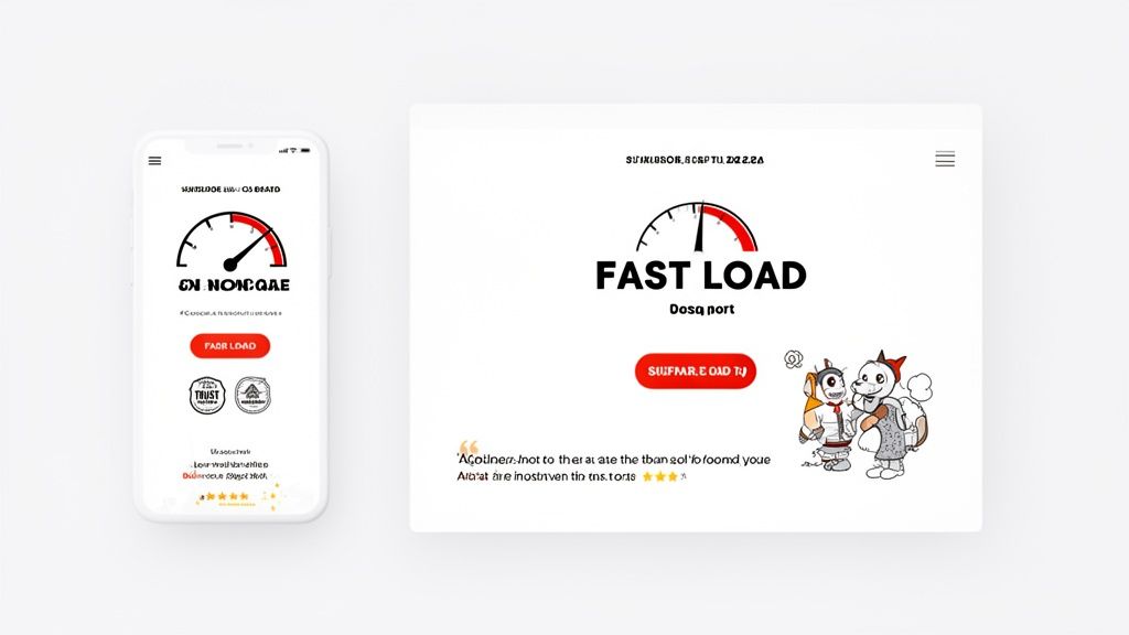
Shave Every Possible Second Off Your Page Speed
In the fight for conversions, every second is precious. I mean that literally. A tiny one-second delay in page load time can tank your conversions by up to 7%. Your visitors have zero patience; they won't stick around waiting for heavy images or clunky scripts to load.
Use a free tool like Google PageSpeed Insights to get a diagnosis. It’ll spit out a prioritized list of fixes, but I can almost guarantee you’ll find these common culprits:
Huge Images: Run all your images through a tool like TinyPNG. It can shrink file sizes dramatically without a noticeable drop in quality.
Bloated Code: Minify your CSS and JavaScript files. This cleans up the code so the browser can download it faster.
Slow Server: If your server response time is high, it's time to invest in better hosting or use a Content Delivery Network (CDN) to bring your site physically closer to your users.
Fixing page speed isn't just a box to check for your developer. It's a fundamental sign of respect for your visitor's time.
Carve a Clear Path to Conversion
A great user experience isn't just about what's on the page; it's how everything is arranged. You need a strong visual hierarchy that acts like a GPS, guiding the user's eye directly to the most important elements—your value proposition and, of course, your call-to-action (CTA).
Use size, color, and negative space to create contrast and draw attention. Your main CTA button should be the most visually dominant thing on the screen. It should be almost impossible to miss. Your headline should be significantly bigger than your body copy. These seem like obvious points, but you’d be surprised how many sites get them wrong. For more on this, we've got a whole guide on landing page design best practices.
Don’t make your users think. A good design makes the next step obvious. The path to conversion should feel like a gentle downhill slope, not an uphill climb.
Finally, you have to build trust at every single step. Sprinkle in social proof like customer testimonials, star ratings, and security badges—especially near payment forms. These small signals constantly reassure the user that they're making a smart, safe decision.
Your Top Questions About Improving Conversion Rates, Answered
As you start digging into conversion optimization, you’ll inevitably run into the same questions that every team faces. Getting these sorted out early on saves you from common missteps and helps you build momentum right out of the gate.
Let's clear up some of the most common hurdles with straightforward, practical advice. Think of this as the essential FAQ that gets you from knowing you should be optimizing to actually doing it well.
What’s a Good Website Conversion Rate?
This is the million-dollar question, and the only honest answer is: it depends. A "good" conversion rate is completely relative to your industry, business model, and traffic source. An e-commerce brand might be thrilled with a 2-3% conversion rate, while a B2B landing page pulling in high-intent traffic could be aiming for 5% or higher.
Sure, you can look up industry benchmarks to get a general idea, but don't treat them as gospel. The only benchmark that truly matters is your own.
A “good” conversion rate is simply one that’s better than last month’s. The goal isn’t to hit some arbitrary industry number; it’s to consistently beat your own performance.
The best sites can hit conversion rates of 10% and beyond, but they didn’t get there overnight. They got there by making steady, incremental improvements. Your real job is to establish your baseline and then relentlessly find ways to improve it. That’s how you build sustainable growth.
How Long Should I Run an A/B Test?
When it comes to A/B testing, patience is everything. The single biggest mistake I see teams make is calling a test the second it hits 95% statistical significance. That's a classic recipe for a false positive, where a random traffic spike makes a variation look like a winner when it’s not.
For reliable data, you have to run tests for full business cycles. I always recommend a minimum of one full week, but two is even better. This simple rule helps smooth out the natural behavioral differences between weekday and weekend visitors.
Of course, the right timeline also hinges on your traffic.
High-Traffic Pages: A landing page getting thousands of visitors a day might have enough data to call a test in just a week.
Low-Traffic Pages: A specific feature page deep within your app might need to run for a month or more to get enough conversions for a valid result.
The best practice here is to determine your required sample size before you launch anything. Let the test run until you hit that number and you’ve completed at least one full weekly cycle. It takes discipline, but it ensures your decisions are backed by real data, not just wishful thinking.
Where Should I Start on a Small Budget?
You absolutely do not need an expensive tech stack to get meaningful results. In fact, some of the most powerful insights come from tools that are free or low-cost. It’s all about being scrappy and focusing on what really moves the needle: understanding your users.
Start with the tools you probably already have. Use Google Analytics to see what users are doing, then layer on a tool like Microsoft Clarity or the free plan from Hotjar to watch session recordings and see why they're doing it.
Instead of a pricey survey tool, whip up a simple Google Form and send it to your last 20 customers. Their raw, unfiltered feedback is pure gold. When you're ready to test, Google Optimize is still a great free option for running A/B tests.
With a tight budget, your time is your most valuable asset. Pour it into high-impact, low-effort changes first. These "quick wins" often look like:
Rewriting a confusing headline on your homepage.
Removing unnecessary fields from a signup form.
Adding a couple of powerful customer testimonials right next to your main CTA.
Remember, smart insights always beat expensive software. Start small, learn from real users, and build from there.
Ready to turn these insights into action? The team at Shalev Agency specializes in turning good websites into high-performing conversion machines. We combine user research, sharp design, and solid engineering to help you ship faster and get measurable results. See how we can help you grow.