How to Map User Flows for SaaS Navigation
May 23, 2025
Learn how to effectively map user flows for SaaS navigation to enhance user experience and boost conversions through data-driven insights.
User flows are essential for creating a seamless SaaS experience. They guide users through tasks, reduce frustration, and improve usability. Here's a quick summary of how to map and optimize user flows:
Why User Flows Matter:
Poor usability causes 90% of users to abandon apps.
Optimized flows can boost conversions by up to 36%.
Key Elements of User Flows:
Entry Points: Where users start (e.g., login page).
Steps: Actions users take (e.g., filling forms).
Decision Points: Choices users make (e.g., plan selection).
Endpoints: Final goals (e.g., purchase confirmation).
4 Steps to Map User Flows:
Analyze Behavior: Use data to find pain points.
Define Tasks: Focus on core user goals.
Map Journeys: Visualize steps and interactions.
Test & Improve: Use A/B testing to refine flows.
Tips for Better Navigation:
Simplify choices and group features logically.
Design for accessibility (e.g., keyboard navigation).
Use data to track and improve performance.
Key Metrics to Watch:
Drop-off rates, task completion rates, and feature adoption.
410: 7 Key User Flows to Unlock Your SaaS Growth - with Peter Loving
User Flow Fundamentals
User flows act as visual guides, helping users navigate your platform while transforming casual visitors into engaged, loyal users. By simplifying interactions, they ensure a smoother experience.
Core User Flow Concepts
A user flow outlines every step a user takes within your SaaS platform. Kara from Strafe Creative describes it well:
"A user flow is a diagram to explain how a user would click and flow around a website or application. This includes from page to page and interactions that trigger emails or processes, such as user sign-in".
These flows confirm that navigation is logical, user-friendly, and geared toward achieving specific goals.
For example, Notion’s onboarding process starts with a straightforward "Get Started" page, then tailors the journey based on the user's needs. This approach has been highly effective in boosting user activation and engagement.
Grasping these basics makes it easier to identify and fix navigation issues.
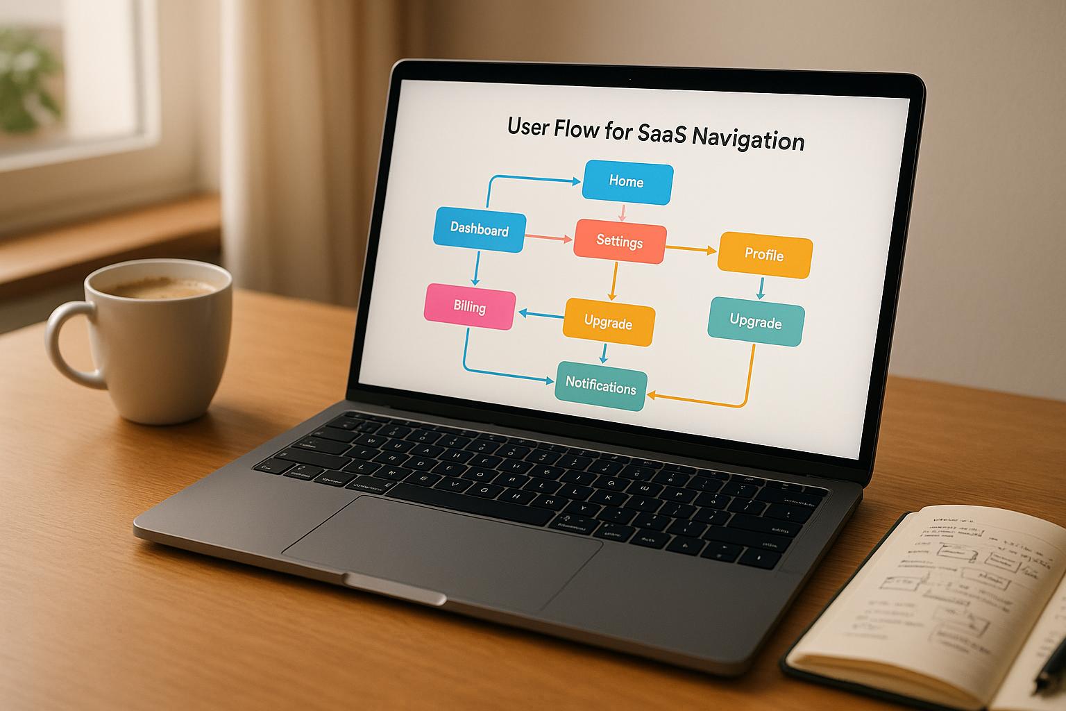
Main User Flow Elements
A user flow typically consists of four key components, each playing a specific role in shaping the navigation experience:
Element | Purpose | Example |
|---|---|---|
Entry Points | Where users begin their journey | Dashboard widgets, menu items |
Steps | Actions users must take to move forward | Filling out forms, adjusting settings |
Decision Points | Points where users choose between options | Subscription tiers, feature selections |
Endpoints | The final goal or completion of a task | Purchase confirmation, post scheduling |
A good example of these elements in action is Figma’s checkout process. Users start by exploring the free platform, encounter timely upgrade prompts, and are guided through an interactive plan selection. The flow ends with a seamless payment process and confirmation.
These components provide a framework for identifying and solving common navigation issues.
Navigation Problems to Solve
Well-designed user flows address several typical navigation challenges:
Cognitive Overload: Users shouldn’t have to guess their next step. Simplifying the journey reduces mental effort.
Feature Discovery: Complex platforms often fail to showcase all their features. Effective flows introduce functionality at the right time.
Task Completion: Confusing navigation can leave users frustrated, increasing support requests and operational costs.
To tackle these issues, keep navigation consistent, group related features logically, use straightforward language in menus, and include visual cues to help users stay oriented. These small but meaningful adjustments make a big difference in improving the overall user experience.
4 Steps to Map SaaS User Flows
Crafting effective SaaS user flows requires a mix of data analysis, user insights, and iterative testing. Here's a step-by-step guide to designing navigation paths that help users achieve their goals:
Step 1: Analyze User Behavior
Start by tracking how users interact with your platform. Analytics tools can reveal where users face challenges or abandon tasks. For example, Spotify used this approach to identify pain points, which led to simplifying menus and adding dropdown folders for easier navigation.
Key metrics to monitor include:
Page-to-page navigation flows
Time spent on each screen
Drop-off points
Most common user paths
Feature adoption rates
These insights form the foundation for understanding what users need and where they struggle.
Step 2: Define User Tasks and Goals
Pinpoint the core tasks users want to accomplish. Research indicates that 86% of customers expect self-service support options, emphasizing the importance of designing flows that empower users to complete tasks independently.
A task priority matrix can help:
Priority | Task Type | Examples |
|---|---|---|
Critical | Core Functions | Account setup, accessing basic features |
High | Regular Tasks | Managing data, generating reports |
Medium | Secondary Features | Customization, integrating tools |
Low | Optional Actions | Updating profiles, setting preferences |
This matrix ensures that your flow designs focus on what matters most to users.
Step 3: Map User Journeys
With tasks clearly outlined, create visual diagrams to represent the user journey. These flow diagrams should highlight key interaction points. HubSpot, for instance, mapped out customer interactions to identify patterns and reduce churn.
Key components of a flow diagram include:
Entry points: Where users begin their journey
Decision points: Where users make choices
Action steps: What users need to do
Exit points: Where tasks are completed
A clear map helps you understand how users move through your platform and where improvements can be made.
Step 4: Test and Improve
Once the flows are mapped, test them thoroughly. A/B testing is a powerful tool to refine navigation. For instance, optimizing a checkout flow led to:
A 54.68% increase in conversion rates
An 11.46% boost in average revenue per user
A 13.35% drop in checkout bounce rates
As Dan Siroker wisely put it, "It's about being humble... maybe we don't actually know what's best, let's look at data and use that to help guide us."
Keep an eye on metrics like task completion rates, time taken for actions, error occurrences, and user satisfaction to ensure your flows continuously improve.
Tips to Improve SaaS Navigation
Once you've mapped out your user flows, these strategies can help fine-tune your navigation to ensure users achieve their goals efficiently.
Reduce Navigation Choices
Simplifying navigation can significantly lower the chances of users dropping off during their journey.
Here are some effective ways to streamline navigation:
Group related features: For example, Monday.com organizes its navigation into four main sections, each with intuitive dropdown menus.
Use progressive disclosure: Display advanced options only when users need them, keeping the interface clean.
Create clear hierarchies: ClickUp structures its navigation by emphasizing core functions, making it easier for users to focus on what matters most.
A well-organized hierarchy can make a world of difference. Here's a breakdown:
Level | Purpose | Example Features |
|---|---|---|
Primary | Core tasks | Dashboard, Projects, Reports |
Secondary | Regular functions | Settings, Notifications, Help |
Tertiary | Advanced options | Admin tools, Integrations |
While simplification is key, remember to design for all users, regardless of their needs or experience levels.
Make Navigation Work for Everyone
About 15% of the global population lives with some form of disability. By designing navigation that accommodates everyone, you not only improve usability but also expand your potential audience. Asana, for instance, revamped its color palette to enhance accessibility, making the platform more user-friendly.
Key elements of accessible navigation include:
Support for keyboard navigation
Consistent navigation patterns throughout the interface
Clear visual feedback for user actions
Adequate color contrast to enhance readability
Descriptive alt text for icons and visuals
Pairing inclusive design with ongoing data analysis ensures your navigation remains effective and user-friendly.
Use Data to Make Updates
Tracking specific metrics can highlight areas where navigation may be falling short:
Pages per session: Reveals how users move through your platform.
Average session duration: Indicates how much time users are spending.
Feature engagement count: Shows which navigation elements are being used.
Drop-off rates: Identifies where users abandon tasks.
Error rates: Pinpoints areas where users might be struggling.
A great example of data-informed navigation is Hotjar's menu system. When dropdown menus are activated, inactive items fade out, helping users focus on their current options.
To refine your navigation further, combine these data points with direct user feedback:
Analyze session recordings to observe real user behavior.
Use heatmaps to identify where users are clicking most frequently.
Conduct surveys at key interaction points to gather insights.
Run A/B tests to evaluate the impact of navigation changes.
Conclusion: Creating Clear Navigation Paths
Effective SaaS user flows rely on a process that's both iterative and driven by data. User testing plays a crucial role here, uncovering up to 85% of usability issues in a product. This makes it indispensable for crafting intuitive navigation.
Even small delays can have a big impact - just a 1-second lag can result in a 7% drop in conversions. Examples like Adobe's 2019 Creative Cloud redesign and Dropbox's 2017 testing with over 700 participants show how focusing on user-centered navigation pays off.
To measure navigation success, keep an eye on key metrics like:
Stickiness rates of 20% or higher
Retention rates of at least 90%
CSAT scores reaching 75% or more
Regular cycles of user testing
Using product analytics to pinpoint friction
These benchmarks help guide strategic improvements and validate navigation changes.
Ultimately, great SaaS navigation strikes a balance between being simple to use and offering robust functionality. This balance, emphasized throughout this guide, is achieved by leveraging data-driven insights and listening to user feedback. Together, they create navigation paths that not only guide users seamlessly but also contribute to long-term success.
"The test of good design is whether it makes people happy".
FAQs
How can I use data to find and fix issues in my SaaS user flows?
To identify and fix problems in your SaaS user flows, begin by examining user behavior with tools that track metrics such as drop-off rates and conversion funnels. These metrics reveal where users are facing challenges or leaving tasks incomplete, pinpointing areas that require attention.
Supplement this with qualitative feedback gathered from user surveys and usability tests. This approach provides valuable insights into user frustrations and preferences. By blending these data sources, you can make thoughtful changes to streamline navigation and enhance the overall user experience.
What are the best practices for creating user-friendly and accessible navigation?
To create navigation that’s easy to use and accessible for everyone, there are a few essential principles to keep in mind. First, make sure all interactive elements - like buttons and links - are clearly labeled and have strong color contrast. This helps users with visual impairments identify and interact with them more easily. Keyboard accessibility is another must-have. Your site should be fully navigable using a keyboard, with a logical and intuitive tab order to guide users smoothly.
Incorporating features like skip navigation links can also make a big difference. These allow users to skip over repetitive content and get straight to what they need. Adding breadcrumbs is another smart move, as they help users keep track of their location on more complex sites. These thoughtful details not only improve usability for individuals with disabilities but also make navigation more intuitive and seamless for everyone.
How can A/B testing improve SaaS navigation and boost conversions?
How A/B Testing Can Improve SaaS Navigation
A/B testing is a smart way to fine-tune your SaaS navigation and boost conversions. The idea is simple: you create two versions of your navigation - let's call them Version A and Version B - and see which one performs better. This allows you to figure out which design makes it easier for users to engage with your platform.
Start by crafting a clear hypothesis. For example, you might test whether changing the placement of a menu item or tweaking its wording leads to better results. Then, randomly split your audience so some users see Version A, while others see Version B.
To evaluate the results, focus on metrics that matter, like:
Click-through rates: Are users clicking on the right links?
Time spent on pages: Does the navigation keep users engaged?
Conversion rates: Are users completing desired actions, like signing up or making a purchase?
Once you identify the version that performs best, roll it out for all users. But don’t stop there - keep experimenting with other navigation elements to ensure your platform stays easy to use. Regular testing like this helps create a seamless experience, making it simple for users to accomplish what they came for.