How to Create High-Converting Landing Pages: Step-by-Step Guide
May 19, 2025
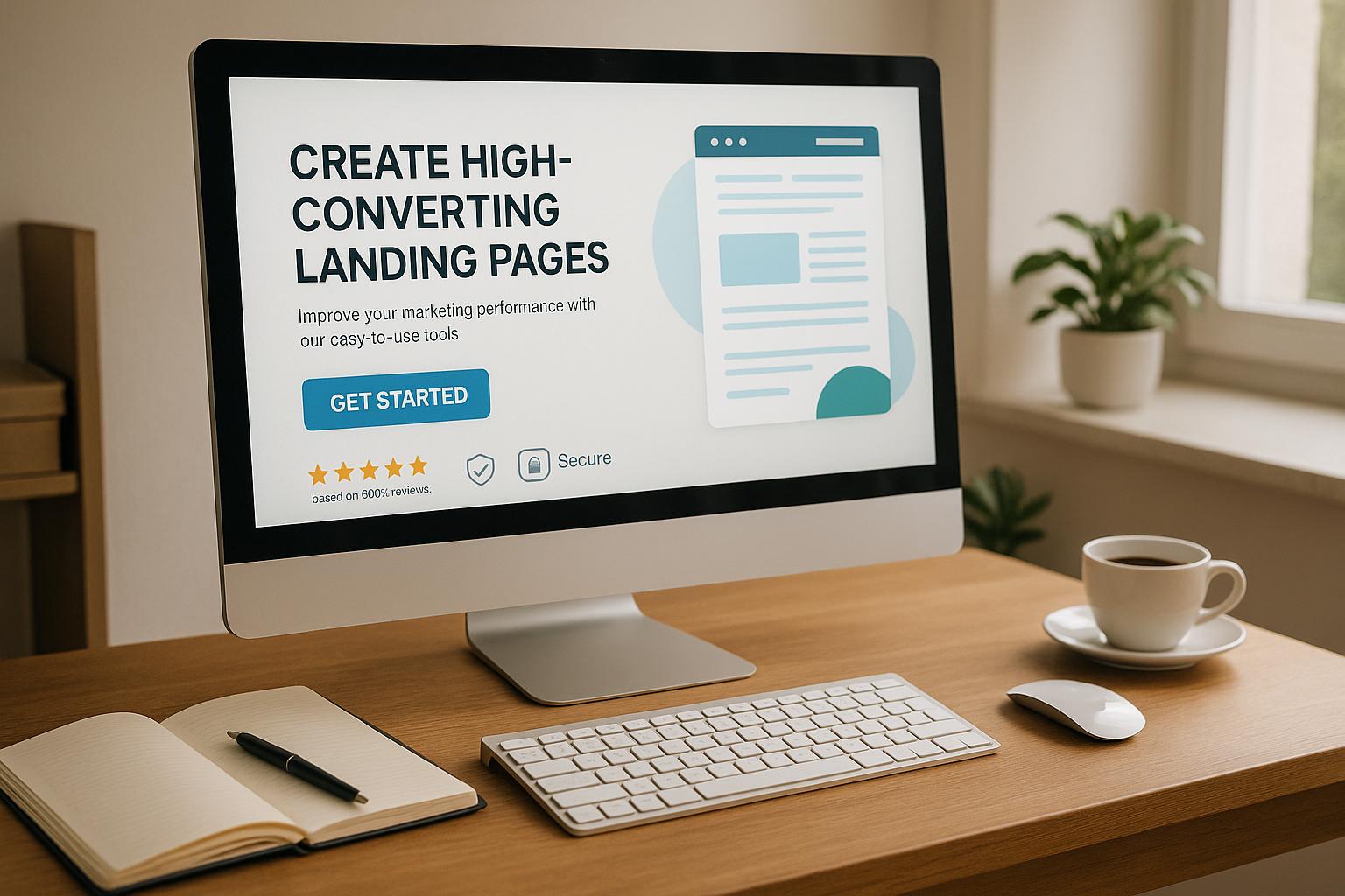
Learn how to create high-converting landing pages with effective headlines, layouts, persuasive copy, and trust signals for optimal results.
Landing pages are designed to convert visitors into leads or customers. Unlike regular websites, they focus on one action. Here’s how to create high-converting landing pages:
Strong Headlines: Grab attention with clear, problem-solving headlines. Example: "Save 5+ Hours Weekly with Our Tool."
Effective Layout: Use a simple design, clear CTAs, and fast loading times. Mobile optimization is a must - 83% of visits are mobile.
Persuasive Copy: Highlight benefits and customer results. Example: "Boost sales by 3x in 15 minutes."
Trust Signals: Add reviews, testimonials, badges, and guarantees to build credibility.
Test and Improve: Use A/B testing, track user behavior, and update content regularly.
Key Stats:
Pages loading in 1 second convert 2.5x better than slower ones.
Personalized CTAs perform 202% better.
Adding trust indicators can boost conversions by 48%.
Landing pages work best when they’re focused, distraction-free, and continuously optimized. Start with a clear goal and refine based on user behavior.
How to Create High-Converting Landing Pages
Step 1: Write Strong Headlines
Your landing page headline plays a huge role in grabbing attention. Studies reveal that while 8 out of 10 people will read a headline, only 2 will stick around to read the rest of the page.
Match Headlines to Your Audience
To create headlines that truly convert, you need to understand your audience’s needs. The best headlines address specific problems and offer clear solutions. For instance, when ePIPE adjusted its headline to directly speak to customer concerns and provide solutions, their conversion rate skyrocketed by 190%.
Here’s how to craft audience-focused headlines:
Speak their language: Use words and phrases your audience naturally uses.
Focus on their pain points: Highlight the problems they’re dealing with.
Show the benefits: Clearly explain what they’ll gain.
Keep it short and punchy: Headlines with 6–12 words tend to work best.
Tailoring your headlines to match your audience’s needs and language sets the stage for better engagement.
"Writing a headline without knowing your audience is like a comedian telling jokes without reading the room."
Connect Headers with Marketing
Once you’ve nailed the headline, it’s important to align it with your overall marketing message. This ensures clarity and encourages action. KlientBoost’s work with MOXĒ is a great example - by shifting from a generic headline to one that focused on user experience, they saw a 30% increase in conversions.
Here are some proven headline strategies that deliver results:
Use location-specific details: Adding "Toronto" to Shulman Law’s headline boosted conversions by 95%.
Leverage direct quotes from customers: Laura Roeder increased conversions by 24.31% with the headline, "Yours is the only newsletter I actually read."
Adopt a problem-solution format: Copyhackers improved clicks by 400% and leads by 20% by changing their headline from "Your Addiction Ends Here" to "If You Think You Need Rehab, You Do."
"The best landing page headlines sell an intended action."
Andi Coombs, Senior Marketing Manager, KlientBoost
Straightforward headlines tend to outperform creative ones 88% of the time. As KlientBoost puts it, "Clarity wins over creativity or cleverness 9 times out of 10."
Testing is crucial. Experiment with different headlines to see what resonates most with your audience. For example, Unbounce discovered that using benefits framed in a positive tone boosted conversions by over 40%. The key? Make sure your headline delivers on its promise and aligns with the content that follows.
Step 2: Build an Effective Layout
A well-thought-out layout can make a big difference in conversions. Visitors take just 0.05 seconds to form an opinion about your page, so every design choice matters.
Top Section Design
The top section is where first impressions are made. It should feature a standout headline, a clear value proposition, and a bold call-to-action (CTA). Daily Harvest nails this with animated visuals showcasing product benefits and how-to GIFs that explain their service.
Key elements to include above the fold:
A headline reinforced with design cues
Visual hierarchy that highlights benefits
A high-contrast, attention-grabbing CTA button
Strategic use of visuals
Trust indicators like testimonials or social proof
"When visitors arrive on your landing page, the first thing they're likely to notice is the headline. Effective headlines clearly state both the offer and your unique value proposition. Your sub-headline should fill in the blanks by adding in additional key details."
Twila Liggitt, Content Writer & Editor, Instapage
Direct User Attention
After the hero section, keeping visitors focused is essential. Indochino’s landing page is a great example, using clean visuals and a minimalist design that naturally leads users to their CTA button.
Tips for directing attention:
Use directional cues and contrasting colors to guide the eye
Remove navigation elements that might distract users
Add whitespace around CTAs to make them stand out
Place CTAs at pivotal decision-making points
Personalized CTAs can convert up to 202% better than generic ones, so thoughtful design and placement are worth the effort.
Mobile Design Requirements
With 83% of landing page visits coming from mobile devices, optimizing for mobile is non-negotiable.
Element | Requirements |
|---|---|
Layout Structure | Single-column design, easy-to-tap navigation |
Content Format | Bullet points, short paragraphs |
CTA Placement | Above the fold, high contrast |
Loading Speed | Optimized images, minimal scripts |
Form Design | Touch-friendly inputs, fewer fields |
Mobile users interact differently with content, so your design should reflect that. Test your layout across devices to ensure it performs consistently. Focus on speed and simplicity by compressing images, using single-column layouts, and including large, tappable elements. Features like click-to-call buttons for instant support and mobile-friendly popups can also enhance the user experience.
Step 3: Write Copy That Sells
The right landing page copy can turn visitors into customers by directly addressing their needs. It's one of the core elements that supports a conversion-focused design strategy.
Highlight Customer Results
Great copy focuses on what customers gain - not just what your product does. It directly tackles their pain points and shows how your solution delivers results.
Here’s how to structure your copy for maximum impact:
Start with the problem
Begin by addressing the challenges your audience faces. For example, KlientBoost analyzed customer reviews to uncover recurring pain points like results, expertise, speed, communication, education, and cost. They then integrated these themes into their copy to resonate with their audience.
Show the transformation
Help visitors picture the outcome. Use specific benefits, measurable results, and clear examples to build trust and credibility.
Copy Element | Weak Example | Strong Example |
|---|---|---|
Problem Statement | "Email marketing is hard" | "Tired of spending 5+ hours crafting emails that get ignored?" |
Benefit Description | "Our tool helps you work faster" | "Create engaging emails in 15 minutes that drive 3x more opens" |
Feature Presentation | "AI-powered writing assistant" | "Get expert-quality copy suggestions as you write, cutting revision time by 75%" |
By focusing on customer success and outcomes, you naturally guide visitors toward your call-to-action (CTA).
Write Strong Call-to-Action Text
Once your copy has drawn visitors in, a strong CTA gives them the push they need to take action. Personalized CTAs, for instance, have been shown to perform 202% better than generic ones.
Here are a few principles for crafting high-performing CTAs:
Use action verbs to create urgency.
Address potential objections right near the CTA.
Keep plenty of white space around buttons to make them stand out.
Match the CTA text to the visitor’s intent.
Continuously test and refine different versions to improve results.
Netflix provides a great example with their “Get Started” button. By pairing it with the message “Cancel anytime,” they tackle concerns about long-term commitments while keeping the CTA simple.
To amplify the impact of your CTAs, surround them with social proof and elements that reduce risk. For instance, Wise strategically places CTAs like “Open an Account,” “Register,” and “Send Money” to address different user intents, ensuring clarity and relevance.
CTA Element | Action | Result |
|---|---|---|
Button Copy | Use action verbs | Increases CTR by 30% |
Placement | Add white space | Boosts conversions by up to 232% |
Messaging | Address doubts | Increases conversions by 124% |
Personalization | Match user intent | Leads to 202% better performance |
Step 4: Add Proof and Credibility
Building trust is a key driver of conversions. In fact, incorporating social proof and trust indicators can boost conversion rates by up to 48% when done right.
Place Reviews and Results
Customer testimonials and reviews are powerful tools for earning trust. A whopping 72% of customers say they trust a brand more after reading positive reviews. To make the most impact, place testimonials near pricing sections or calls-to-action (CTAs). Include details like:
Real customer names and job titles
Photos of the person or company
Company names and information
Specific results achieved
Links to social media profiles for authenticity
Video testimonials pack an even bigger punch. Research shows that people retain 90% of the information from videos, compared to just reading text. For example, when SafeSoft Solutions strategically placed video testimonials next to their lead generation form, they doubled their leads.
Review Element | Impact on Trust |
|---|---|
Star Ratings | 4.2–4.5 stars are ideal for driving purchases |
Customer Photos | More memorable than text-only reviews |
Minimum Reviews | 5+ reviews make buyers 4× more likely to purchase |
Video Format | Processed 60,000 times faster than text |
Adding reviews is just the start. Pair them with other trust signals to further solidify credibility.
Display Trust Indicators
Trust indicators like badges and security seals can make a significant difference. For B2B buyers, these are especially crucial near pricing and checkout areas, with 75% actively looking for them. A great example is Quran Academy, which added a money-back guarantee seal and an app store badge to their sign-up page. The result? A 32.57% increase in sales.
Here’s where to strategically place trust indicators:
Placement | Purpose | Impact |
|---|---|---|
Header/Navigation | Immediate visibility | Builds trust from the start |
Near CTAs | Supports decision-making | Boosts conversions by 35.6% |
Checkout Area | Provides purchase confidence | Essential for closing sales |
Footer | Offers comprehensive proof | Reinforces credibility |
Once these elements are in place, keep refining and testing them to maintain and improve results over time.
Step 5: Test and Improve Results
Fine-tuning your landing page is an ongoing process. In fact, 60% of companies actively use A/B testing to improve their pages and boost conversion rates. These adjustments work hand-in-hand with your earlier design and copy strategies, creating a well-rounded approach to optimizing conversions.
Run A/B Tests
A/B testing is a straightforward way to compare two versions of your landing page. Even small tweaks can lead to significant improvements - sometimes increasing conversions by as much as 300%.
Set Clear Goals
Define specific objectives, like increasing form submissions by 5% or cutting bounce rates by 10%. Focus on more than just clicks by tracking key metrics:
Metric
What to Measure
Primary Conversion
Form submissions, purchases, sign-ups
User Engagement
Time on page, scroll depth
Page Performance
Load time, bounce rate
Source Quality
Conversion rates by traffic source
Test One Element at a Time
Isolate one element to test so you can pinpoint what drives the change. Consider experimenting with:
Headlines and subheaders
CTA button text, color, or placement
Form length and required fields
Placement of social proof
Hero image variations
Ensure Reliable Results
For accurate insights, test with enough visitors - at least 1,000 per variant - and run the test for a full week.
"You need to include enough visitors and run the test long enough to ensure that your data is representative of regular behavior across weekdays and business cycles. The most common pitfall is to use 95% confidence as a stopping rule. Confidence alone is no guarantee that you've collected a big enough sample of representative data. Sample size and business cycles are absolutely crucial in judging whether your test is cooked."
These steps provide a solid foundation for understanding how visitors interact with your page.
Track User Behavior
Beyond A/B testing, tracking real user behavior can uncover additional opportunities for improvement. Tools like Hotjar and Crazy Egg help you analyze heatmaps and session recordings. Focus on behaviors such as:
Where users click on CTAs and links
How far they scroll and where they linger
Points where forms are abandoned
Differences in mobile versus desktop interactions
The pages where users exit your site
With visitors spending an average of just 69 seconds on a page, capturing their attention quickly is critical. Keep an eye on these engagement metrics:
Metric | Benchmark | Action if Below |
|---|---|---|
Conversion Rate | 2.35% average | Reassess your value proposition |
Bounce Rate | 40.5% average | Improve page relevance |
Form Completion | 66% average | Simplify your form fields |
Update Content Regularly
Consistently refreshing your content ensures your landing page stays effective. Watch for signs that updates are needed, such as:
A drop in conversion rates
Lower engagement metrics
Outdated information
Increased competition
For example, one SaaS company increased monthly conversions from 171 to 258 by aligning their content more closely with search intent. To maintain strong results, review your page monthly and conduct more in-depth evaluations every quarter. Regular updates will keep your landing page performing at its best.
Conclusion: Build Better Converting Pages
Creating landing pages that truly convert requires a structured and ongoing effort. While the average conversion rate sits at 2.35%, top-performing pages reach an impressive 11.45%. This gap highlights the potential impact of well-optimized pages.
To recap, success comes from combining tailored copy, smart design, and consistent testing. For instance, mobile optimization is non-negotiable - 83% of visits now happen on mobile devices, and just a one-second delay can slash conversions by 7%.
Design also plays a huge role. A striking 94% of first impressions are based on design. Adding elements like videos can boost conversions by 80%, while trust signals like security badges can increase rates by up to 42%.
These numbers drive home the importance of focused, distraction-free landing pages. Ryan McHugh, Director of CRO at NP Digital, puts it perfectly:
"One of the biggest mistakes site owners make when building landing pages is not having a clear, single focus for the page. Landing pages should have one primary objective, whether it's capturing email addresses, getting sign-ups, or making a sale. When a page has too many distractions, including links, navigation options, or too much information, it can confuse visitors and decrease conversions. Keep the content blocks concise and relevant. Focus on a clear value proposition and be sure to place a consistent and action-oriented call to action prominently on your pages."
To stay on track, monitor these critical metrics:
Metric | Benchmark | Key Action |
|---|---|---|
Conversion Rate | 2.35% average | Test value proposition and CTAs |
Bounce Rate | 40.5% average | Improve page relevance and reduce load time |
Mobile Performance | 54.8% of traffic | Ensure responsive design and fast loading |
These stats underline the need for constant refinement. Experts also emphasize the importance of maintaining a single, clear focus for your landing pages:
"Start with the goal. The call to action. The thing you want visitors to a landing page to do. Then, work backward from your button, writing ONLY copy that will convince people to click that button. Nothing else makes it on the page. Nothing."
FAQs
What are the most common mistakes to avoid when designing a landing page?
When creating a landing page, there are several missteps that can hurt its ability to perform well. Steering clear of these mistakes can help ensure your page encourages visitors to take action:
Overloaded design: A cluttered layout can confuse visitors, making it tough for them to focus on your key message. Keep it clean and organized.
Weak calls-to-action (CTAs): Your CTA should be prominent, easy to understand, and motivate users to act immediately.
Slow load speeds: If your page takes too long to load, visitors may lose patience and leave before it even appears.
Ignoring mobile users: A landing page that isn’t optimized for mobile devices risks alienating a large portion of your audience. Make sure it looks and works great on all screen sizes.
Too much text: Bombarding visitors with excessive information can dilute your message. Stick to the essentials and keep it concise.
Unclear value proposition: Visitors should instantly grasp what you’re offering and how it benefits them. Don’t make them guess.
Lack of trust elements: Trust is crucial. Include testimonials, reviews, or trust badges to reassure visitors that your offer is reliable.
By prioritizing a simple design, clear messaging, and a smooth user experience, you can create a landing page that not only grabs attention but also drives conversions.
What’s the best way to use A/B testing to boost landing page conversions?
To get the most out of A/B testing for your landing page conversions, start by setting a specific goal. This could be anything from boosting sign-ups to lowering bounce rates. Next, create two versions of your landing page - Version A and Version B - and make sure to change just one element between them, like the headline, the color of the CTA button, or the placement of an image. Keeping it to a single change helps you identify exactly what's driving the difference in performance.
Let the test run long enough to collect enough data for reliable results. Afterward, dive into the numbers to see which version came out on top, and then implement the winning change. Keep this process going by testing other elements regularly, so you can fine-tune your landing page and keep improving engagement and conversions over time.
What are the key elements of a landing page that build trust and credibility?
To make your landing page trustworthy and credible, focus on these key elements:
Social Proof: Showcase testimonials, customer reviews, or user endorsements to highlight that others rely on and value your product or service.
Trust Indicators: Display security badges, certifications, or payment method logos to emphasize safety and reliability.
Clear Contact Information: Offer accessible customer support options, like a phone number, email, or live chat, to show transparency and availability.
Professional Design: Opt for a clean, polished layout that conveys quality and builds confidence.
Success Stories: Share case studies or examples of how your product has positively impacted others to strengthen your credibility.
Incorporating these elements can make your landing page more reliable, helping visitors feel secure and confident in taking the next step.