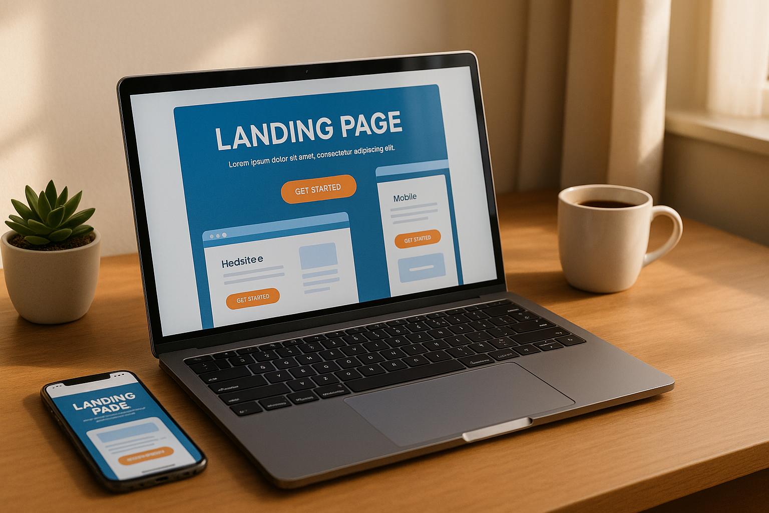
Common Landing Page Problems and Their Solutions
May 8, 2025
Identify common landing page issues like slow speeds and poor mobile optimization, and learn effective solutions to boost conversions.
Landing pages often fail to convert because of common issues like slow load times, poor mobile optimization, or unclear messaging. Fixing these problems can significantly improve your results.
Key Problems and Solutions:
Slow Page Speed: Every second of delay reduces conversions by 6%. Compress images, clean up code, and use a CDN.
Message Misalignment: Ensure ad headlines, visuals, and offers match your landing page content.
Cluttered Forms: Reduce form fields to 7 or fewer and optimize for mobile.
Weak Trust Signals: Use real testimonials, trust badges, and measurable results.
Poor Mobile Experience: Design for mobile-first with responsive layouts, larger text, and touch-friendly elements.
Quick Fixes:
Match ad and landing page messaging.
Simplify forms and limit CTAs.
Optimize for mobile and speed up load times.
Add trust-building elements like customer reviews and security badges.
By addressing these issues, you can turn underperforming landing pages into high-converting assets.
Simple CRO Fixes to Improve Your Landing Page Conversions
Ad and Landing Page Message Misalignment
Ads create specific expectations, but when landing pages don't align with those expectations, it damages trust and reduces conversions. Below, we break down common misalignment issues and how to fix them.
Problem: Disconnect Between Ads and Landing Pages
Message misalignment typically falls into three categories:
Visual Disconnect: When the design of the landing page doesn’t match the ad, it confuses visitors.
Offer Mismatch: If the ad makes a promise, the landing page must deliver on it.
Context Loss: Linking directly to forms or generic pages without providing supporting information.
For example, Samsung ran a Galaxy Tab A campaign with a banner ad promoting a Father’s Day gift that included a 3-month Next Issue subscription. However, the landing page didn’t mention this offer, leaving visitors confused and disengaged.
Solution: Align Your Messages
Build Dedicated Landing Pages: Air Canada ensures their ads and landing pages match by keeping headlines, subheads, and visual elements consistent.
Use Dynamic Keywords: Chat Support saw a 66% boost in conversions by consistently using the phrase "Fully Free for Life" across their ads and landing pages.
Here’s a quick checklist to help maintain alignment:
Element | What to Match | Why It Matters |
|---|---|---|
Headlines | Keep the main headline identical in ads and pages | Reinforces the visitor is in the right place |
Visuals | Match colors, fonts, and imagery | Ensures a smooth transition from ad to page |
Offer Details | Keep pricing, promotions, and benefits consistent | Builds trust and avoids confusion |
Call-to-Action | Use the same wording for CTAs | Keeps visitors focused on taking action |
Case Study Example: KlientBoost demonstrated the impact of consistent messaging by aligning their Google Ads and Facebook campaigns with their case studies landing page. This strategy delivered a 23% conversion rate.
Add Local Touches: Tailor landing pages with location-specific details, such as area codes or city names. This makes your offer feel more relevant to visitors from various regions.
Complex Conversion Steps
Problem: Cluttered Forms and Multiple Buttons
Overcomplicated forms and too many CTAs can frustrate users and hurt your conversion rates. Research shows that conversion rates drop significantly after 7 form fields. Here are the main challenges:
Form Overload: The average checkout process includes 11.8 fields, but many sites could cut this by 20–60%. For example, Expedia once lost substantial revenue because of an unnecessary optional field.
Confusing Processes: Multiple CTAs, excessive navigation options, and complex multi-step processes often confuse users and lead to fewer completions.
Simplifying the process is key to reducing these barriers.
Solution: Remove Extra Steps
Here’s how you can streamline forms and CTAs to make conversions easier:
Optimize Form Length
Keep forms simple while collecting the data you need. Here’s what works best:
Form Type | Recommended Structure | Best Practice |
|---|---|---|
8 or fewer fields | Single-column layout | Align labels on top, left-justified |
10+ fields | Double-column layout | Use clear visual organization |
Multi-step forms | Break into logical segments | Add progress indicators |
Smart Field Configuration
Small changes can have a big impact. For instance:
ContentVerve boosted subscriptions by 87% by adding benefit-focused bullet points near their opt-in form.
Darwin Homes cut their CPA by 45% and increased conversions by 22% by testing CTA button colors.
"The biggest takeaway is that sometimes you don't need a big dramatic change; sometimes just something simple will provide you results. In this case, they already had a short form, so all we did was take it from the homepage to the degree page."
– Warren Staley, Research Manager, MECLABS Institute
Technical Optimizations
Enable autofill to cut form completion time by 30%.
Replace dropdowns with radio buttons for quicker selections.
Add inline validation for real-time feedback.
Arrange fields from easiest to hardest to keep users engaged.
Make sure your forms are mobile-friendly by sizing and spacing fields for touchscreens.
Trust-Building Elements
Adding trust signals near forms can make a big difference. For example, 66% of customers convert better when trust elements are visible. Yoast saw an 11.30% increase in conversions by simply adding the phrase "there will be no additional costs" to their checkout form.
As Oli Gardner, CEO of Unbounce, explains:
"I started with the same mentality that most people have, that fewer form fields perform better. From a conversion standpoint, this is still true. But you'd be surprised at how adding a few more fields can impact results. Sometimes form length doesn't make much difference, and if you're interested in quality over quantity, the extra friction can be a good thing. But choose those fields carefully, or the friction will create false data."
– Oli Gardner, CEO and founder of Unbounce
Poor Page Speed
Problem: Heavy Files and Bad Code
Slow-loading pages hurt conversions. In fact, just a 1-second delay can slash conversions by 7%. Mobile users are even less forgiving - 74% will leave a page that takes more than 5 seconds to load. These delays can seriously impact your results.
Here are some common culprits behind slow speeds:
Large Images: Over 45% of top e-commerce sites fail to compress images effectively, even though images make up more than 20% of a typical page's weight.
Server Delays: Poor hosting and inefficient database queries can slow things down.
Messy Code: Unminified JavaScript, CSS, and too many HTTP requests can drag performance down.
Resource Issues: Weak caching and poorly optimized asset loading can delay page rendering.
Solution: Speed Up Your Page
Here’s how you can improve your page speed:
Image Optimization
Action | Impact | How to Do It |
|---|---|---|
Compression | Shrinks file sizes | Use tools like TinyJPG or Compressor.io |
Format Selection | Balances quality and size | Use JPEG for photos, PNG for graphics |
Dimension Control | Matches display size | Resize images to fit their display size |
Technical Improvements
1. Boost Server Performance
Use a Content Delivery Network (CDN) to deliver content faster. CDNs store your site’s resources on servers closer to your visitors, cutting down load times.
2. Clean Up Your Code
Minify HTML, CSS, and JavaScript by removing unnecessary characters. Enable GZIP compression to shrink file sizes. Also, eliminate render-blocking resources to speed up page loading.
Smart Resource Loading
Adopt these tactics to streamline resource management:
Browser Caching: Set up your server to store static assets locally, so returning users experience faster load times.
Script Placement: Move non-essential scripts to the bottom of your page.
External Hosting: Use platforms like YouTube or Wistia to host large media files, such as videos.
With nearly 50% of users expecting pages to load in 2 seconds or less, these adjustments are crucial for meeting expectations.
Mobile Performance
Don’t stop at technical fixes - optimize specifically for mobile users. With 68.1% of global website traffic coming from mobile devices, focus on:
Highlighting above-the-fold content
Cutting out unnecessary elements
Testing on different devices and network speeds
Google’s research shows that 70% of mobile landing pages take over 7 seconds to fully load. Speeding up mobile sites is essential to keep users engaged.
Bad Mobile Experience
Problem: Desktop-First Designs
Even though mobile users make up 68.1% of global web traffic, many landing pages are still designed with desktop users in mind. This often leads to frustrating experiences for mobile visitors.
Common Mobile Design Issues:
Text size is too small, often below the 16px minimum.
Clickable elements are placed too close together, causing accidental taps.
Forms are wider than the screen, forcing users to scroll horizontally.
Large images and videos load at desktop resolutions, wasting bandwidth.
Navigation menus and pop-ups are hard to use on touchscreens.
These problems, combined with slow loading speeds, lead to high abandonment rates. In fact, 53% of mobile users leave a page if it takes more than three seconds to load. Fixing these mobile-specific issues is just as important as optimizing your page for desktop users.
Solution: Design for Mobile First
A mobile-first approach ensures your landing page works well for the majority of your visitors. Here's how to make your page mobile-friendly:
Touch-Friendly Interface
Interactive elements should be at least 44px square. Leave enough space between tap targets to avoid misclicks.
Key Mobile Optimizations
Simplify Your Layout
Use a single-column design to make content easier to read on small screens.
Streamline Forms
Only include the most essential fields to reduce friction for mobile users.
Improve Performance
Add sticky navigation bars to help users find content faster.
Include click-to-call buttons, as 94% of users prefer calling businesses directly.
Use responsive design, which can increase conversion rates by up to 400%.
Enhance Navigation
Add sticky headers or footers to keep important calls-to-action visible.
Use click-to-scroll buttons for easy navigation between sections.
Place primary calls-to-action above the fold.
Remove unnecessary navigation links to avoid clutter.
Test Your Mobile Design
Test your page on multiple devices (both iOS and Android), screen sizes, and under different network conditions. Tools like Google's PageSpeed Insights and the Unbounce Landing Page Analyzer can help you spot areas for improvement. Prioritize fast load times, as half of all visitors expect pages to load in two seconds or less.
Weak Trust Signals
Problem: Low-Quality Testimonials
Trust signals on landing pages often fall short when they appear fake or unconvincing. According to research, 90% of consumers believe marketing testimonials are fabricated. This doubt usually arises from issues like:
Testimonials lacking detailed outcomes
Missing or generic profile photos
Outdated or stale endorsements
Feedback from irrelevant or unknown sources
Reviews focusing on features instead of tangible results
These shortcomings can hurt conversion rates. Once technical issues are addressed, building real credibility becomes the next priority. The strategies below can turn weak testimonials into powerful social proof.
Solution: Strengthen Social Proof
To earn genuine trust from your audience, focus on creating testimonials that are credible and easy to verify.
Use Recognized Experts
Feature endorsements from well-known industry figures. For instance, Neil Patel saw his conversions double by showcasing testimonials from major brands instead of smaller businesses.
Add Visual Cues
Adding photos can make testimonials more relatable. For example, 37signals boosted conversions by 102.5% simply by including a large photo of a customer alongside their testimonial.
Highlight Measurable Results
Swap out generic praise for specific, measurable outcomes. For example, mention increases in conversion rates, revenue growth, or faster customer service response times.
Layer Your Trust Signals
Go beyond testimonials to build a stronger sense of credibility:
Display security badges during checkout
Showcase logos of well-known clients
Highlight press mentions
Provide clear privacy and return policies
"Landing page testimonials need to be trusted before they can have even the faintest influence on conversions and revenue."
– Pratik Dholakiya, Founder, Growfusely
Conclusion: Fix Your Landing Page Issues
Landing page optimization can directly impact your business growth. In fact, 1 in 3 brands is expected to achieve higher conversion rates in 2023. Even small changes matter - a one-second improvement in page load time can prevent a 12% drop in conversions.
Here’s how you can fine-tune your landing page for better results:
Speed and Mobile Optimization
Did you know that 83% of landing page visits happen on mobile devices? And 70% of consumers say loading time affects their buying decisions. To meet these expectations, focus on:
Compressing and optimizing images
Simplifying your code
Ensuring your design works flawlessly on all screen sizes
Trust and Simplified Conversion Paths
Trust signals are powerful - they can increase conversion rates by 34%. Meanwhile, cutting out unnecessary navigation can double your conversions. As SaaS expert Alexej puts it:
"A landing page serves 1 purpose: To generate leads or sell products."
Keep your page focused and straightforward to guide users toward action.
Testing and Iteration
A/B testing is a must for refining your landing page. A.J. Beltis, HubSpot's Content & Acquisition Manager, explains:
"If you're using a content management system with a built-in A/B testing tool, you can easily set up and run a test to see which copy, design, imagery, and page elements yield a stronger conversion rate. This means you can quickly uncover new ways to drive more leads and contacts for your business."
FAQs
What are the best ways to test and evaluate changes to my landing page?
To effectively test and evaluate changes to your landing page, start with A/B testing. This involves creating two or more versions of your page to see which one performs better based on metrics like clicks, sign-ups, or purchases. For more complex adjustments, you can use multivariate testing, which analyzes how multiple elements (like headlines, images, or buttons) work together to impact performance.
Make sure to track results using analytics tools that measure key metrics, such as conversion rates, bounce rates, and user behavior. Focus on one change at a time for A/B testing to clearly identify what drives improvements, and always allow enough time to gather meaningful data before drawing conclusions.
How can I build trust on my landing page to boost conversions?
Building trust on your landing page is essential for increasing conversions. Start by using a clear and compelling headline that immediately communicates the value of your offer. Include testimonials with real photos to make them relatable and authentic. Show social proof by highlighting customer reviews, social media engagement, or the number of users who trust your product.
Make your contact information easy to find, and consider adding a photo of yourself or your team to create a personal connection. Ensure transparency by linking to your privacy policy and using trust-building elements like guarantees or certifications. Keep the design clean and professional to avoid overwhelming visitors and focus on creating a seamless user experience.
Why is mobile optimization important for landing pages, and what should you focus on to improve the mobile experience?
Mobile optimization is essential for landing pages because a large percentage of web traffic comes from mobile devices. If your page isn’t mobile-friendly, visitors may have difficulty navigating or engaging with your content, leading to lost conversions.
To improve the mobile experience, focus on a mobile-first design with fast loading times and simple layouts. Use concise, easy-to-read copy, place calls to action (CTAs) above the fold, and limit the use of large images or videos. Ensure navigation is intuitive, forms are easy to fill out on smaller screens, and include features like click-to-call buttons for better accessibility. Prioritizing these elements will help create a seamless experience for mobile users and boost your landing page performance.